Mattias Jersild by BVD
Opinion by Richard Baird Posted 23 January 2013
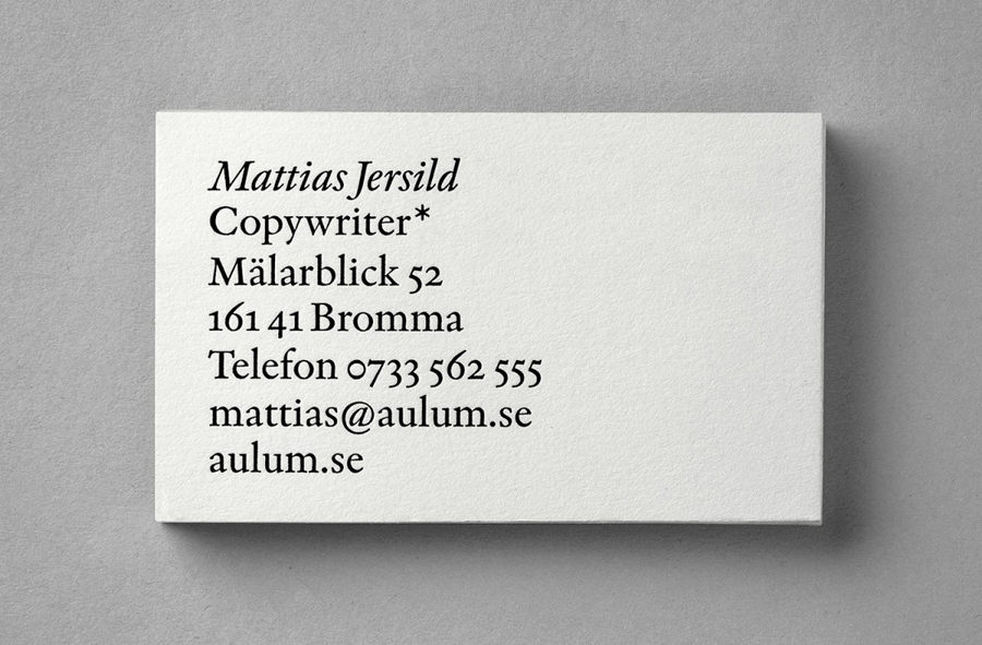
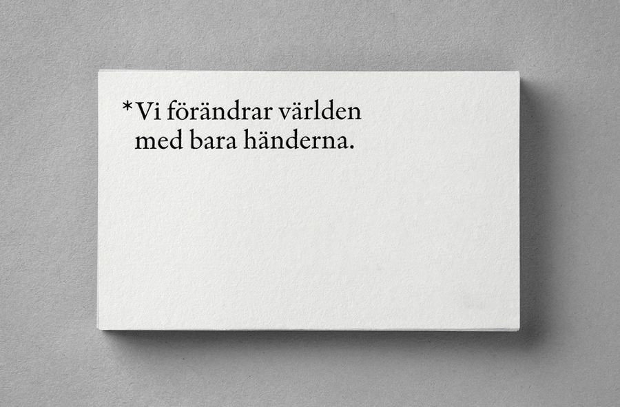
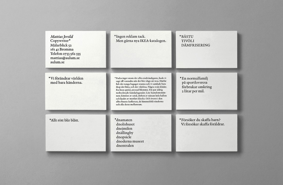
Of all BVD’s recent projects, which includes their packaging for 7-Eleven – a blog favourite this and last week -, it is their work for Swedish copywriter Mattias Jersild that really stood out for me. It is an incredibly simple but wonderfully laid out, spaced and restrained solution that introduces variety through an interesting mix of lowercase, sentence case and uppercase typography set out as paragraphs and footnotes using the Swedish typeface Indigo. A choice that, by drawing on classic 15th and 16th century literary references, digitally adapting these to fit contemporary printing techniques and giving ‘optimal legibility to ordinary type sizes’ – works well to convey a sense of timelessness, professionalism and academia.
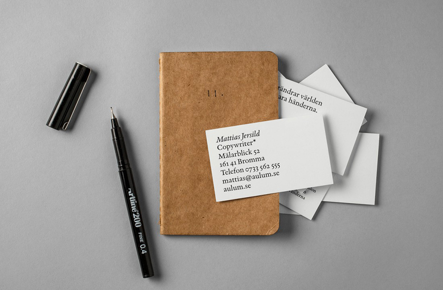
There is an honesty and straightforwardness in the uncoated nature of the paper, the single black ink print treatment and the way the logo-type sits unassumingly within the body of the content – marked only by a change to and motion of an italic – which feels complementary rather than appearing overtly individual. The absence of iconic or superfluous detail clearly places language at the very heart of the identity with a modernistic design sophistication and although I cannot read Swedish I have no doubt that there is a personal relevance to every word.
