Sifang Art Museum by Foreign Policy
Opinion by Richard Baird Posted 29 November 2012

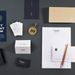
Sifang Art Museum is a gallery and creative space located in the Pukou region of Nanjing, China dedicated to art, architecture and international collaboration. Their visual identity, a bilingual logo-type set across a collateral of unusual trapezoidal cut detail and monochromatic colour palette—developed by Singapore-based creative and strategic design agency Foreign Policy—draws together the themes of architectural space, the dimensionality created by light and shadow, the meeting of ideas and the built environment.

“Set within the gentle terrain of Laoshan in Nanjing, the architecture of Sifang Art Museum is a well-constructed mix of harsh angularity with an elegant appeal whereby the asymmetrical structure hovers in space. Every view angle yielding a different trapezoidal perspective; the collateral system adopts the trapezoidal form. The Chinese saying – Strength within Gentleness – is inspired by bamboo – the material and form used for landscaping and parts of the structure. This underpins the brand identity, describing the gentle landscape where in old China, scholars and artists took recluse to master their craft or refine their thinking. The demure that also balances the masculinity of the architecture. White, is also a canvas a museum would function as.” – Foreign Policy


The logo-type—a juxtaposition of slim Latin characters and square simplified Chinese logograms—has been well executed and is clear in its presentation of modernistic ideas set within rural and traditional China. The shared geometric form, mono and grid-based spacing, square terminals, single consistent line weight and stacked resolution of both types of characters appropriately visualises the collaboration of east and west whilst also having a structural and technical plan-like quality with a good balance of space.

The die cuts of the stationery establish a physical relationship between brand identity and the architecture of the museum without being obvious or literal, it hints at the idea of multiple-perspectives, the omnidirectional nature of the name and delivers a subtle, distinctive and proprietary quality beyond the simplicity of the graphical components.
The result is incredibly well restrained and has a tranquility in the lightness of the line weight and use of ample white space that perhaps reflects some of the spirituality that inhabits the country and its past. It does rely on a few architectural conventions but manages to elevate these with some simple cuts and enhances these with the light and shadow of a monochromatic material choice.