Designed by Moodley
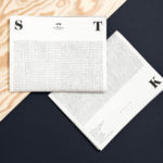
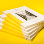
STK Magazine by Moodley
Steirische Terrior und Klassikweingüter (STK) is a free association of ten wineries that have committed themselves to a region-specific wine culture and outstanding quality. The STK seal is a protected trademark and guarantee of quality for wines produced in the Southern and South-Eastern region of Styria, Austria. STK was founded more than 30 years ago by a group of winegrowers who believed...
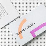
Raumindex by Moodley
Raumindex is an Austrian design, development and project management studio established in 2005 that creates integrated interior and exterior retail environments for national and international clients. Its philosophy is rooted in the shaping and arrangement of form, space and content to create functional and flexible environments to add value and elicit feelings. With a desire to appear more accessible, and with...
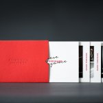
Grand Ferdinand by Moodley
Grand Ferdinand is hotelier Florian Weitzer’s fifth hotel. It features a distinctive interior of green leather upholstery and Lobmeyr chandeliers, rooms with ornate and functional furnishings, and a restaurant that is said to serve the best French champagne and the grandest Viennese cuisine, all set within a landmark building located on Vienna’s Ringstraße. Grand Ferdinand has a philosophy that celebrates the past whilst moving forward. This meeting of tradition...
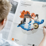
Bregenzer Festspiele by Moodley
Bregenzer Festspiele is a performing arts festival and opera venue with a 7,000 seat open-air amphitheatre. The festival is held each year in July and August and features a unique set built on top of a floating stage on Lake Constance in the Austrian city of Bregenz. Notable set designs include a giant book and skeleton for Giuseppe Verdi’s Aida, the...
Raiffeisen Rechenzentrum by Moodley
The Raiffeisen Rechenzentrum is a customised IT infrastructure service provider and subsidiary of Raiffeisen Landesbank with a modern, ‘high availability’ and maximum security data centre located in Austria. Design agency Moodley recently developed RRZ’s brand identity—which included a logo, business cards, brochure and website—based around a single sans-serif, a contrast of humanistic and technological imagery and a white, black and bright...