Newsprint
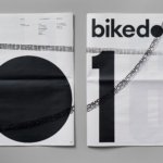
Bikedot by Studio Sutherl&
The concept of a brand today rarely has a sense of physicality. The hand (or indeed roller), the mark-maker, usually feels totally absent. It makes sense really, considering our primary interaction with a brand is often online; but when a project comes along that’s so obviously delighting in the possibilities of print processes, inks and paper it feels like a...
Blue Mountains by For The People
The Blue Mountains of New South Wales, Australia are not technically mountains at all. They are, rather, a complex labyrinth of dissected plateaus, gorges and valleys of sandstone, formed over 50 million years ago. So far, so deceptive. Fortunately, however, the Blue Mountains are most definitely blue. When the atmospheric temperature of the region rises, a superfine mist of fragrant...
Whale Tales by Interbrand
Every year an impressive 40,000 humpback whales travel along the Sydney coastline. This annual migration pattern is one of the many awe-inspiring natural spectacles that make the city so unique. It is fitting then, that the New Sydney Waterfront Company chose to revitalise Sydney’s Western Harbour Precinct with an installation of thirty whale tail sculptures, telling thirty individual stories, or...
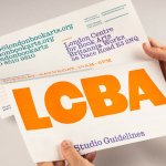
LCBA by Studio Bergini
Not a new project, but a lovely one nonetheless; it seems there couldn’t have been a more perfect fit for London Centre for Book Arts than Studio Bergini when it was looking for a design team to task with creating its new visual identity. Formed by two Central Saint Martins grads – Norwegian Kristian Hjorth Berge and Italian Francesco Corsini (hence...
Skateyogi by Order
The skateboarding learning curve is really defined by the individual. There are lessons (passed down or shared online), but much of it is practice (and patience). Further, and perhaps more importantly, skateboarding is expressive, it’s fused with personal style. Timeless tricks are given an individual twist that keep it evolving and competitive. Iconic skateboarding brands have grown out of the...
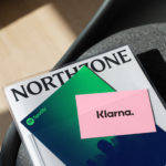
Northzone by Ragged Edge
Northzone is an early stage venture capital fund with the insight necessary to cut through the hype of funding and recognise strong teams doing good work. From their offices in London, Stockholm and New York they partner with founders at Seed, Series A and Series B stage across Europe and America. London-based Ragged Edge worked with Northzone to create a brand identity that would...
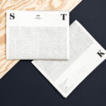
STK Magazine by Moodley
Steirische Terrior und Klassikweingüter (STK) is a free association of ten wineries that have committed themselves to a region-specific wine culture and outstanding quality. The STK seal is a protected trademark and guarantee of quality for wines produced in the Southern and South-Eastern region of Styria, Austria. STK was founded more than 30 years ago by a group of winegrowers who believed...

The Dayrooms by Two Times Elliott
The Dayrooms is a multi-label womenswear store, located in the London district of Notting Hill, created by Aytan Mehdiyeva and Zumrud Mammadova. The store gives a UK platform to emerging Australian designers and is an expression of Aytan and Zumrud’s shared passion for fashion and travel, and Aytan’s love of photography, textiles and Australian craftsmanship. This is reflected throughout The Dayroom’s graphic identity, developed by Two Times...
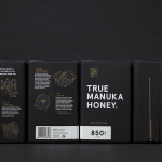
The True Honey Co. by Marx Design
The True Honey Company (TTHC) dedicates itself to the production of mānuka honey, a monofloral variety produced in Australia and New Zealand from the nectar of the mānuka tree. It has a unique colour and texture, and a high level of Dietary Methyglyoxal, an organic compound with antibacterial and antiviral properties. With a price range starting at 60.00AUD and rising to 230.00AUD per jar,...
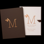
The Mansion on Marylebone Lane by Pentagram
The Mansion on Marylebone Lane will be a 22-unit high-quality residential development in Central London with lower ground, ground and seven upper floors, roof terraces and two basement levels. It will feature reflective glazed terracotta external cladding with a subtle variation in colour and shade to achieve an element of interest and complexity, while the reverse will be a white reflective glazed terracotta...
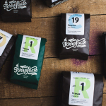
Torrefacto by Fork
Torrefacto is a Russian coffee roasting business founded in 2011 in response to what they describe as the difficulty of sourcing freshly roasted coffee beans in Moscow, and the time and trouble associated with importing it. Torrefacto prides itself on batch production and hand roasting processes, good consumer relations – which sees its owners personally answering letters and addressing website comments – and...
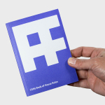
Austin Fraser by Felt
Austin Fraser is a UK information technology and engineering recruitment specialist with an open and transparent business practice. Established in 2007 it has gone on to win a variety of awards and recently opened its first international office in Munich with another office planned for Austin Texas this year. Described as dated, parochial and not reflective of Austin Fraser’s ability or ambition,...