Olive Oil Logo and Packaging Design
Six Six by A Friend of Mine
Six Six is an eyewear store and optometrist based in Melbourne, which opened early this year with the aim to be “more like a destination than a store”. Tasked with creating the brand identity to make that happen was A Friend of Mine, or AFOL for short (Embla, Great Wrap, Suupaa), a brand design studio also based in Melbourne which...
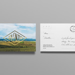
Where fallow deer roam
Deer feel like unlikely ambassadors/ mascots/ PosterCreatures for olive oil, but it turns out they work brilliantly – when, that is, in the superlatively capable hands of a studio like SMLXL. Said olive oil is D’arbequina, a name which more broadly simply refers to the sort of plant from which the oil is produced: Arbequina is a widely cultivated olive...
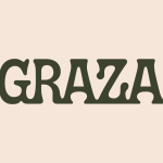
Graza by Gander
Using olive oil has never been so squ-easy. That’s how Andrew Benin, founder of Graza, would like us to feel. As Kelsey McClellan reports for the Wall Street Journal, Benin knew the last thing the world needed was another snobby olive oil and the key goal was finding ‘the sweet spot between flavor and affordability’. This product does feel different...
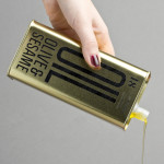
Unto by Studio Bergini
Five years ago, the discerning and culinary-minded were content with their everyday Waitrose Essential Extra Virgin Olive Oil. But now – as with wine – there is increasing awareness that the taste of oil is individual, depending on olive variety, soil type, climate, cultivation method, and a host of other factors. From The River Café’s hotly anticipated annual pressing to...
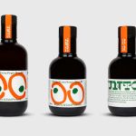
Olive & Sesame Oil by Lo Siento
Design agency Lo Siento have recently completed their packaging design work for Spanish olive oil producer Olis Bargalló‘s new Olive & Sesame variety. Lo Siento’s use of condensed sans-serif typography, stacked vertically, and printed with a single black ink makes great use of the tall tin and its warm gold colour. Typography, structural choice and straightforward language share a similar commercial...
Olaf Olive Oil by Anagrama
Olaf is a Mexican cold-pressed extra-virgin olive oil produced by Olivarera Italo-Mexicana – a Mexican Italian collaboration – intended for healthy, home-cooked, family meals and makes up one-third of Olivarera ‘s olive oil range, which also includes Valentto and Olive Gold. Anagrama, the design agency behind Olaf’s new visual identity, print materials and packaging, describe their approach as taking “typical Italian visual clichés...
Valentto Olive Oil by Anagrama
Valentto is a Mexican cold-pressed virgin olive oil produced by Olivarera Italo-Mexicana – a Mexican Italian collaboration – created for commercial kitchen and restaurant use. Multidisciplinary design agency Anagrama recently developed a new brand identity and packaging solution for Valentto that juxtaposes the natural detail of Italian landscapes alongside the industrial utility of a square tin structural choice, described by Anagrama as being...
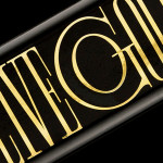
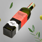
Olive Gold by Anagrama
Olive Gold is described by Anagrama, the multidisciplinary design agency behind its new packaging and visual identity, as an ‘ultra premium’ cold-pressed, extra virgin olive oil from Olivarera Italo-Mexicana that “targets the global high-end section of its category, is marketed through word-of-mouth, luxury communication channels and is only available in a few upscale gourmet stores and luxury-chic hotels.”...