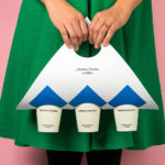
Anton&Anton Kioski by Bond
Anton&Anton (A&A) is an alternative to and antithesis of the large supermarket chains. Staff are described as relaxed, smiley and proud. Their ranges (mostly) organic, some homecooked and also available online for home delivery. With a desire to express an approachable, playful yet credible positioning, and a need to develop a cohesive set of packaging and communications assets A&A worked...
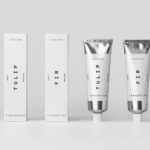
Tangent GC Hand Cream by Carl Nas Associates
Tangent GC began as a Scandinavian organic garment and shoe care company developing products that intended to ensure longevity, and entered the organic skincare market in 2016. The company’s graphic identity, a simple typographical expression, designed by Essen International, delivered a sense of informational immediacy through the absence of superfluous stylistic detail and colour, yet divide content and drew out a distinction in...
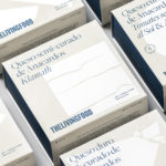
The Living Food by Francesc Moret Studio
The Living Food is a Barcelona-based grocery store and deli stocking organic and vegan foods. Francesc Moret Studio worked with the store to develop a packaging design for its range of nine vegan cheeses. Drawing on the brand’s established visual identity of silhouettes, the studio built a visual language with a bold graphic style, typographical detail, and a modern and distinctive...
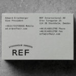
REF by Kurppa Hosk
REF is an environmentally conscientious Swedish hair care brand with a range of products that are made from high quality organic ingredients. With a desire to enter the international market of the US and further into the Nordic regions, both dominated by well-established FMCG, Scandinavian design studio Kurppa Hosk were commissioned to rejuvenate REF’s visual identity. This included packaging design, art...
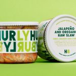
Hurly Burly by Midday
Hurly Burly brings the bold flavour and natural health benefits of naturally fermented foods to the United Kingdom. Its first range of products will be a variety of raw organic coleslaws. Flavours include Jalapeño & Oregano, Lemon & Ginger and Turmeric & Cumin. Name, brand identity and packaging design, developed by London-based design studio Midday, intends to bring to the forefront...
Tangent GC Soap by Carl Nas Associates
Tangent GC is a Scandinavian organic garment and shoe care company developing products that intend to ensure longevity. The company’s brand identity, a simple utilitarian typographical expression, designed by Essen International, delivered a sense of informational immediacy through the absence of superfluous stylistic detail and colour, dividing content in the arrangement, orientation and typesetting of Akkurat Mono. Venturing into organic personal skincare, Tangent GC worked with...