Packaging Shortlist 2017
Port of Mokha by Manual
Port of Mokha is a coffee, sourced from Yemen, that is said to be the rarest, most expensive and best tasting in the world. As a brand it is critically acclaimed, winning awards and receiving the highest ratings in blind cuppings, and mindful, helping to support local communities. Port of Mokha’s story begins with the return and daring escape of...

Volcano At Home by Commission
Volcano At Home is an ethically traded coffee range, roasted in small batches by a dedicated team, and sold in 100% compostable Nespresso-compatible pods. The range has been created for the retail, subscription and wholesale markets and is available in three varieties, Bold Morning Shot, Balanced All Day and Reserve Rich And Sweet. Volcano At Home is the latest venture of London-based independent coffee roasters Volcano Coffee Works and...
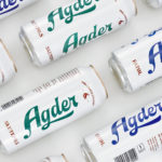
Agder Bryggeri by Frank
Agder Bryggeri is a well-regarded and historical name amongst breweries throughout Norway. It was first established in 1900 but was closed down in 1904 due to operational problems. Recently, the brewery has been resurrected as part of Norsk Bryggerier’s commitment to local beer brands, and is now sold throughout the Agder counties of southern Norway. As part of this resurrection...

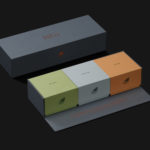
Talor&Jørgen Coffee by Bielke & Yang
Talor&Jørgen is a Norwegian speciality coffee roastery and coffee subscription service that delivers small boxes of freshly roasted beans, sourced from across the globe, to subscribers based on their drinking habits rather than to a schedule. Product naming focuses on bringing to the forefront flavour notes rather than bean provenance, variety and preparation (although this is online and on pack) with the intention of making...
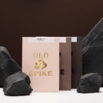
Old Spike Coffee by Commission Studio
Old Spike is a coffee roastery, subscription service and wholesaler, cafe and social enterprise working with the homeless, located in South East London. It is situated on the site of a former workhouse, a place where the poor would break rocks over metal spikes for food and lodgings, and where the roaster gets its name. With a desire to separate the roastery’s commercial...
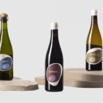
Pepe Raventós Natural Wines by Mucho
Bastard Negre, Xarel·lo and Ancestral are a small batch natural wine collection created, with minimal intervention, by Spanish vintner Pepe Raventós. Although Pepe is in charge of a vineyard that has been in his family’s hands for over 22 generations, and maintains the philosophies of his father and grandfather, this small collection was produced in the garage of his house,...
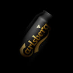
Carlsberg Black Gold by Kontrapunkt
Carlsberg is a Danish beer brand founded in 1847 by J.C. Jacobsen. It is part of the Carlsberg Group portfolio which also includes Tuborg, Kronenbourg and Somersby cider, as well as Carlsberg Export and Carlsberg Black Gold. Carlsberg has a significant heritage. And, like many other beer brands, has largely conveyed this using the visual language and associated legacy of the beer...

Chaos by Socio Design
Inspired by fashion’s current fascination with customisation, technology and a “sense of light-hearted fun”, creative duo and stylists Charlotte Stockdale and Katie Lyall created Chaos, a new UK luxury lifestyle brand producing limited edition and personalised tech and travel accessories. Through form and finish, materiality and graphic design, Chaos products, which include phone cases and charms, zips and luggage tags, express the brand’s take on practicality...
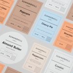
Summerhill Market by Blok
Summerhill Market is a family-run business, managed by the third generation, with premises on Toronto’s Summerhill Avenue and a smaller location—a floral boutique—on Mt. Pleasant Rd. The store has 200 employees, a butchers, bakery and deli, a BBQ in the summer and offers a variety of catering services. Summerhill Market is admired for its high quality products, and its ability—since 1954—to consistently redefine what...

Brewdog’s Lone Wolf by B&B Studio
Lone Wolf—a whisky, gin and vodka range—marks Brewdog’s entry into the craft spirits market. These are produced by Brewdog’s distillery in Scotland, the only one to make base spirit from grain under one roof, a roof specially modified to accommodate a 19m high 60-plate rectification column to get the purest results possible. The range features a brand identity and packaging design created...
Talor&Jørgen Coffee by Bielke & Yang
Talor&Jørgen is a Norwegian speciality coffee roastery and coffee subscription service delivering small boxes of freshly roasted beans, sourced from across the globe, to subscribers based on their drinking habits rather than to a schedule. Product naming focuses on bringing to the forefront flavour notes rather than bean provenance, variety and preparation (although this is online and on pack) with the intention of making speciality coffee...