Talor&Jørgen Coffee by Bielke & Yang
Opinion by Richard Baird Posted 24 August 2017

Talor&Jørgen is a Norwegian speciality coffee roastery and coffee subscription service that delivers small boxes of freshly roasted beans, sourced from across the globe, to subscribers based on their drinking habits rather than to a schedule. Product naming focuses on bringing to the forefront flavour notes rather than bean provenance, variety and preparation (although this is online and on pack) with the intention of making speciality coffee more accessible.
The range changes seasonally. This began with Apricot & Black Tea, Blackcurrant & Sugar Snap Pea and Elderflower & Butter, and continues this season with Lavender & Red Currant sourced from a cooperative in Kapsokisio, Kenya.
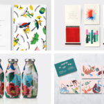
Talor&Jørgen’s packaging design, created by Oslo-based studio Bielke & Yang, expresses the accessible positioning of brand and the freshness of its coffee in the distinctive pairing of small robust structural choice that holds 250g and the tone and content of illustration drawn by Janne Iivonen.

Bielke & Yang’s packaging for Talor&Jørgen is unexpected and distinctive in its strategic rearranging of speciality coffee conventions. Where many rosters focus on origin and preparation, and often articulating this in a somewhat reductive, utilitarian and austere way, Talor&Jørgen draws to the forefront flavour profile, and favours a more convivial and personable brand expression. This is effectively acknowledged in Bielke & Yang’s collaboration with Finnish-born but London-based illustrator Janne Iivonen.


Janne Iivonen characterises his work as fun and optimistic. It often features unique characters in a variety of everyday situations, inspired by the people and life around him. His commercial work blends brand relevance with realism. Here, Janne Iivonen brings together the shared experience of coffee drinking, the partnership that is the foundation of Talor&Jørgen and establishes a celebratory whimsy that also channels something of Belgium’s Hergé. It is a style that works well to bring together the mechanical qualities of coffee roasting and the social element of its consumption, with the proximity of the two, although odd, conveying freshness. The quality of illustration, the specificity of its content and light tone, works well to give a more accessible dimension to a high quality product without confusion. With further ranges comes a sense of brand world building.
Lavender & Red Currant introduces a simpler composition, a quieter moment for sharing coffee. There is a pleasant sense of time and place in the exterior architecture and the view on the reverse into an office setting which suits the new structural design that stands the pack upright, but also in the choice of objects. A camera and Gorillapod, the objects of the office, and the bike again help further the characterisation of Talor&Jørgen.

Flavours, producer or cooperative, country of origin, the varietal, processing method, roast date and customer address appear as a label that bisects the illustration on the back, and neatly finishes as a colour block tied to flavour on the front. The box is a laminated cardboard and contains a recycled plastic bag containing the beans. This will be replaced with a biodegradable plastic bag in the future.
Structural design and illustration are a great pairing, finding a comfortable balance between visual interest and robustness for delivery. This later season sees this replaced by a flat-bottomed design that stands the pack upright. If increasing value was being placed on retail contexts, alongside subscriptions, this makes more sense.
The work is distinctive in both tone and rendering, in the pairing of image and structure. There is a strong sense of brand character without the need for logo, although there is one. The simplicity and utility often associated with subscription coffee, and increasingly, the vernacular of today’s supermarket shelf of restrained modernity and luxury, gives way to detail, character and story that makes the most of the subscription model.
Each new seasonal release was due to feature a new illustrative style from a different illustrator, making way for alternative takes and a visual freshness, yet Janne Iivonen’s style feels well-suited, establishes a continuity yet with room for variety in time and place, and making a connection with subscribers in the dressing of space. More by Bielke & Yang on BP&O.
Design: Bielke & Yang. Illustration: Janne Iivonen. Opinion: Richard Baird.