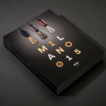
ECC Milano 2015 by Inhouse
ECC is a high quality lighting, furniture and product supplier for both the home and commercial markets. It represents a variety of brands, some of which include Jeremy Coal, Parri and Lumina, and has showrooms throughout Australia and New Zealand. As part of its continued commitment to these brands, ECC attends Salone Internazionale del Mobile di Milano, an annual event that...
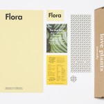
Flora by P.A.R
Flora is a Barcelona based business that looks to provide an alternative to caring for live plants, and describes itself as having an interest in bringing nature indoors in a new way and offering an antidote to the frantic pace, dark rooms and concrete of the city. Flora essentially sell, from their online shop, framed prints of plants shot on a...

John Reynolds’ Blutopia by Inhouse
John Reynolds is a New Zealand based contemporary artist, Arts Foundation Laureate, Sydney Biennale headliner and Walters Prize nominee. John began painting large abstract panels, however, has moved towards creating work with a typographic and structural foundation and has embraced smaller formats which has, amongst others, included postcards and stamps. Blutopia is a full colour reproduction of John Reynolds’ Bluetopia series from 2014...

Life or Death by DIA
Life or Death is a New York and LA based full-service public relations and management business with hip hop roots. It draws its name from the idea that, within the music industry, there is no middle ground, it is either life or death. This abstraction and dual notion manifests itself within the firm’s new brand identity system, designed by DIA, as...

Biber Architects by Spin
Biber Architects is the New York based practice of teacher, author, architect and former Pentagram partner James Biber. Biber is made up of a tightly organized, highly experienced, and efficient team that have been producing design-led work—where others are process-focused or ideologically orientated—for more than 25 years. The practice was conceived as a place to tackle architectural work from a fresh perspective,...

The Washington Post Magazine by Snask
Following an extensive studio search The Washington Post, one of America’s most widely circulated newspapers, commissioned Stockholm based graphic design studio Snask to illustrate The Favorite’s Issue with a fun and tactile idea that would unite, amongst others, topics such as food and drink, music, art and the outdoors. Snask’s concept is informed by the essence and characteristics of each topic, and individually visualised...
Upgrade to
BP&O Plus
Read more
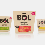
BOL by B&B Studio
BOL is a range of vegetable pots made from fresh natural ingredients using recipes inspired by local chefs and street market stalls from a variety of international destinations, packed and presented with a modern on-the-go convenience in mind. BOL was created by Paul Brown, the former general manager of Innocent’s food division, following the company’s exit from the category, and features...
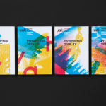
UAL 2016–17 Campaign by Spy
The University of the Arts London is Europe’s largest specialist arts and design university. It is made up of six colleges, each with its own unique character and programme, yet unified in their effort to deliver a high quality creative eduction. This united position is expressed through a visual identity system developed by Pentagram partner Domenic Lippa. Based around a robust, black and white...
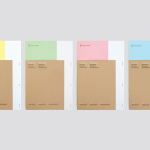
FS Silas Launch Campaign by Believe In
FS Silas is a new sans-serif and slab-serif font family from British type foundry Fontsmith, each available in five weights and an italic. The family is described as having a squareness of rounded forms with dynamically angles terminals and slabs capable of offering contemporary brands the opportunity to employ different voices with one typographic system. Fontsmith worked with graphic design studio Believe In to...
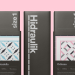
Hidraulik by Huaman
Hidraulik is a Barcelona based business producing rugs for contemporary spaces. These are inspired by cement panels hydraulically pressed, rather than fired, with a layer of coloured pigment. Hydraulic panels originated in the 1850’s and experienced a resurgence in the mid 20th century, these would often feature brightly coloured and detailed patterns, and were popular during an era of personalisation and interior expression....
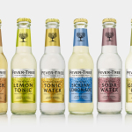
Fever-Tree by B&B Studio
Responding to the continued and widespread use of preservatives, artificial sweeteners and cheap aromatics, Charles Rolls and Tim Warrillow combined their experience of the beverage and luxury food industries to develop a tonic made from natural high quality ingredients. Since its launch in 2005, under the brand Fever-Tree—the colloquial name for the cinchona tree, source of quinine, a key ingredient in tonic—the range has grown year...