Print Finishing
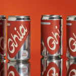
Ghia Non-Alcoholic Aperitif by Perron-Roettinger
In case you’ve missed it, low and no-alcohol drinks are a thing. With over 20% of adults in the UK claiming to be teetotal, abstinence is cool: Brewdog is now Punk AF (that’s ‘alcohol free’), Thomson & Scott’s Noughty is (fairly) nice, and Seedlip is sexy. This sobriety revolution is driven, in part, by the mindfully sceptical Gen Z, turned...
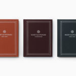
Näsby Slottspark by Bedow
Näsby Slottspark is a residential property development located in Täby, a municipality situated north of Stockholm. The development is built around a 17th-century castle and its gardens, and is made up of three distinct structural groupings, Södra Parken, Norra Parken and Strandängarna. Each of these is characterised by a Scandinavian simplicity, lightness and truth to materials inside and out and...

Strömma Arkipelag by 25ah
Strömma Arkipelag is a new residential property project from Swedish developer Innovation Properties, and located in between the inner city and outer archipelago of Stockholm. Strömma Arkipelag offers a unique intersection of modern living spaces and an unspoilt rural environment, with the two interlinked by large windows and a material commonality. This relationship is also expressed by the development’s graphic identity, designed...

2LG Studio by Two Times Elliott
2LG is an award-winning London-based interior design studio, offering residential and commercial interior design, styling and consultation services, founded by creative duo Jordan Cluroe and Russell Whitehead. The studio’s work is characterised by a use of signature colour, high quality material texture and moments of significant contrast, and emerges from a process rooted in creative partnership and a sensitivity to both...

Kape 24h by Bond
Kari Aihinen is a Finnish chef with a growing international reputation. Aside from creating exclusive pop-up Finnish dinning experiences for New Yorkers, working for Ravintola Savoy and developing one-off Nordic-Asian menus with chef Eric Neo in Singapore, he is also the co-founder and headchef of Helsinki restaurant Roster. Roster is a distinct experience. It features an interior design of custom furniture with a...
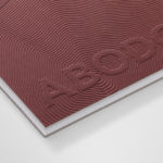
Abodo by Richards Partners
Abodo is a New Zealand-based timber specialist producing high performance and carefully crafted materials for architectural and structural contexts, and has a catalogue of cladding, decking, screening and timber panelling. Abodo worked with Richards Partners to better articulate its brand story, bring clarity to and emphasise the company’s respect for timber; where it comes from, where it is used and by...
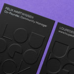
Loupedeck by Bond
Loupedeck is a Finnish startup and photo editing console designed to make the process of image manipulation faster in Adobe Lightroom for both Windows and Mac users. It is described as being an intuitive replacement for keyboard and mouse, is mapped exactly to Lightroom to encourage creative spontaneity and experimentation, and suited to beginners and professionals alike. To help establish and...

Whitlam Place by Studio Hi Ho
Whitlam Place is a collection of eleven residencies located in Fitzroy, Melbourne, developed by Milieu Properties and completed this year. The residencies are described as being ideally positioned within a leafy pocket of the city’s most vibrant cultural precinct, and feature views of the adjacent Whitlam Place gardens, Fitzroy Town Hall and city skyline. the residencies were designed to engage with the historic...
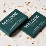
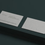
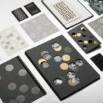
Maldini Studios by Jens Nilsson
Maldini Studios is a Stockholm-based interior design and carpentry studio made up of project manager and carpenter Rasmus Moberg, interior designer Elina Johansson and carpenter Theo Klyvar. The studio’s work often uses precise lines and geometric forms to elevate the irregular detail and texture of natural materials. There are moments of utilitarian and ornamental juxtaposition, times at which this feels subtle and transitional,...
Planned Living Architects by A Friend Of Mine
Planned Living Architects (PLA) is located on Australia’s Mornington Peninsula and has an architectural portfolio that shows a sensitivity and responsiveness to the uniqueness of each site, is environmentally-consciencious, materially mindful, beautiful and functional. The studio is well-regarded, has decades of experience and expertise working within coastal and rural areas, is known for its pared-back style, and has a philosophy that is...

Volcano At Home by Commission
Volcano At Home is an ethically traded coffee range, roasted in small batches by a dedicated team, and sold in 100% compostable Nespresso-compatible pods. The range has been created for the retail, subscription and wholesale markets and is available in three varieties, Bold Morning Shot, Balanced All Day and Reserve Rich And Sweet. Volcano At Home is the latest venture of London-based independent coffee roasters Volcano Coffee Works and...
Jackalope Hotels by Fabio Ongarato Design
Jackalope Hotels is a luxury hospitality experience developed by Melbourne-based Louis Li, a hotelier described as having a penchant for the avant-garde. The first Jackalope Hotel is situated in the heart of the Mornington Peninsula, Victoria, Australia. It is unique in its location, surrounded by the hotel’s vineyard, in its architecture and interior by Carr Design, and in its visual...