Print Production Logos

Printed by Somerset by Leo Burnett
Somerset is described as being Canada’s top printer, known for its precision, attention to detail and ability to pull off complex jobs. Alongside reproduction services, Somerset, a family-run business, also provides extensive print finishing services. Inspired by this, the stacked paper of the press, and with the intention of engaging a new generation of designers, Toronto based studio Leo Burnett developed a new brand identity...
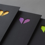
Minke by Atipo
Minke is a Spanish print production studio that favours ‘analogue splendour’ over mass manufacture, providing its clients with a variety of small-scale, mechanical and handcrafted processes and print finishes. Their visual identity, developed by multidisciplinary design studio Atipo, reflects this philosophy and service through a mix of traditional and contemporary detail split across type, colour, material texture, print finish, pattern and die cut...
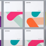
Cerovski by Bunch
Cerovski is a young Croatian print production studio that revels in the challenge of “nebulous finishing, microscopic editions, absurd materials and crazy deadlines”. Bunch worked with Cerovski to develop a new brand identity for the studio—which included a custom logotype and typeface, website, and a variety of printed collateral—that delivers a distinctive contrast of utility and creative flourish, technology and individualised service...
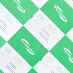
MediaCreator by Lundgren+Lindqvist
Media Creator is a Swedish print production and project management company that utilises a flexible web-based system that pairs a ‘intuitive computerized system’ and translation service, with ‘alert’ and ‘friendly’ staff to streamline their entire print process. Utilising a predominantly two-tone colour palette, san-serif typography and bright contemporary illustrative detail, MediaCreator’s new visual identity, which included a new logo, stationery set and...
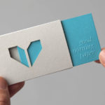
Minke by Atipo
Minke is a Spanish print production studio that favours ‘analogue splendour’ over mass manufacture, providing its clients with a variety of small-scale, mechanical and handcrafted processes. Their visual identity, developed by multidisciplinary design studio Atipo, reflects these services, processes and philosophy through a union of traditional and contemporary detail that exists across type, colour, material texture, print finish, pattern and die cut...