Fonts in Use: Replica
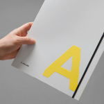
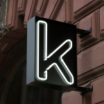
Kristin Jarmund Architects by Snøhetta
Kristin Jarmund Architects is an oslo-based architectural studio with a design philosophy that is focused on using a simplicity of form and a clarity of purpose to address complex problems, while at the same time, allowing for a contextual and human sensitivity. Reduction, as well as the duality inherent to the studio’s work, was the founding principles of their new...
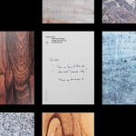
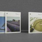
K. Apeland by Bielke&Yang, Norway
K. Apeland is a Norwegian independent civil engineering consultancy that specialises in construction technologies, and applies its experience to new builds, remodelling projects and renovation. It has a favour for steel-wood and concrete structures, which has won the consultancy a number of awards, and has a broad portfolio that covers public infrastructure, private offices and housing, as well as viewing platforms,...
Markus Form by Lundgren+Lindqvist
Markus Form is a contemporary furniture company, founded with the intention of revitalising Sweden’s furniture industry, and with an ambition to produce relevant, practical and easy to match designs that are durable and sustainable. The company’s furniture will also draw on a significant Swedish and Scandinavian design culture and heritage that unites ergonomics, functionality, craftsmanship and a good working knowledge of materials, whilst also...
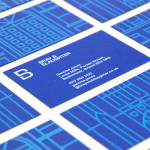
Bray & Slaughter by Mytton Williams
Bray & Slaughter is a UK based regional contractor with over 100 years of experience in the construction industry and an extensive understanding of the education, healthcare, commercial, heritage, conservation and residential sectors. Following industry and company changes, Bray & Slaughter commissioned design studio Mytton Williams to create a new visual identity that would better reflect their growth and move from ‘local builder’ to ‘regional...
Lorient — Aura by Believe In
Aura is a new range of high end products from door sealing system manufacturer and specialist Lorient. These include drop seals, perimeter seals, door bottom seals, threshold plates and ramps designed with a distinctive curved profile that is described by Lorient as creating a sophisticated visual aesthetic that also spreads and diffuses sound. Design studio Believe In recently worked with Lorient to develop a brand identity for...
Kontoret by Werklig
Created by consultant Ray Lindberg with the intention of setting new standards for flexible work environments, Kontoret provides low-cost office space by the hour, with wireless internet, printers and coffee, to freelancers, chief executives, local businesses and international travellers in the centre of Helsinki. Inspired by the “essence and basic needs of office work and the aesthetics of the classic office...
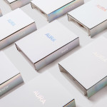
ITI Computers and Diventa by Bunch
ITI Computers is a Croatian-based software company that specialises in the development of IT solutions for the leisure, tourism and hospitality sectors. Bound by a consistent typographic and monogrammatic design solution but divided by an organic and systematic contrast of context, creative agency Bunch developed a new logo and print solution for ITI and its leading management product Diventa, which delivers an interesting richness...