Markus Form by Lundgren+Lindqvist
Opinion by Richard Baird Posted 14 April 2015

Markus Form is a contemporary furniture company, founded with the intention of revitalising Sweden’s furniture industry, and with an ambition to produce relevant, practical and easy to match designs that are durable and sustainable. The company’s furniture will also draw on a significant Swedish and Scandinavian design culture and heritage that unites ergonomics, functionality, craftsmanship and a good working knowledge of materials, whilst also being individualistic. Markus Form describe their philosophy as one that takes on greater challenges than those posed by form and finish, and acknowledges furniture as an architectonic component that has to handle scale and other spatial conditions and addresses everyday needs.
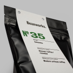
These values are the basis of Markus Form’s brand identity, developed by graphic design studio Lundgren+Lindqvist, and expressed using reductive, geometric, typographic shape and its consistent application, an appropriate use of space, proportion and layout, detail and the absence of detail, print finish and the distinctive and contextual qualities of still life photography. The project included business cards, postcards, tags, labels, folders and website.

Like any good brand identity treatment, Lundgren+Lindqvist’s visual identity leverages contrast, juxtaposition, disparity, the familiar and the unfamiliar to resolve and convey brand values and product quality, and secure an aesthetic distinction. As you might expect, consideration is given to typography, layout, space, colour, visual and material texture, but it is the photography that really sets tone and the communicative agenda.


The images—captured by Kalle Sanner and art directed by Lundgren+Lindqvist—are described as a series of photographic essays, and are a departure from the conventions of contemporary furniture design presentation. Where these can often be sparse and product-centric, here they are interesting, diverse and rich in content, drawing attention away from product and towards context, placing value on universality and functionality, but also using play, humour and a little of the left field to lighten the tone.

Dressing, environment, texture, modernity alongside antiquity, ornament alongside utility, industry and family, clearly convey the themes of timelessness and product integration within a variety of environments, while multi-functionality is made explicit in the acutely disparate nature of each photograph, confidently moving between still life and tableau.
These blur the line between product aesthetic and communicative subtext, effectively play with intuition, are firmly rooted in the contextual, and are bound by the quality of composition and lighting. It is an unfamiliar yet distinctive approach underpinned by some clear ideas despite their eclectic content.


Where the images are unfamiliar in their approach, print holds true to more familiar but equally communicative intentions. From the technicality of the bold sans-serif characters of Replica, robust and uniform in their application, to the current sensibilities of the colour palette, and the Scandinavian simplicity of black ink and white board, grid-based layouts and areas of unprinted space. These address values such as durability and functionality and offer a simpler, more reductive and communicatively direct counterpoint to the photography.

The small flourishes of die cut envelopes with angled windows, a distinctive folder, the natural qualities of worked wood, worn leather and polished stone images, and a black block foil print finish, amongst the practical and in conjunction with photography, layer the print work with a crafted quality, individuality and attention to detail that draws directly from Markus Form’s manifesto. More from Lundgren+Lindqvist on BP&O.
Design: Lundgren+Lindqvist
Photography: Kalle Sanner
Print: Göteborgstryckeriet
Opinion: Richard Baird
Fonts Used: Replica


Lundgren+Lindqvist continue to work with Markus Form into 2017, updating the company’s business cards. In contrast to the oversized type of the previous design these new cards scale information down and crop a list of objects and furniture to give these an endless scrolling quality. Type makes for a pleasant visual texture whilst remaining thoroughly modern in letter shape and the relationship between space and content.