Imperia by Landor
As well as being a coastal city in south west Italy (formed in 1923 by none other than Benito Mussolini), Imperia is a pasta machine company that was formed from a ‘little artisan workshop’ in 1932. Imperia soon began to distribute pasta machines around the world; mainly catering to the US’ large Italian community. From its plant in Sant’Ambrogio, Turin,...

Tessas Eplegård by Olssøn Barbieri
One of the many brilliant things about the world of branding is that to work in it, write about it, or just take an interest in it forces you to learn something about pretty much everything. Maybe that’s how LEGO might actually be a better investment than gold; or that Murray’s Parmigiano Reggiano cheese pairs well with a nice New...
Pomus by Sömestr Studio
Branding a film production company is a delicate business. On the one hand, you need branding that can match and even enhance the quality of the films being produced, but on the other, you need something that doesn’t distract from the work or compete with it. Film is an intrinsically creative visual medium, and building a framework to support it...
PAC NYC by Porto Rocha
There have been some brilliant logo designs inspired by the very buildings they represent. The Centre Pompidou, for instance, bears a powerfully stark logo that’s been largely unchanged since it was first created in the 1970s: six black stripes crossed by two zigzags representing the site’s ‘caterpillar’ escalator, one of the most famous parts of Renzo Piano and Richard Rogers’...
RTS Cambridge Convention by Studio Kiln
The Royal Television Society’s annual two-day event at The University of Cambridge brings together leading television industry bigwigs to ponder the present and future of the small screen. This year, over 350 luminaries descended on Cambridge to contend with such weighty topics as ‘the future of media, the impact of AI, and the role of opinion in news’. Quite a...
LEGO by Interbrand & OLA
As recognisable brands go, LEGO is up there with the Nike swooshes and McGolden Arches of this world. Pretty much anything in that red and yellow lockup with vaguely Stay Puft-esque lettering (naturally there’s a LEGO version of that exact sailor) instantly says ‘LEGO’ – even when what it really says is, unlawfully, ‘Lepin’; or somehow scraping into legality, ‘Xinh’;...

Bimmi by Bedow
When it comes to pre-packaged, semi-liquid meals and snacks, it’s easy to cite the infamous examples that are now stand-ins for whole demographics – I’m talking about SlimFast, the epitome of 90s diet culture; biohacker fuel Soylent; and, more recently, the US-based celeb-backed Daily Harvest, which made headlines due to product recall over food poisoning incidents. But there’s perhaps no...
RSPCA by JKR
It’s often the launch of major charity rebrands that puts the gulf between how the design world views something, and how the rest of the world might, into sharp relief. Countless headlines abound bemoaning the £££millions ‘spent on a new logo’, as if that’s just about all there is to it, and now the children/animals/elderly etc will directly suffer as...
Trulli Ulivi by Here Design
Most people have likely never played the game ‘Italian Food or Italian Celebrity’; but trust me, it’s a pretty fun game – great for car/tube/bus journeys, or whiling away a bit of time after Christmas between gorging on something and watching Eastenders Omnibus. The premise is simple: someone says a name, the others guess if it’s an Italian food, or...

The Gospel by DDMMYY
Not a new project, but one certainly worth revisiting; this work for whisky brand The Gospel scooped a fair few awards back in 2020, and it’s not hard to see why. The design agency behind everything from strategy and naming to brand story, creative direction, packaging design, and more is DDMMYY, based in Auckland, New Zealand. The team was initially...
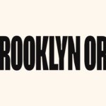
Brooklyn Org by Mother and Mother Design
Mother New York and Mother Design (Fhirst, Brooklyn Org, Peerspace) have overseen the rebirth of Brooklyn Community Foundation as the commandingly named Brooklyn Org. The sea change arose from a desire to distance the organisation from ‘notions of traditional philanthropy, seen largely today as elitist, dysfunctional, and detached’. If that sounds like a solution to a problem that shouldn’t exist...
Frank Penny by Bedow
Frank Penny is a consultancy specialising in AML – anti-money laundering. Knowing next to nothing about financial matters, I had no idea such companies existed. But like pretty much any other business, to succeed and stand out against their competitors, at some point or another anti-AML consultants need to think about their brand identity. Stockholm studio Bedow was recently tasked...