Mercht by Robot Food
Opinion by Richard Baird Posted 27 April 2016

Mercht is a UK based custom merchandise business, created by the team at Awesome Merchandise, that offers its customers a risk-free way to design, sell and ship customised t-shirts and wearable accessories, through an online showcase and print on demand service. It is a platform where, if designs sell well, both parties profit, with neither loosing if they do not.
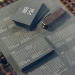
Leeds based graphic design studio Robot Food, the studio behind Awesome Merchandise’s brand identity, developed an identity for Mercht that captures the creative, custom and accessible spirit of the service through a playful and convivial mix of bright colour, hand drawn lettering and pattern, which links a variety of collateral. This included badges, stickers, notebooks and packaging, postcards and branded t-shirts.

Mercht’s brand identity finds a comfortable balance between memorable identity and communicative clarity, drawing a strong and distinctive brand expression from the customised and democratic nature of its business.
Hand drawn logotype, the loose structure of pattern and high-contrast colour palette successfully convey the custom nature of the service and give Mercht a personable, youthful and accessible character where competitors are described as “largely faceless and corporate-looking”.
Accessibility is explored further through empowering democratic and campaign-like language. This is characterised by lots of You, calls to be creative and the freedom to be expressive, and slogans such as “It’s Time” and “Print For The People”. It is a familiar idea, but well-weighted, adding a layer of detail, rather than hanging the whole identity on this.

The logotype is well-drawn with a current favour for the monolinear. It is distinctive and well-balanced with a pleasant flow between letters, some good ligatures, simple flourishes, and a nice forward motion. Similarly weight icons, but with strong geometric foundations, do a good job of linking logotype with the contrasting geometric sans-serif characters of Noyh. The crossed pencils is a touch clichéd but communicative and, much like the copywriting component, is really only one small part of a visual identity rich in detail and intention.


Each element is well-founded and current, and together, distinctive and youthful, with the flexibility to move between the restraint of one colour and a single graphic expression, to a busy mix of multiple colours, patterns and stickers. This flexibility is perhaps most acutely seen online, where busyness of identity in print is dialled down in favour of communicative clarity and functionality, whilst retaining a general sense of continuity. More from Robot Food on BP&O.
Design: Robot Food. Opinion: Richard Baird. Fonts Used: Noyh.