Serif Typography
Dark Arts Coffee by NOT Wieden+Kennedy
If a brand that fuses memes, hot takes, occultism, and coffee is going to succeed anywhere, it’s probably in east London. Dark Arts Coffee started out in 2014 in a Homerton railway arch, and managed to corner that distinct subgenre of goth/metal/biker-ish aesthetics which opts for craft ale over snakebite; Hackney over Camden; self-care over self-destruction. Where the old guard,...
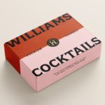
Williams Cocktails by Offff
In the last five years, canned cocktails have become ubiquitous, with offerings from MOTH: (packaging by Pentagram) and Whitebox (cans created in-house) among the strongest designs competing on the shelves of off-licenses, delis and bottle shops. Convenience and a post-pandemic demand for ‘on-the-go’ experiences have helped drive this trend, with Mintel data demonstrating that sales of spirit-based ready-to-drink beverages increased...
Imperia by Landor
As well as being a coastal city in south west Italy (formed in 1923 by none other than Benito Mussolini), Imperia is a pasta machine company that was formed from a ‘little artisan workshop’ in 1932. Imperia soon began to distribute pasta machines around the world; mainly catering to the US’ large Italian community. From its plant in Sant’Ambrogio, Turin,...
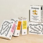
Tessas Eplegård by Olssøn Barbieri
One of the many brilliant things about the world of branding is that to work in it, write about it, or just take an interest in it forces you to learn something about pretty much everything. Maybe that’s how LEGO might actually be a better investment than gold; or that Murray’s Parmigiano Reggiano cheese pairs well with a nice New...
Blue Mountains by For The People
The Blue Mountains of New South Wales, Australia are not technically mountains at all. They are, rather, a complex labyrinth of dissected plateaus, gorges and valleys of sandstone, formed over 50 million years ago. So far, so deceptive. Fortunately, however, the Blue Mountains are most definitely blue. When the atmospheric temperature of the region rises, a superfine mist of fragrant...

Wype by Among Equals
London-based creative agency Among Equals recently worked with ‘below-the-waist wellness company’ Wype on its brand identity and art direction, aiming to help the company build a new brand that would set it up for its next phase of growth. Wype is a gel that was designed to ‘turn any toilet paper into an eco-friendly wet wipe, all at the squeeze...
FitzJohn’s by DutchScot
When my partner and I first moved to London in 2014, surviving on scarcely more than minimum wage, it obviously seemed like a sensible idea to rent in Hampstead. We’d heard of the Heath, and were familiar with the Northern Line. The flat, apparently once a Sex Pistols’ squat, was tiny and hadn’t improved much since the 70s. Back then...
San Francisco Symphony by Collins
Formed in 1911, while San Francisco was rapidly rebuilding after the devastating earthquake of 1906, the San Francisco Symphony (SFS) has been serving audiences in the Bay Area and beyond for 111 years. In 2018, Esa-Pekka Salonen – a Finnish conductor and composer – was announced as the incoming musical director, with his tenure to start during the fall season...
Panettoni Pavolucci by Requena Office
Panettone has origins as far back as ancient Rome, but its connection to Christmas was first established in the eighteenth century. This sweet bread – originally from Milan – has earned its place across the globe as a staple of the festive season. However, earlier this summer, Barcelona-based twins Chiara and Francesca Pavolucci opened a bakery to bring panettone to...
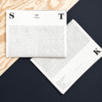
STK Magazine by Moodley
Steirische Terrior und Klassikweingüter (STK) is a free association of ten wineries that have committed themselves to a region-specific wine culture and outstanding quality. The STK seal is a protected trademark and guarantee of quality for wines produced in the Southern and South-Eastern region of Styria, Austria. STK was founded more than 30 years ago by a group of winegrowers who believed...
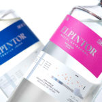
El Pintor by Anagrama
El Pintor is a high-quality tequila and mezcal brand said to have been handcrafted by the world’s second certified maestro tequilero. El Pinto’s approach intends to create perfectly equilibrated spirits through the intersection of science and artistry. This artistry forms the basis of El Pinto’s graphic identity and packaging design developed by Anagrama. This is characterised by colour blocking, tapered bottle, distinctive screw...
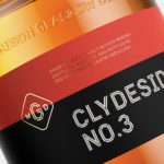
The Clydeside Distillery by Manual
The Clydeside Distillery was set up in 2014 with the intention of reviving distilling in Glasgow and telling the story of Scottish Whisky through a visitor’s centre. The distillery was set up by the Morrison’s, a family with a century-long history within the Scottish Whisky industry as both owners and operators. San Francisco based Manual travelled to Glasgow to work closely with founders, architects...