Wype by Among Equals
Opinion by Emily Gosling Posted 4 May 2023
London-based creative agency Among Equals recently worked with ‘below-the-waist wellness company’ Wype on its brand identity and art direction, aiming to help the company build a new brand that would set it up for its next phase of growth.
Wype is a gel that was designed to ‘turn any toilet paper into an eco-friendly wet wipe, all at the squeeze of a button’. Big on eco-credentials, the brand promises a natural formula that doesn’t break down toilet tissue; with botanical, natural ingredients such as aloe vera and chamomile and an organic, all vegan product.
The initial design brief also focused on the fact that Wype wanted to bust taboos and help people talk about things usually kept private, but in a way that’s humorous, a bit sassy, and playful.
Emily Jeffrey-Barrett, founder of Among Equals, says that when the agency came on board in 2022, ‘the whole thing started with a simple product insight’. She continues, ‘Obviously the product is designed to keep people clean, but by helping to reduce wet wipes it’s keeping the planet clean too.’
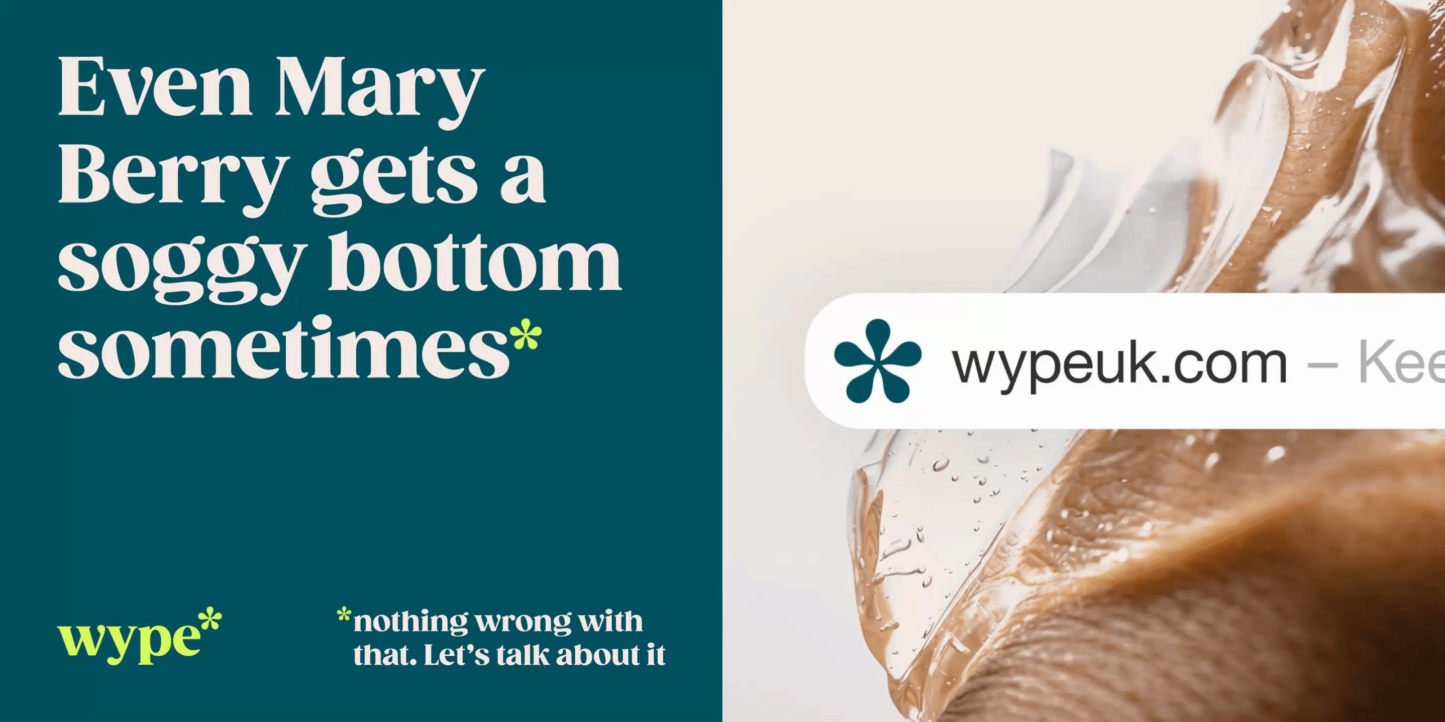
That nice parallel between Wype’s product and its intention proved to be the perfect brand idea: Keep it Clean. From there, Among Equals developed what it calls the ‘core distinctive asset’ for Wype, cheekily dubbed the ‘ass-terisk’.
‘Distinctive Assets are central to how we develop all brands,’ says Jeffrey-Barrett. ‘There’s not much “science” to go on in the creative industry, but DAs are one of the few proven factors that contribute to the effectiveness of a brand – keep repeating them and you build mental availability.’
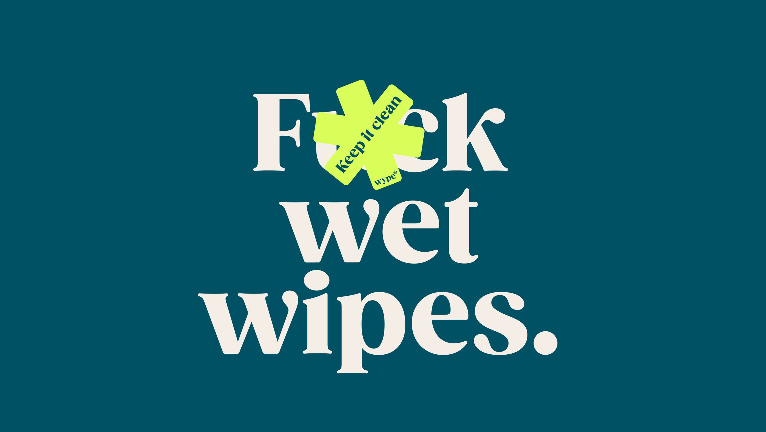
The ass-terisk forms a symbol that works on many levels. The Wype brand copy is cheeky and playful, and by reappropriating the mark often used to ‘censor’ certain letters in swear words it meant that Wype could both say things it wouldn’t have otherwise been able to; while also reinforcing the distinctive brand device. Slogans, for instance, include ‘Shoreditch is full of a**holes’ on a billboard; and ‘Boris is a ****-end.’ Longer poster copy takes an equally irreverent, wry tone: ‘The state of the world can be total c**p. And a total S***show but our down theres don’t need to be.’
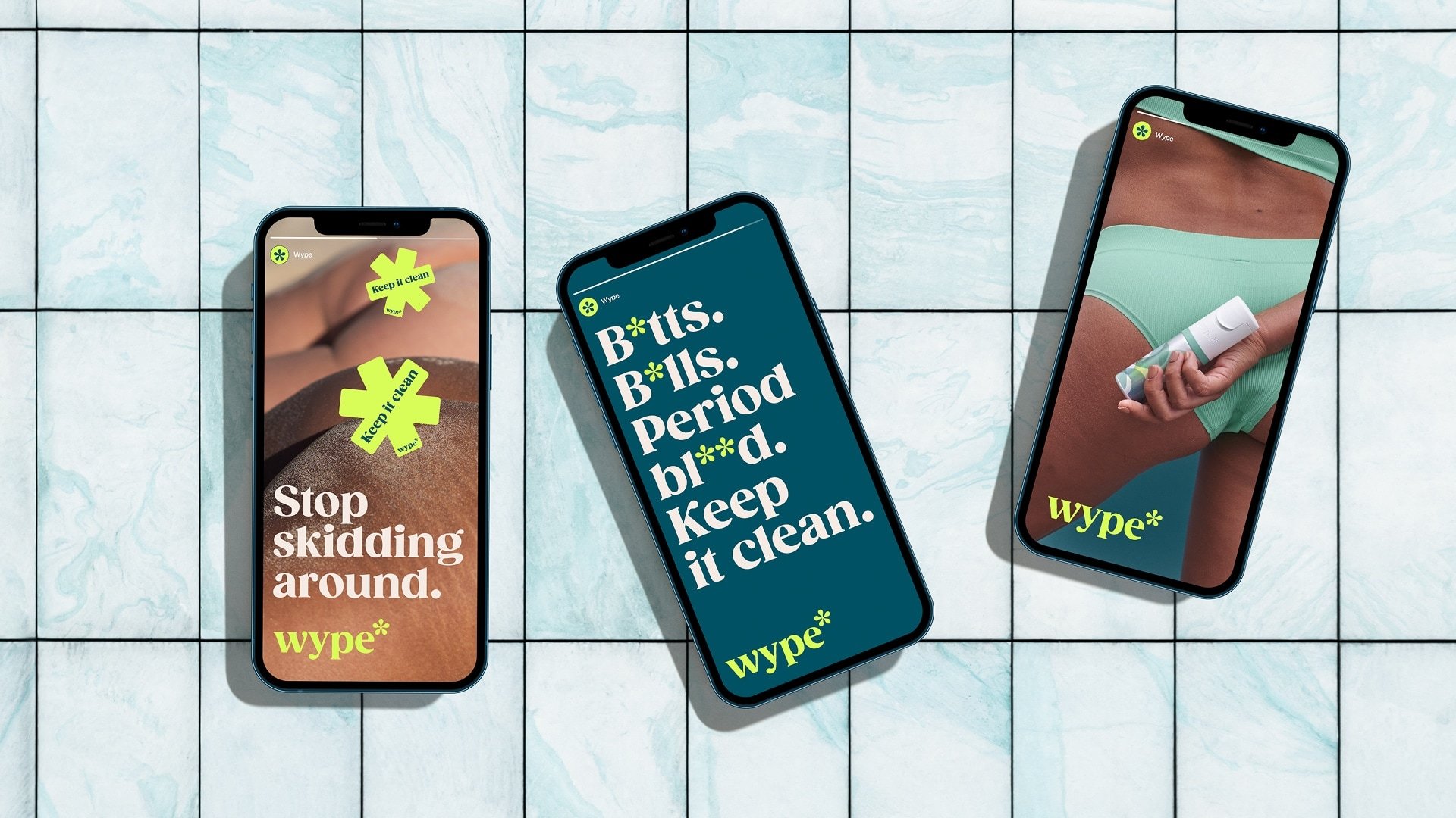
Other copy uses the asterisk to play with the idea of censorship itself; excluding letters from words that aren’t necessarily swear words, but which don’t exactly have ‘fun’ connotations while leaving those that people shouldn’t be as squeamish about intact: ‘B*tts. B*lls. Period bl**d. Keep it clean.’
The ass-terisk takes on a similar role with image-led brand assets, keeping imagery clean by covering up NSFW images in the right places, and once again, driving home the own able Wype branding with a simple, memorable and enormously flexible device.
‘It had two helpful associations,’ says Jeffrey-Barrett of the ass-terisk. ‘On one hand, it looked floral (clean, safe, hygienic); on the other, it looked a bit like the area it helps keep clean (iykyk).’ We’re assuming she’s referencing the literal a**-hole here. ‘This hard-working symbol runs through the entire brand – forming the basis of everything from typography to packaging and keeps copy and imagery clean along the way,’ she adds.
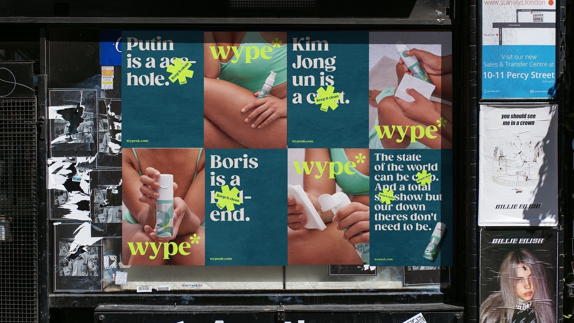
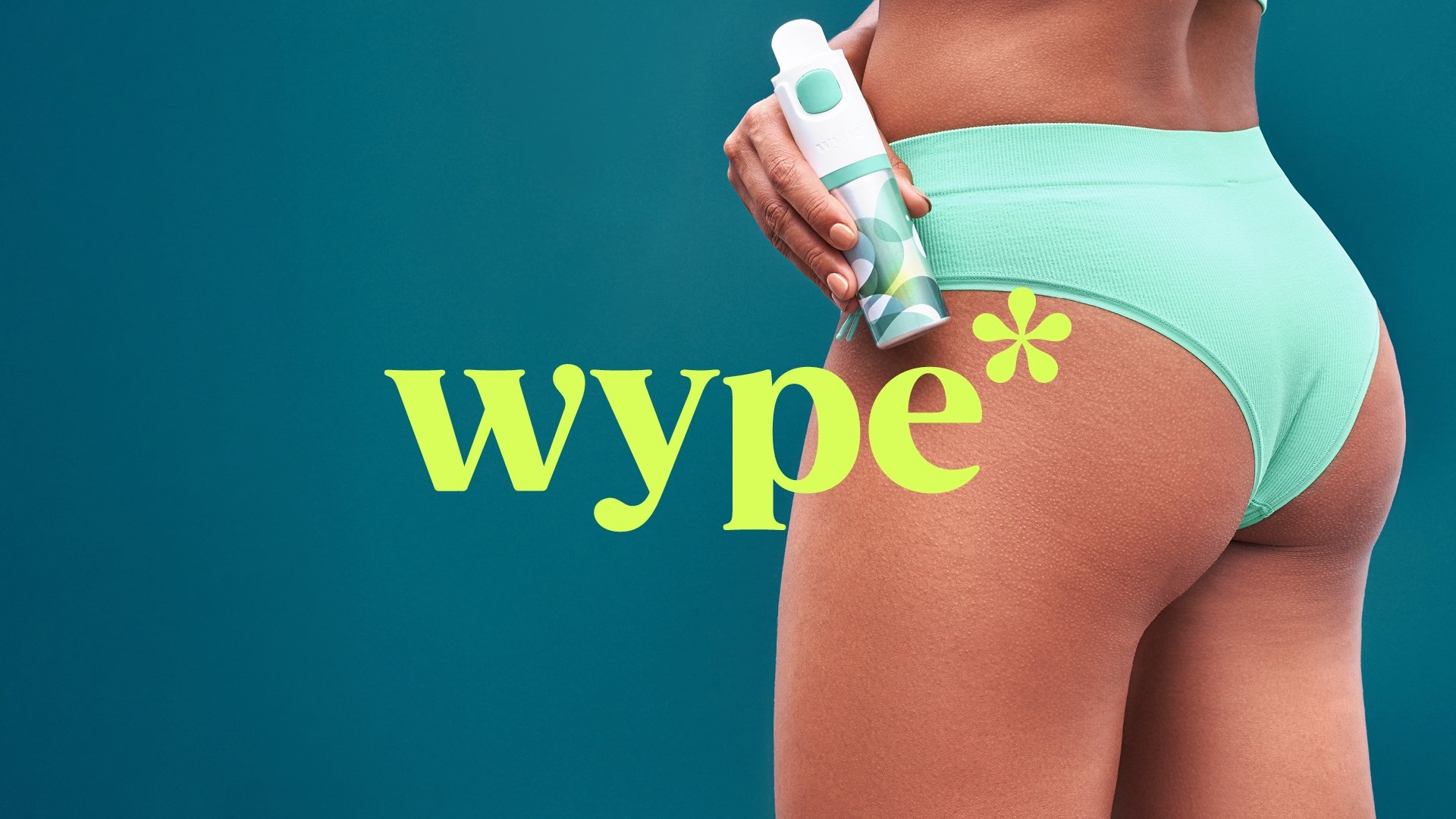
The branding is largely built around an all-lower-case logotype that uses the Monotype font Gazpacho, described as a ‘modern, juicy, friendly serif’ which was chosen for its curves, mirroring the rounded forms of the ass-terisk itself. A secondary font by Pennsylvania-based font foundry [Type Type]) TT Commons – a modern, geometric sans serif – is used to support Gazpacho thanks to its clean, versatile workhorse qualities.
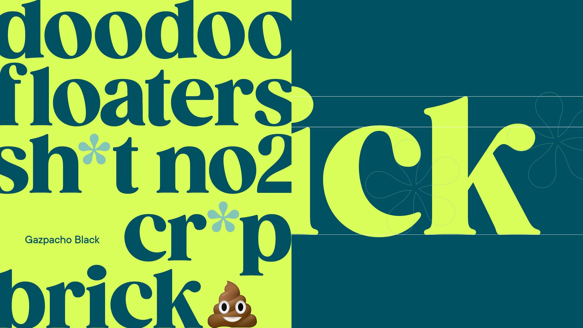
The Wype colour palette is fairly minimal, based around various shades of green (the logotype uses a tone dubbed ’Wype teal’) and white, with accents of blue and pale pink in places. This is used across the packaging, website, product, posters and other touchpoints. Brighton-based photographer Veega Tankun shot the campaign photography under Among Equals’ art direction.
‘The potential audience for the product is, well, everyone, so we needed a brand with huge flex,’ says the studio. ‘We struck a balance by creating an aesthetic that felt safe, clean and grown up, then creating a tone of voice that was always a bit cheeky, sometimes outrageous.’
That cheek and outrageousness is dialed up and down depending on the branding’s application; audiences; and occasion. Wype mostly works as a DTC subscription model (though the products can also be purchased as individual, one-off items); and so for the packaging and website Among Equals deliberately kept things ‘safe with an occasional bit of tongue-in-cheekiness’.
However the brand has also advertised heavily at specific events such as Glastonbury Festival, and for these, the branding and campaign materials could be hyper specific, referencing things like the festival’s infamous longdrop toilets. ‘Where we could, such as with events and on social, we went to town,’ says Jeffrey-Barrett.
Whatever surprise wait await below the belt, has met a daring dose of creativity, boldly disrupting the bathroom scene by embracing humour. So, whether you’re tackling the daily grind or dancing in the fields of Glastonbury, Wype is here to keep it clean, one ass-terisk at a time.
Fonts used: Gazpacho & TT Commons
