Designed in Singapore
Project Send by Foreign Policy
Since their advent, kinetic and variable type have become a familiar part of the lexicon of brand design. It’s little surprise really: they offer a way to make an identity consistent yet dynamic; uniform but multifarious; endlessly flexible with countless opportunities to modify mood, tone, and messaging. But few projects seem to use kinetic type as a way to visually...
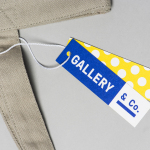
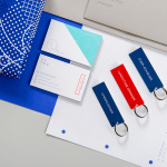
Gallery & Co. by Foreign Policy
& Co. links museum shop, a food and drink retailer and cafe housed within the National Gallery Singapore. These share a brand identity designed by Singapore-based graphic design studio Foreign Policy, built around the basic foundations of modern art and design; primary colour, geometric form and repetition, and Grilli Type’s GT Pressura. This runs across and unites a variety of printed materials that includes, but is...
Park Bench Deli by Foreign Policy
Park Bench Deli is located on Singapore’s Telok Ayer St and features a rich interior design, styled on the all-American deli, that mixes a variety of vintage textures and ornament. These include tiled floors and wood panelled walls alongside personal items of the shop owners. Visual identity shares a similarly busy and material quality, referencing park life, but introduces the multi-coloured. This connects menus, packaging, and...
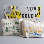
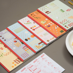
EAT by Fable
EAT is the second installation of a two-year long series of exhibitions that draw on the gastronomic memories of residents from Jurong, Singapore. Graphic design studio Fable worked to create the visual identity for EAT which included a variety of printed collateral. These appear to take their cues from menus and street food packaging, a contemporary gallery aesthetic and juxtaposes these...
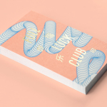
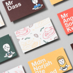
Full of Luck Club 福乐 by Bravo
Full of Luck Club 福乐 and Bao Bar is a combined Cantonese restaurant and takeaway, located in Holland Village, Singapore, serving authentic Chinese comfort food. The restaurant was created by the team behind Li Bai Cantonese Restaurant at Sheraton Towers Singapore, and has a menu that combines timeless plates such as roast meats, fresh noodles and dim sum with more contemporary items such as Chinese-inspired...
The Working Capitol by Foreign Policy
The Working Capitol is a co-working space located within a historic building situated in Singapore’s Chinatown. It is described as being less of a start-up incubator and more of a community of knowledgeable people working at the intersection creativity, technology and business. Its brand identity, designed by Foreign Policy, is based around the Euclidean Principle, a mathematical system of basic parts that...
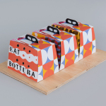
Bottura by Foreign Policy
Bottura is an Italian restaurant and food store with space in Singapore’s Suntec City Mall. It has a contemporary interior of exposed utilities painted black, white suspended ceiling and surfaces, dark wood and steel furniture, glass, concrete and steel counters, warm spot and low-hanging lights and an open kitchen working from authentic family recipes rooted in the owner’s hometown of Bologna. This interior is punctuated...
EDL Laminates by Bravo
Working with manufacturers in Italy, Korea and Taiwan EDL provides high pressure laminates for architects and interior designers throughout Asia, and is dedicated to anticipating trends, adopting the latest technologies and introducing its own break-through innovations that amome from a decade of industry experience. To coincide with EDL’s tenth anniversary, and a push further into the international market, the company worked with Singapore and New York...
Marco Marco by Acre
Marco Marco is an Italian restaurant business with five locations across the city-state of Singapore and an affordable menu made up of international interpretations of classic dishes. These are created from simple recipes inspired by modern food culture using fresh locally sourced ingredients. The name, a reference to the adventures of merchant traveller Marco Polo, was chosen to reflect the international meeting...
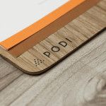
Podi by Bravo
Podi is a Singapore-based organic restaurant that ‘celebrates bold, robust and unique flavours’ and the responsible sourcing and cooking of ingredients. Drawing inspiration from the restaurant’s name, a Hindi word to describe a mixture of ground dry spices and herbs, design agency Bravo developed a visual identity that pairs a small, abstract interpretation of heaped spices with a bold logo-type, earthy tones and...

Multicourse by Bravo
Multicourse is a provider of F&B service training for catering staff developed by industry experts and operates across Singapore. Their identity, developed by independent design agency Bravo (also based in Singapore) translates the brand’s high quality service proposition and accessibility in a neat logo-type solution and a playfully contrasting, folded napkin logo-mark and collateral....