Spot Colours

Unto by Studio Bergini
Five years ago, the discerning and culinary-minded were content with their everyday Waitrose Essential Extra Virgin Olive Oil. But now – as with wine – there is increasing awareness that the taste of oil is individual, depending on olive variety, soil type, climate, cultivation method, and a host of other factors. From The River Café’s hotly anticipated annual pressing to...
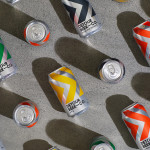
Detour Beer Co. by Weave
Craft beer has become a hugely competitive market to enter. It seems a rather obvious thing to write, but it’s quite something to have been part of the generation that saw its rise. It’s also provided a lot of great imagery for design blogs, and moved freely between both brand building and just plain visual delight. To see large fridges within...
Everybird by Marx Design
Few products have successfully integrated ethical, sustainable and environmental concerns with a product than coffee. It’s hard to imagine a time when the conditions of cultivation (both human and environmental) were not equal to flavour and – if we’re getting technical – whether the roast is blended or single origin. With its smaller volumes, the speciality coffee market has challenged...
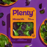
Plenty by &Walsh
Agricultural practices are constantly changing to provide greater crop yields. In an effort to achieve this goal, modern farming has created a host of ecological side effects. Most notably, overconsumption of water and a reliance on chemical fertilisers, GMOs and pesticides. Plenty is an indoor vertical farm providing green produce to the masses through sustainable practices, using less space and...

Marc Jacobs by Triboro
Fashion designer Marc Jacobs heads his own eponymous fashion brand, as well as diffusion lines The Marc Jacobs and Heaven by Marc Jacobs. He was also creative director at Louis Vuitton from 1997 to 2014, where he created the company’s first ready-to-wear clothing line. In his own words, Jacobs’ work is ‘a little preppy, a little grungy, a little couture’, and this...
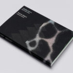
Leandro Erlich: Both Sides Now Catalogue by Studio fnt
Both Sides Now was an exhibition of works by Argentinian contemporary artist Leandro Erlich. This took place at the Seoul Museum of Art between December 2019 and March 2020. Erlich’s installations employ mirrors, reflective surfaces, water and other materials to form optical illusions with the intention of transforming familiar, everyday spaces. Studio fnt worked to develop an identity for the exhibition that would...
Mitka by Madcats Agency
The spray paint packaging on shelves in Ukraine is usually sad, and often amusing: ‘sad because someone made it… amusing because someone put it into production,’ Kyiv’s Madcats Agency admits. There’s a riot of colour, a sea of tasteless typography and a catalogue of dreadful names (Auto Email, Body 999 and Rector are among the competition). Mitka is different. The...
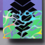
Leandro Erlich: Both Sides Now by Studio fnt
Both Sides Now, a title borrowed from Joni Mitchell’s famous song, is a solo exhibition of Argentinian contemporary artist Leandro Erlich’s work that took place at the Seoul Museum of Art between December 2019 and March 2020. Erlich’s installations, often receiving international acclaim, mirrors, reflective surfaces, water and other various materials to create optical illusions to transform familiar, everyday spaces such as...
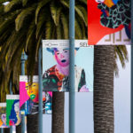
Self, Made by Collins
Exploratorium is a “public learning laboratory” and San Francisco based museum that enables visitors to question and make sense of the world around them through hands-on exhibits that touch upon science, art and human perception. Its summer 2019 exhibition, Self, Made, continues in the spirit of exploration but turns this inward, tackling the theme of human identity. It did this...
Ascari by Blok Design
Ascari is an Italian restaurant which two locations, one on Queens Street East and another newly opened establishment on King St West. Toronto, Canada. It is named after the proprietor’s hero, Formula 1 legend, Alberto Ascari, (who was also known for his love of food). To reflect both the passion for good simple food and racing, design studio Blok developed an identity that brings together...
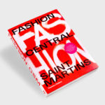
Fashion Central Saint Martins by Praline
Fashion Central Saint Martins documents and celebrates what has become one of the most influential fashion courses in the world. It is a collaboration between publisher Thames & Hudson and Central Saint Martins, and co-authored by Programme Director of Fashion Hywel Davies and Cally Blackman, lecturer in Fashion History and Theory. The Central Saint Martins Fashion Course has a legacy...

René Redzepi, A Work in Progress: A Journal by Pentagram
Pentagram partner Astrid Stavro and project team Jake Gilbert and Susanna Foppoli have recently completed work on A Work in Progress: A Journal, a book from the acclaimed Danish chef René Redzepi, published by Phaidon. Through Noma, a two-Michelin star restaurant that reimagined Nordic cuisine, René Redzepi has built a formidable reputation for innovation and inventiveness. His viewpoint and approach...