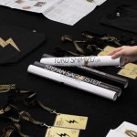
Stencil Cut Logotypes
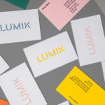
Lumik by Hey
Lumik is a Spanish lighting design and manufacture company, and partnership between the traditional metalworking company of Francesc and Ferran Martí, and interior designer and art director Frank Domínguez. Together they have 65 years of experience, and have built a catalogue of products with simple forms, moments of colour, elements of play and the industrial. These move between those that are...
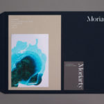
Moriarty by Bond
Inspired by the spontaneity and celebratory energy of parties and exploring the idea that curating great events is an art form, design studio Bond crafted a visual identity for new luxury event planning business Moriarty based around a series of abstract ink illustrations. These are paired with high quality dyed papers and boards, bringing a measured and distinctive contrast to printed...

Raw Wine by The Counter Press
Raw Wine is an international two-day wine fair that takes place in the cities of LA, London, Berlin and New York. It was founded by Deborah Lambert and Isabelle Legeron MW, France’s only female master of wine, and provides an opportunity for growers, makers and buyers to get together. Raw Wine is also a celebration of the best organic, biodynamic and...
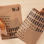
H+J by Spy
H+J is a UK independent catering business, established in 2004, that has provided food and catering solutions to venues such as The Cutty Sark, Moët & Chandon, Abbey Road, RIBA and Selfridges. Their services include working lunches and private dining rooms, large scale food courts, cafes and deli bars. London-based graphic design studio Spy worked with H+J to develop a new brand identity that would...
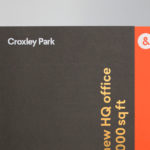
Croxley Park by Blast
Croxley Park is a business park located two miles from the town of Watford, United Kingdom, with good local public transport links and twelve minutes from the M25, an arterial route that encircles Greater London. Although strategically placed to make the most of these networks, Croxely Park also has a unique 25 acre parkland setting. Currently, this is home to both multi-national companies and...

Heritage: A User’s Manual by Bond
Heritage: A User’s Manual was an exhibition at Southbank Centre’s Archive Studio—a temporary space located within the foyer of the Royal Festival Hall—that took place between the 24th November – 13th December 2016. The exhibition was curated by MA Culture, Criticism and Curation students from London art school Central Saint Martins and “was founded on the belief that the heritage of a building is...

Printed by Somerset by Leo Burnett
Somerset is described as being Canada’s top printer, known for its precision, attention to detail and ability to pull off complex jobs. Alongside reproduction services, Somerset, a family-run business, also provides extensive print finishing services. Inspired by this, the stacked paper of the press, and with the intention of engaging a new generation of designers, Toronto based studio Leo Burnett developed a new brand identity...
Latin American Design Festival ’16 by IS Creative Studio
The Latin American Design Festival is an organisation that promotes Latin American Design internationally and looks to highlight the social potential of design using lectures, workshops, exhibitions and complementary activities. This year’s festival, as with previous events, took place in the Peruvian city of Lima, with guest speaks that included Stefan Sagmeister, Yuko Shimizu and Stockholm Design Lab. IS Creative Studio, who worked on LADFest’s 2015 visual identity, continue to...
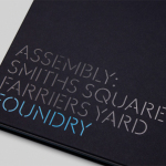
Assembly by Blast
Assembly is a new 250,000 sq ft. development project managed by Axa Real Estate, located in London’s Hammersmith, and comprised of 4 office buildings, 3 public squares, bars, restaurants and estate wide amenities. As a business hub the development is strategically positioned between Central London and Heathrow, with easy access to the Underground, road and river networks. Working with Axa Real Estate, Bell...
Teabox by Pentagram
Teabox is an e-commerce tea business, established in 2012 and located at the heart of India’s tea-growing regions, that looks to revolutionise the experience of buying and enjoying one of the oldest drinks in history by bringing it directly to consumers. It is based on the popular monthly subscription model, and uses data science to match teas to subscriber’s personal tastes. Teabox worked with Pentagram partner...
Bord 13 by Snask
Bord 13 is a restaurant, located on Malmö’s Engelbrektsgatan, with a menu that steers clear of the overfished, the modified and unnatural. It is a collaboration between chefs Robert Jacobson and Besnik Gashi, a former Souschef and a Head Sommelier from world-renowned Noma, and features a brand identity and interior design by Scandinavian studio Snask. This extended to material, lighting and furniture...
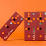
Fedrigoni Sirio Color by Design Project
Leeds based studio Design Project were commissioned by Fedrigoni, one of Europe’s leading paper manufacturers, to develop a material sample solution that would help them to promote their flagship paper brand ‘Sirio Color’ within the UK market. With the intention of allowing customers to experience the tactile characteristics and diverse colour palette of the range first-hand, Design Project developed a flat-pack...