Blå Bär by BVD
Blå Bär (Swedish for blueberries) sells a variety miscellaneous goods from Scandinavia from its store in Osaka, Japan. These include, but are not limited to, glass and kitchenware, soft furnishings, ornaments and jewellery. Many of these could be described as having something of a shared Scandinavian simplicity of form, lightness of colour, natural material quality and cheerful character in pattern...

Pontus In The Air by Bold
Pontus In The Air is located at Sweden’s Arlanda Airport and was developed with the intention of being Europe’s leading airport restaurant in its blend of high quality, affordable prices and fast service. It features three distinct areas, The Brasserie, a classic bistro with table service inspired by the golden days of aviation, The Market, a self-service canteen with a more utilitarian finish, and...
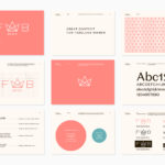
Fab Media by Bedow
Fab Media is one of Sweden’s leading media companies. It produces inspiring and entertaining content aimed at young women, and owns a variety of multi-media brands made up of websites, social media platforms and magazines. Fab Media’s specialisation, engaging exclusively women and the creation of modern cross-platform brand experiences, is expressed by their new visual identity, created by Stockholm-based graphic...
Konserthuset Stockholm by Kurppa Hosk
Konserthuset Stockholm is home to the internationally recognised Royal Stockholm Philharmonic Orchestra, and is described as one of Sweden’s most famous and important cultural institutions. Graphic design studio Kurppa Hosk worked with the institution to create a brand identity that would integrate the corporate aspect of venue, one of iconic status and significant cultural legacy, with the passion and dynamism of the...

Caldo Coffee by 25ah
Caldo Coffee is a café serving organic coffee and fresh salads, sandwiches and pastries from its location in the Scandic Continental, a hotel in the centre of Stockholm. It features a distinctive and modern interior design of light wood, tall shelves and a long wood panelled and marble topped counter. It also includes a large custom-built menu board, neon signage and a...
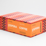
Víspera Coffee by Stockholm Design Lab
Víspera is premium coffee brand that intends to bring together the best of two worlds, a blend of 100% Arabica coffee beans sourced from the high altitude plantations of Colombia and a Swedish eye for quality and craftsmanship in its roasting. This meeting is visually articulated through type contrast, colour and pattern across Víspera’s packaging, developed by Stockholm Design Lab....
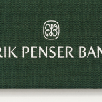
Erik Penser Bank Cookbook by Bedow
Erik Penser Bank provides its clients with independent financial advice and a high-level of personal service. While large banks do provide similar services, Erik Penser Bank is Sweden’s only dedicated private banking business. Professionalism, experience and an individualised service practice is expressed throughout the bank’s visual identity, created by Swedish studio Bedow, in the personable and less corporate association and aesthetic qualities of a new monogram. This then informs some...
Tangent GC Soap by Carl Nas Associates
Tangent GC is a Scandinavian organic garment and shoe care company developing products that intend to ensure longevity. The company’s brand identity, a simple utilitarian typographical expression, designed by Essen International, delivered a sense of informational immediacy through the absence of superfluous stylistic detail and colour, dividing content in the arrangement, orientation and typesetting of Akkurat Mono. Venturing into organic personal skincare, Tangent GC worked with...
Terri Timely by Bedow
Terri Timely is a Californian directing duo creating short films, music videos and commercials. Although they collaborate with a variety of clients; these include Mitsubishi, Amazon and Comcast, much of the duo’s work share a quirky and humorous visual style. This is expressed by their new brand identity, developed by Swedish graphic design studio Bedow, through a simple but playful visual style and animation...
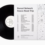
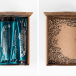
Boreal Network, Itasca Road Trip by Bedow
Nicole Johnson is a Seattle-based Minnesotan creating what Miles Bowe of Fact Magazine describes as “sun-drenched, foggily nostalgic electronica” under the name Boreal Network. Itasca Road Trip is a limited edition vinyl rerelease and trimmed down version of an earlier album by Boreal Network, distributed by More Than Human Records and featuring artwork by Swedish graphic design studio Bedow. Where the album takes an aural tour...
Erik Penser Bank by Bedow
Erik Penser Bank provides its clients with independent financial advice and a high-level of personal service. While large banks do provide similar services, Erik Penser Bank is Sweden’s only dedicated private banking business. Professionalism, experience and an individualised service practice are expressed by the bank’s new brand identity, created by Stockholm-based graphic design studio Bedow, through the personable and less corporate qualities of a monogram, which...
Biggans Böcklingpastej by Bedow
Böcklingpastej is a smoked herring fish paste from Biggans, a small family owned company creating products for the Swedish market since 1952. The company recently worked with Stockholm-based graphic design studio Bedow, who had previously helped them with the packaging for their range of sauces, to develop product packaging and POS for Böcklingpastej. This replaces a heavily branded logo-centric design with one of...