Posted: | Author: Richard Baird | Filed under: Cafes, Bars and Restaurants, Logo Reviews | Tags: Brand Identity, Brand Identity Reviews, Branding & Packaging of 2017, Branding Blog, Branding Reviews, Custom Typefaces & Logotypes, Custom Typography, Design For Print, Design News, Design Opinion, Design Reviews, From Australia, Graphic Design, Graphic Design Blog, Lettering, Logo Design & Branding Blog, Logo Design Inspiration, Logo Design Resource, Logo Designs, Logo Opinion, Logotypes, Restaurant & Cafe Menu Designs, Restaurant Logos, Sans-serif Typography, Swear Words, The Very Best Brand Identities of 2017, The Very Best of 2017, The Very Best of BP&O, Typography | Opinion by Richard Baird.
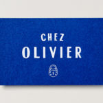
Chez Olivier is an authentic French bistro located in the centre of Greville St village, Melbourne, that intends to share its passion for French food, wine and culture with the community. It features an intimate European-style interior design of stained woods, classic furniture, photography and period advertising. It also has a unique bar of padlocks, inspired by Pont des Arts, engraved with messages of love from couples who visit the bistro, and a distinctive brand identity by Swear Words Through colour, type and image this works together a bunch of European references, expresses something of a playful and personable character and draws on the bistro’s padlock feature and its romantic associations. The projected included logo, menus, vouchers and business cards.
Continue reading this article
Posted: | Author: Richard Baird | Filed under: Cafes, Bars and Restaurants, Fonts in Use, Graphic Design Reviews, Logo Reviews | Tags: Blind Emboss, Brand Identity, Brand Identity Reviews, Branding, Branding Agency, Branding Blog, Branding Reviews, Coloured Paper, Design For Print, Design News, Design Opinion, Design Reviews, Designed in Melbourne, From Australia, Graphic Design, Graphic Design Blog, Logo Design & Branding Blog, Logo Design Inspiration, Logo Design Resource, Logo Designs, Logo Opinion, Logotypes, Minimal Design, Minimal Logos, Minimalist Brand Identities, Monospaced Typography, Restaurant & Cafe Menu Designs, Restaurant Logos, Swear Words, The Best Brand Identities of 2016, The Best Graphic Design Work of 2016, The Best Logo Designs of 2016, Type Foundry: Milieu Grotesque, Typography, Uncoated Papers & Cards, White Block Foil | Opinion by Richard Baird.
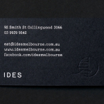
IDES began as a monthly pop-up restaurant with an inventive approach to cuisine, created by former Attica sous chef Peter Gunn. A year into the business, and to coincide with the development of a permanent space in the Melbourne suburb of Fitzroy, Peter Gunn worked with graphic design studio Swear Words to develop a new visual identity that would more effectively express the level of quality and service at IDES. Swear Words’ work manages to capture a sense of the immediacy of ideas and the quality of the final dishes through a juxtaposition of typographical utility, materiality, form and image across business cards and menus.
Continue reading this article
Posted: | Author: Richard Baird | Filed under: Art and Design, Logo Reviews | Tags: Brand Identity, Brand Identity Reviews, Branding, Copper Block Foil, Design News, Design Opinion, Design Reviews, Foil Blocking, From Australia, Graphic Design, Handcraft, Letterpress, Logo Design & Branding Blog, Logo Designs, Logo Opinion, Logos, Logotypes, Sans-serif Logotypes, Swear Words, The Best Brand Identities of 2013, The Best Logo Designs of 2013, Typography, Unbleached Materials |
Established by Catherine Blackford in 2012, Bindle is an Australian mail-order, gift-box service that bundles handmade artisanal food, drink, home and kitchenware products for occasions and individuals under labels such as ‘A Bit On The Side’, ‘Breakfast In Bed’ and ‘For The Hostess’.
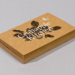
Drawing on the name bindle, a folded canvas sheet carried as a small sack over the shoulder with a stick, the service’s identity, developed by Swear Words, utilises a printed textile pattern across the tactile, earthy textures of an uncoated, unbleached material choice and a string tied detail across the boxes alongside the high quality of a copper foil treatment to, like their work for Crabapple Kitchen, provide a contemporary finish to traditional, communicative craft cues but infused with the underlying theme of travel that conveys the delivered nature of the service.
Continue reading this article