Chez Olivier by Swear Words
Opinion by Richard Baird Posted 13 January 2017

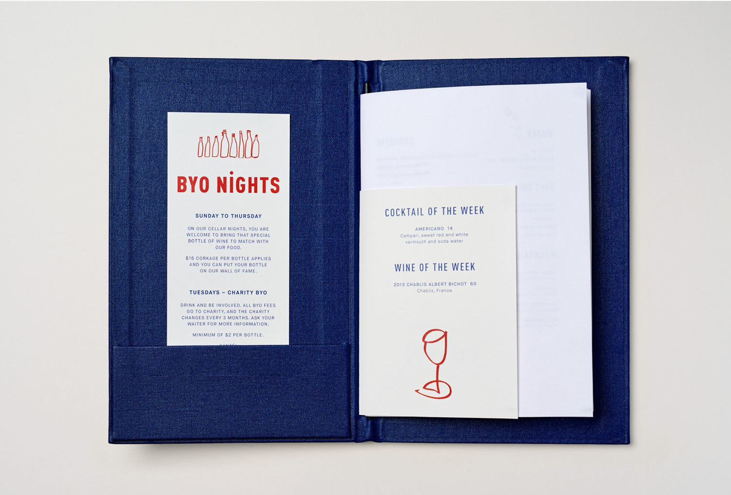
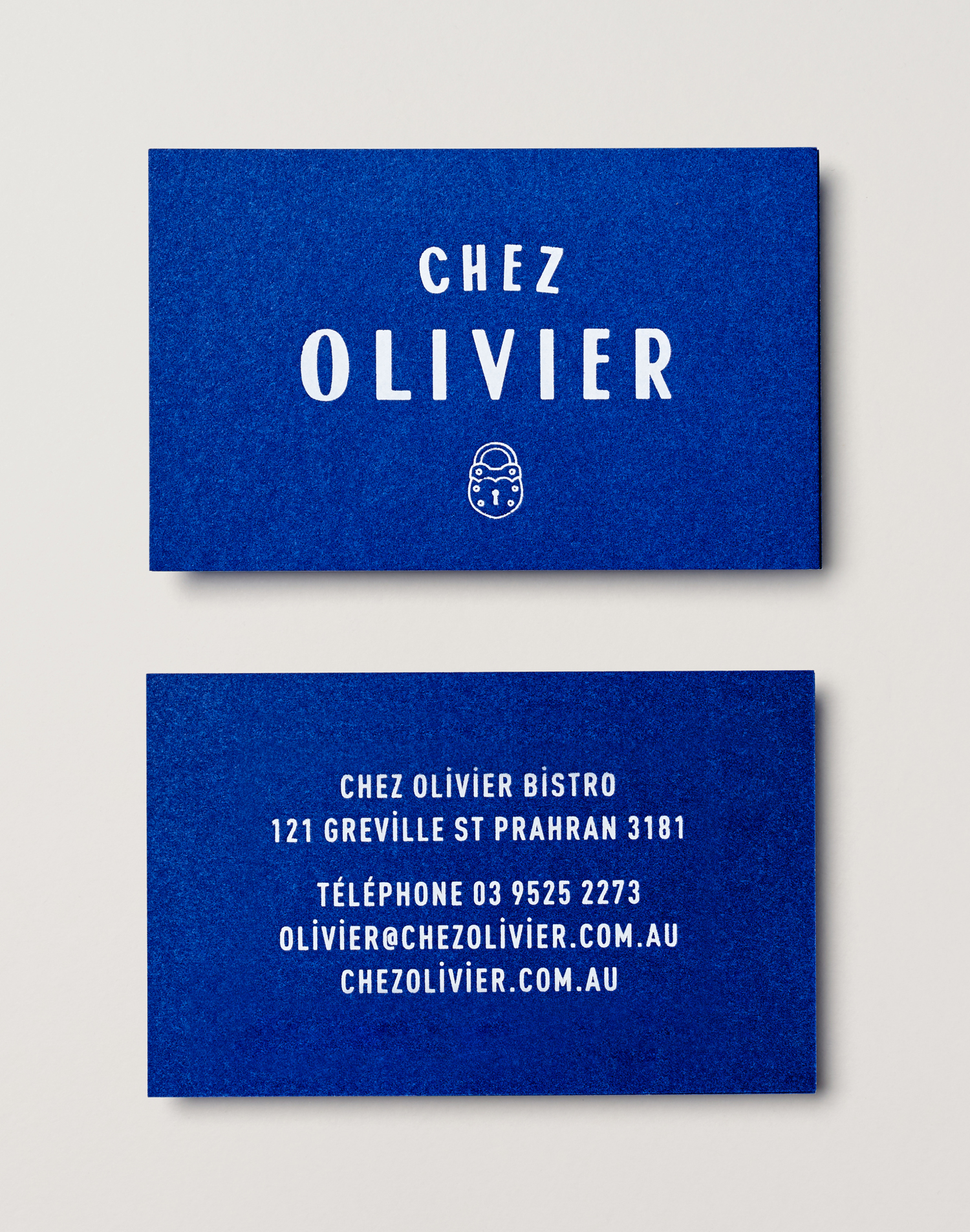
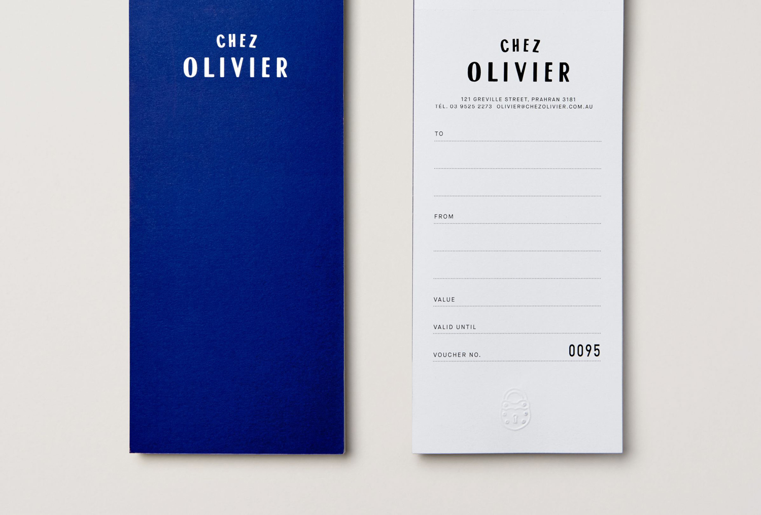
Chez Olivier is an authentic French bistro located in the centre of Greville St village, Melbourne, that intends to share its passion for French food, wine and culture with the community. It features an intimate European-style interior design of stained woods, classic furniture, photography and period advertising. It also has a unique bar of padlocks, inspired by Pont des Arts, engraved with messages of love from couples who visit the bistro, and a distinctive brand identity by Swear Words Through colour, type and image this works together a bunch of European references, expresses something of a playful and personable character and draws on the bistro’s padlock feature and its romantic associations. The projected included logo, menus, vouchers and business cards.
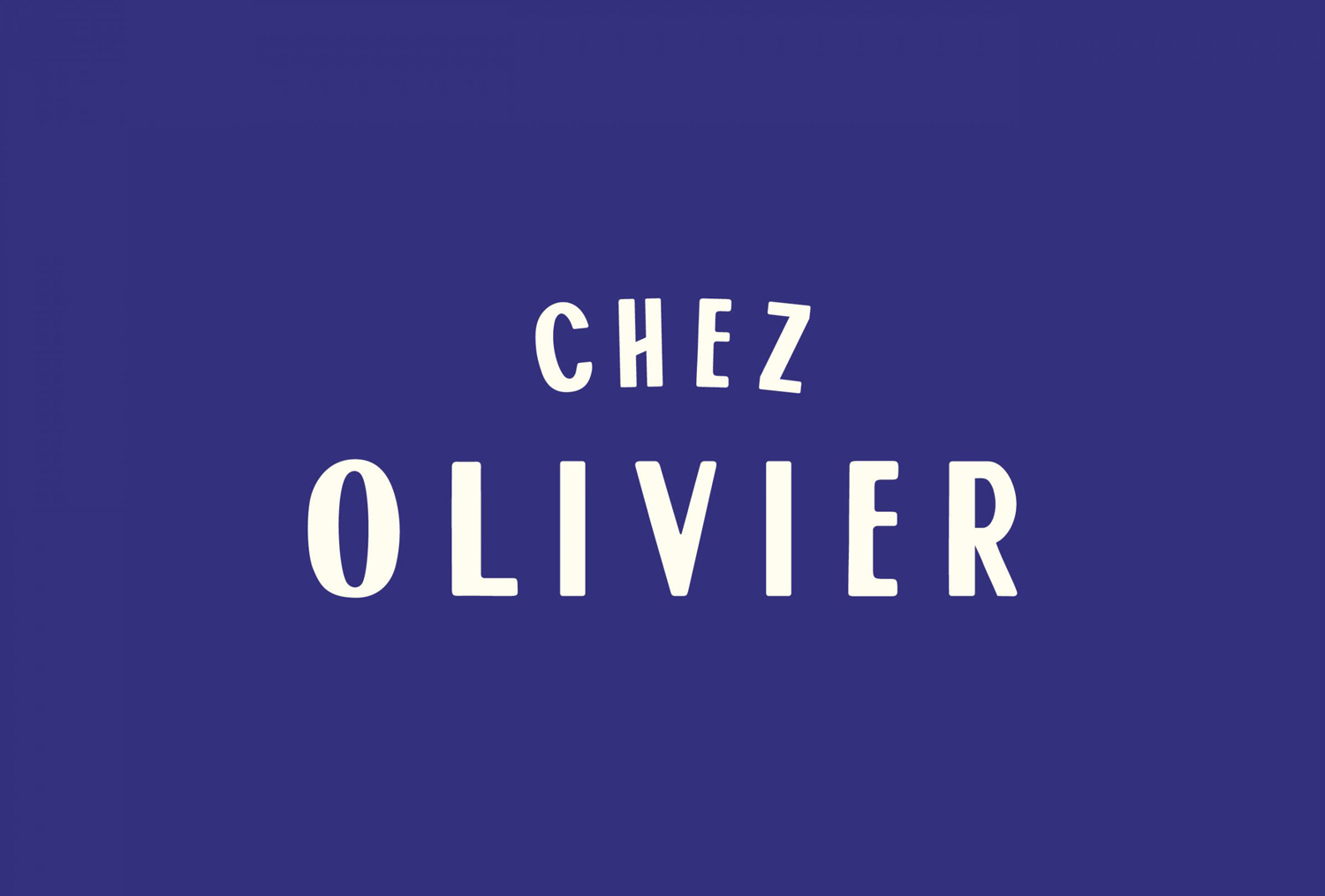
Swear Words’ work for Chez Olivier is pleasant blend of the personable and crafted; conveyed through illustration, a European flavour in type and typesetting, a French quality in the choice of colour and imagery.

Logo is a straightforward in its rendering with no “clever” second element but real value drawn from its connection to interior and how this reflects on what might now be considered a tradition for cluttering up the Pont des Arts, although this may be more a tourist rather than a strictly French gesture. Its monolinear lines and plenty of internal space reduce this idea down into a much neater visual expression whilst retaining something of its romantic associations.
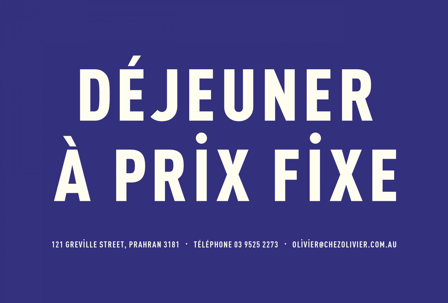
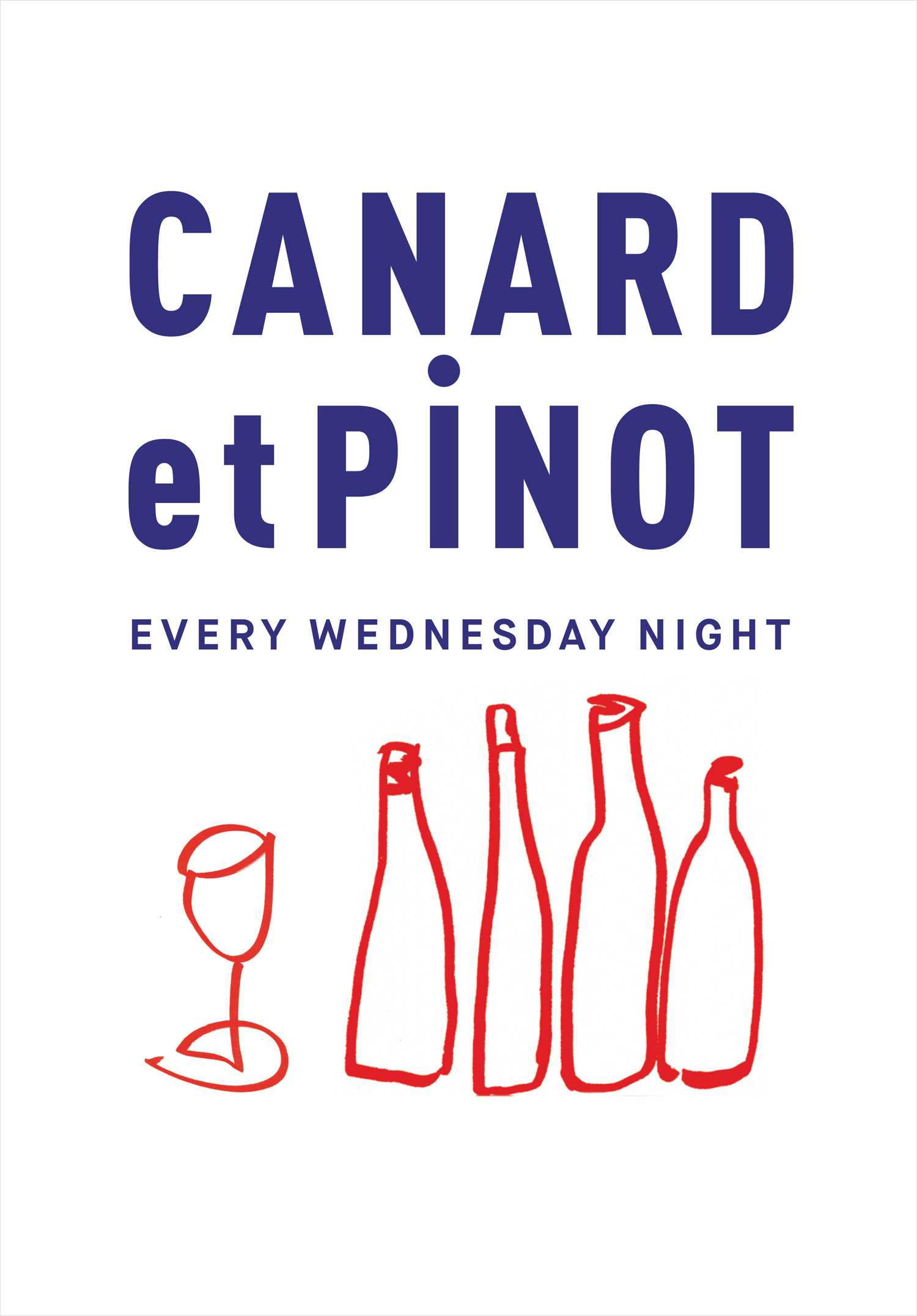
Type is well-composed, European in its condensed uppercase sans-serif letterforms, generous spacing, the dotted capital i, the use of É in English words, and in its reference to the credits of New Wave French filmmaker Jean-Luc Godard. This is something that can also be seen in the branding of Paris. Wordmark does something similar although with the more traditional calligraphic qualities of Onehunga. These are neat choices but within the same system do not provide enough contrast or firmly establish continuity.
There is a pleasant contrast in the tall, robust and precise lines of type alongside the more playful rendering of illustration. These lends the work a more personable, playful and individual quality, and is something that is well-suited to an informal atmosphere and an authentic handcrafted menu.

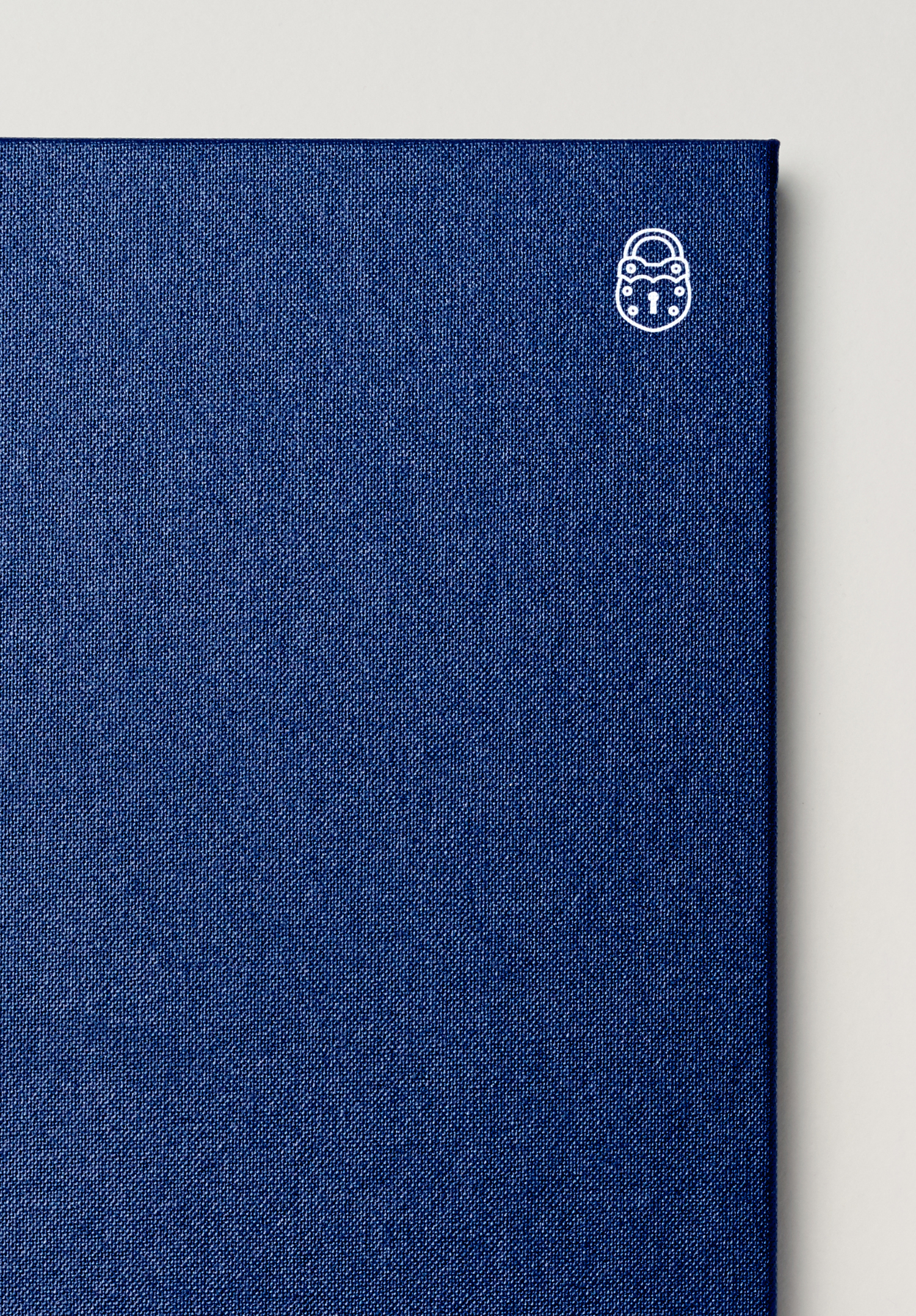
There are some neat detail in print. These include a lovely blue fabric cover for the menu, the blind embossing of the logo and a mix of paper sizes. Assets are effectively held together by a simple blue, cream and red colour palette, the shades of which keep it from becoming heavy-handed in its French reference. This is helped by plenty of space and the absence of flags. More from Swear Words on BP&O.
Design: Swear Words. Opinion: Richard Baird. Fonts Used: Onehunga & Maison Neue, DIN & Jean Luc.
