The Best Brand Identities of 2016
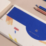
Maisonette by Lotta Nieminen Studio
Maisonette is an American online retailer of luxury children’s brands, founded by former Vogue co-workers Sylvana Durrett and Luisana Mendoza Roccia. The retailer carries a carefully selected yet extensive catalogue of clothing, homeware, gifts and accessories that mixes local up-and-coming brands with those that are well-established and international. Maisonette’s visual identity, designed by New York based Lotta Nieminen Studio, intends to balance and juxtapose a...
AIGA Design Conference by Mother Design
The American Institute of Graphic Arts (AIGA) is a professional design organisation with a membership that covers all forms of visual communication, from graphic design, typography and interaction to branding, motion graphics and environmental design. As well as supporting a community of over 25,000 nationwide members, advancing design as a professional craft, strategic advantage and vital cultural force, AIGA organises two...
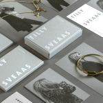
Tilly Sveaas Jewellery by Bond
Tilly Sveaas is a London-based jewellery designer, and the designer behind Silver Service Jewellery. This year sees the launch of her first collection under her own name. This features a brand identity created by the London office of international design studio Bond, and included art direction, postcards, business cards and packaging. Through typographic form, colour, material, print finish and image, Bond’s...
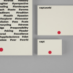
Capt by Bunch
Capt is a San Francisco-based start-up that connects creators wanting to monetize their videos with brands looking for new content and talent. The platform is made up of an app that allows creators to shoot, upload and license their videos, and a website that acts as a market place for buyers. This website also serves as a place to connect creatives with those...
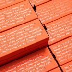
Hidden Characters by RE
Hidden Characters is the latest PR offering from international advertising agency network M&CSaatchi. It replaces/is an evolution of Bang PR, developed in response to the changing public relations landscape. With the advent of social media and the subsequent growth of non-traditional influencers and an increase in inauthentic product placement, Hidden Characters intends to make sure that their client’s reach is handled in an ethical and authentic...
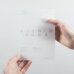
Karla Black + Kishio Suga: A New Order by O Street
A New Order is an exhibition of the work of Karla Black and Kishio Suga taking place at Modern One of the Scottish National Gallery of Modern Art between 22nd October and 19th February. The artists, unaware of each other’s work prior to the conception of the exhibition, working on opposite sides of the world, are described as being united in their use of...
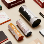
DOIY by Folch
DOIY is product design company creating playful objects that move between the useful and the more whimsical. These include items such as icepop socks, bicycle pizza slicer and unicorn scent. Much of this is firmly tongue-in-cheek but good quality, retailing in high-end and design-focused stores as well as larger chains. With the introduction of materials such as ceramics, woods, metal and porcelain across its new ranges,...
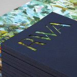
Royal West of England Academy by Spy
Royal West of England Academy brings world-class visual art from around the world to Bristol. It is the city’s first art gallery, the UK’s only regional Royal Academy of Art, and is located in a grand Grade II listed building. RWA worked with London-based graphic design studio Spy to develop a visual identity that would feel relevant and engaging, and re-establish confidence...
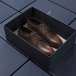
Faust by Snøhetta
Faust is a high-end shoemaker with its first signature store located in Oslo’s Barcode area. The shop is a small but impressive space consisting of five concrete niches and large carved wooden doors. Faust worked with Scandinavian studio Snøhetta to create both interior and brand identity. This was based around the The legend of Faust from the Renaissance, its basis for many literary, artistic, cinematic and musical...
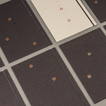
Common Lot by Perky Bros
Common Lot is restaurant located near the Papermill Playhouse in Millburn, New Jersey. It has a menu of seasonal dishes made from locally foraged produce and fresh ingredients, and features an interior design described as being minimalist with unexpected finishes, natural materials, texture and light. The restaurant was created by Australian chef Ehren Ryan and draws upon his globally diverse culinary background and free spirit....
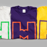
Helsinki City Museum by Werklig
Helsinki City Museum, through its collection of objects and images, provides visitors with historical insight into the everyday lives and personal experiences of the people of Helsinki. It is free to enter and features 2400 sqm of exhibitions and public spaces, a cafe, inner courtyard, areas to relax and conference rooms. To coincide with a move to a new space;...
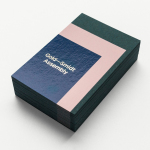
Gold—Smidt Assembly by Re-Public
Gold—Smidt Assembly is a Copenhagen-based pop-up art gallery that exhibits contemporary fine art across the globe, and offers a consultation service, collaborating with professional artists to curate sculptural pieces for commercial, public and residential spaces. Danish design studio Re-public worked with the gallery to develop a visual identity that would link a variety of assets that included signage, print communication and...