The Best Brand Identities of 2020
Sing King by Nomad
I’m going to break with a decade of convention and jump right in. I love this. I was sold as soon as I saw the logo, it’s in the BP&O Gallery. It’s rare you see this kind of logo today. It’s mostly, and understandably, logotypes that prevail today. Those that are striped down to function well on multiple devices. Blanding?...
Petit Planet by Studio fnt
The Hyundai is one of the three major department stores in South Korea, with its 15 branches across the regions of Seoul, Yeongnam and Hoseo accruing more than $6 billion in annual sales. Petit Planet is the Hyundai’s new specialised children’s division, presenting premium brands in an environment designed to stimulate young imaginations. This post includes Extended Insights for BP&O...
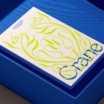
Crane by Collins
In 1775 Crane paper was used to print the first money for the American colonies, and by 1801 the company was the primary paper producer for local and regional banks. Later that century, equipped with an arsenal of innovative techniques from Europe, Crane won a contract with the Bureau of Engraving and Printing and became the supplier for the US...
Omaka by Stockholm Design Lab
According to Sweden’s travel and tourism website, craft beer enthusiasts will discover a ‘smorgasbord’ of artisanal, eco-friendly and organic things to drink there, with more microbreweries per capita than any other country (apart from the UK). Omaka joined the scene in September 2020, at the height of the pandemic, and with a slogan to match its fearless attitude: ‘taste before...
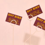
Shy Bird by Perky Bros
Shy Bird is a all-day café, rotisserie and bar in Cambridge, Massachusetts. Its core mission is to elevate chicken, and the experience of eating chicken into the realms of the exceptional through gastronomic know-how, a beautiful interior and a visual identity designed by American studio Perky Bros. Drawing their inspiration from the red junglefowl, the “original chicken” and descendant of the domestic chicken, and...
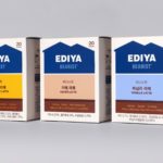
Ediya Beanist by Studio fnt
EDIYA is a well-established South Korean coffee brand, with franchised stores and array of drinks and branded products. It has the largest number of stores, exceeding that of Starbucks and any other international brands, opening its 3000th store at the end of 2019. With such a strong foothold in the market, and with the rise of at-home and ready-to-drink variations...
Mitka by Madcats Agency
The spray paint packaging on shelves in Ukraine is usually sad, and often amusing: ‘sad because someone made it… amusing because someone put it into production,’ Kyiv’s Madcats Agency admits. There’s a riot of colour, a sea of tasteless typography and a catalogue of dreadful names (Auto Email, Body 999 and Rector are among the competition). Mitka is different. The...
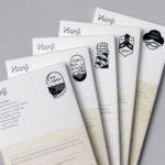
Hanji by Studio fnt
Hanji is a new brand of traditional Korean papers from KCDF created to, not just inspire interest in both professionals and the general public nationally and internationally, but to also serve as a symbol of the craft inherent to the paper making workshops. And further, to promote the paper’s potential and excellence internationally. Hanji began as a basic paper, a material...
Oji by Seachange
Oji is a sushi brand of firsts. It is the first in New Zealand to use fully recyclable and biodegradable packaging and the first to use all free-range products. This is a significant move forward and marks the brand out from well-established competitors. Oji opened in New Zealand with two locations in Auckland’s Commercial Bay, a place where they source...
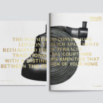
Brigade Court by Jack Renwick Studio
In The London Borough of Southwark sits the Grade II listed building and former headquarters of the London Fire Brigade, the city’s first fire station and a site currently under development. This will see it transformed into residential apartments with period conversations of the original Victorian building alongside a modern new-build. It is a one-of-kind property development that offers a...
Vessel Floats by Order
In the Brooklyn neighbourhood of Greenpoint sits Vessel Floats, a new flotation and deprivation therapy spa that draws on the continuing interest in concepts such as mindful living and wellness. Through considered interior design and visual identity, the latter developed by New York-based studio Order, Vessel Floats intends to further develop and bring to modernity an experience that has been around...
Northstar Film Alliance by Bond
North Star Film Alliance (NSFA) is a joint venture between Estonia, Latvia and Finland. The Alliance intends to develop and promote themselves as one filmmaking region to international film and TV productions. It is a competitive marketplace, with other countries provide low tax rates and incentives to film big-budget spectacles on their stages using local crews. Together, the three countries...