Vessel Floats by Order
Opinion by Richard Baird Posted 11 May 2020
In the Brooklyn neighbourhood of Greenpoint sits Vessel Floats, a new flotation and deprivation therapy spa that draws on the continuing interest in concepts such as mindful living and wellness.
Through considered interior design and visual identity, the latter developed by New York-based studio Order, Vessel Floats intends to further develop and bring to modernity an experience that has been around since the 1950s, and create a holistic experience that supports and builds out and around the central experience of flotation.
For those unfamiliar with flotation or deprivation therapy, this involves a weightless experience inside a tank filled with water with a high salt content, absent sound and any external distractions. This can be augmented by soothing lights, sounds and vibrations. People can expect an experience that disentangles them from their busy present, with some experiencing hallucinations within a safe and managed environment.


The visual language created by Order is an interesting synergy and manifestation of a few of things. An interior design detail of slatted vertical wood panels. The experience of weightlessness, the absence of distraction and the vibrations experienced during a float. These vibrations are given visual form by intersecting Ernst Chladni’s Chladni figures (experimentations with salt and vibrating plates) and the vertical lines.

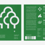
The logo establishes a simple foundation and framework. A two-lined logotype, constructed from Klim’s Untitled Sans that expands and collapses vertically, exists as a simple and elegant expression of floating. Anyone visiting the space will likely make a connection between interior architecture, logotype and floating. Typographical style and the consistency and continuity of a single line weight linking letters and lines keeps visual noise to a minimum, just as the floation tanks do, and falls in line with a contemporary visual language of premium experience. The logotype expands to fill signage, business cards and menus, developing the concept, and becomes the device that then also connects interior and printed materials such as menus, tote bags and business cards via signage and way-finding.
This is the second visual identity project posted to BP&O that utilises Chladni’s experiment, and his resulting figures. The first was Damien Conrad’s work for Camerata de Lausanne. The way these, an architectural detail and the experience of floating are resolved and deployed is immediate, delightful and sophisticated. Although the references are not necessarily immediate, they holds together a variety of applications and deliver visual interest whilst also having a sensory effect itself. More work by Order on BP&O.