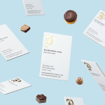
Bombonería Pons by Mucho
Bombonería Pons is a family owned Barcelona based business, established in 1960, dedicated to producing the finest handcrafted chocolates. With a desire to engage with a younger consumer Bombonería Pons worked with international graphic design studio Mucho to develop a brand identity that would be sensitive to its traditional values and history yet give it a contemporary appeal. This extended across packaging, brochure, stationery, business cards and...
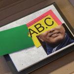
Antenne Books by OK-RM
Antenne Books is a London based distributor of independent publishers with a web shop that covers art, photography, design, illustration, theory, writing, fashion and culture. Their extensive catalogue of books, magazines and journals includes work by authors and artists such as Matt Lambert and Lutz Bacher, and the publishers Lodret Vandret and The Renaissance Society, amongst many others. Antenne Books recently worked with graphic design studio...
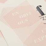
f32 by Blok Design
f32 is an American trend-watching company, founded by Gina and Lisa Priolo, with an office in LA and a commitment to finding and championing artists and brands that will go on to shape global culture. f32 worked with graphic design studio Blok Design to better express this vision, and their refined and highly contemporary aesthetic sensitivities. This was achieved through naming and...
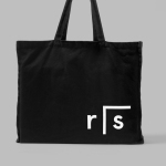
Researchers In Schools by Paul Belford Ltd.
Researchers In Schools recruits and trains post-doctoral science researchers in the United Kingdom to become teachers with the intention of increasing subject expertise, promoting fields of research and improving university access. Researchers In Schools recently worked with London based graphic design studio Paul Belford Ltd. to develop a new brand identity system and visual language. This went on to include logo design...
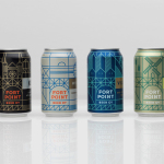
Fort Point Beer Co. by Manual
Fort Point is a San Francisco-based small batch craft beer company that references traditional styles yet is firmly rooted in the present, and has a philosophy that values craftsmanship and innovation, creativity and technique. In 2015, working with local graphic design studio Manual, Fort Point launched a new graphic identity and packaging system to unite its expanding range. Fort Point’s forward-thinking, fast-growing...
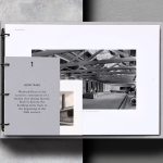
Wenford Dries by ico Design
Wenford Dries is a new property development in the scenic area of North Cornwall. It will be made up of loft-style homes, artist studios, allotments and wild gardens, set on the site, and within the structure of, a former clay drying factory that dates back to the beginning of the 20th century. This is said to have been sensitively restored. The development is billed as...

Fox Real Estate by Parallax
Fox is described by Parallax Design, the Australian graphic design studio behind its new brand identity, as one of Adelaide’s most respected boutique real estate agencies. Established in 2005 by Andrew Fox, Fox Real Estate specialises in the selling of high-end properties. Following business growth and to coincide with a move to larger premises, Fox worked with Parallax to develop a...

Grand Ferdinand by Moodley
Grand Ferdinand is hotelier Florian Weitzer’s fifth hotel. It features a distinctive interior of green leather upholstery and Lobmeyr chandeliers, rooms with ornate and functional furnishings, and a restaurant that is said to serve the best French champagne and the grandest Viennese cuisine, all set within a landmark building located on Vienna’s Ringstraße. Grand Ferdinand has a philosophy that celebrates the past whilst moving forward. This meeting of tradition...
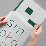
Smokovik by Studio8585
Smokovik is an exclusive property development, located on the Croatian Island of Krk, designed by renowned local architect Idis Turato. The development will be made up of both residential and commercial buildings that share a functional and sustainable build practice, a favour for modernity, flat surfaces and Mediterranean sea views. Smokovik’s brand identity, created by Studio8585 now working from Copenhagen, included logotype, brochure and website design, a...