
Chaos by Socio Design
Inspired by fashion’s current fascination with customisation, technology and a “sense of light-hearted fun”, creative duo and stylists Charlotte Stockdale and Katie Lyall created Chaos, a new UK luxury lifestyle brand producing limited edition and personalised tech and travel accessories. Through form and finish, materiality and graphic design, Chaos products, which include phone cases and charms, zips and luggage tags, express the brand’s take on practicality...
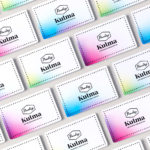
Paulig Kulma by Bond
Paulig Kulma is distinctive space, located in the heart of Helsinki, developed by Paulig, the leading coffee brand in the Nordics. It combines a coffee shop, roastery and barista institute, and intends to appeal to a broad customer group, and accommodate a variety use cases throughout the day. Paulig Kulma serves multiple functions. From the inviting and flexible space of the coffee shop, to...
Roger Burkhard by Lundgren+Lindqvist
Roger Burkhard is a creative web development and interactive studio based in Bern, Switzerland, with a roster of clients throughout the creative industries. The studio worked with Scandinavian designers Lundgren+ Lindqvist on the development of a new brand identity. This included monogram, brand guidelines and website, as well as a stationery set that covered business card and promotional cards, letterhead,...
George + Powlett by Studio Brave
George + Powlett is a residential property development of 11 apartments, created by ICON Developments, and located in East Melbourne. ICON’s properties are described as having a precision and balance, and this continues through to their latest project, which was designed by acclaimed architectural practice Powell & Glenn. The development is set within an environment of what is described as a place of elegant contrasts. This can...

Sydlexia: Making Sense Of Dyslexia by BBDO Dubai
Sydney Dyslexia intends to challenge the misconception that dyslexia is a learning disability, and instead, move the conversation forward, to more appropriately address it as a learning difference. Sydlexia is an innovative and pioneering platform, created by Sydney Dyslexia, to help aid this change, and offers new techniques and training methods to help facilitate “dyslexia correction”. Dyslexia is the most common learning disorder....
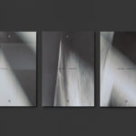
Quad Cinema by Pentagram
Quad opened in 1972 and was New York’s first multi-screen cinema. Since then its four screens have been dedicated to playing a diverse programme of independent, classic and first-run films. To coincide with its contemporary state-of-the-art refurbishment, completed earlier this year, Quad’s new owner Charles S. Cohen and his independent film production and distribution company Cohen Media Group worked with Pentagram partner Paula Scher and her team on...

Disrepute by Two Times Elliott
Disrepute is a members-only bar, located in London’s Soho, described by Two Times Elliott, the design studio behind its brand identity, as having a heritage of “establishment and scandal”. The bar features a rich interior design of high quality material detail that elegantly plays with shape, pattern and symmetry, solid colour and texture, the geometric and the organic. There is...
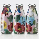
Superfly by B&B Studio
Superfly is a limited edition non-alcoholic cocktail, and collaboration between celebrated mixologist Ryan Chetiyawardana, aka Mr Lyan, and naturally revitalising UK juice drink brand Firefly. The cocktail blends redcurrents, aronia berries and grapefruit with botanicals that include green coffee, angelica, wormwood, kola nut and cascara. It features a unique packaging design by London-based B&B Studio that wraps Firefly’s distinctive structural design with...
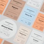
Summerhill Market by Blok
Summerhill Market is a family-run business, managed by the third generation, with premises on Toronto’s Summerhill Avenue and a smaller location—a floral boutique—on Mt. Pleasant Rd. The store has 200 employees, a butchers, bakery and deli, a BBQ in the summer and offers a variety of catering services. Summerhill Market is admired for its high quality products, and its ability—since 1954—to consistently redefine what...

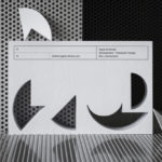
Finland 100 by Kokoro & Moi
This year Finland celebrates its centenary and will mark the occasion with a broad programme of events created and supported by a wide range of stakeholders. Based around the theme of “Together”, and with the intention of creating a cohesive and useful system to unite events and initiatives from local councils and independent organisations and businesses, Scandinavian design studio Kokoro & Moi created “Finland’s Faces”, a brand...

Brewdog’s Lone Wolf by B&B Studio
Lone Wolf—a whisky, gin and vodka range—marks Brewdog’s entry into the craft spirits market. These are produced by Brewdog’s distillery in Scotland, the only one to make base spirit from grain under one roof, a roof specially modified to accommodate a 19m high 60-plate rectification column to get the purest results possible. The range features a brand identity and packaging design created...
Mere by Bibliothèque
Mere–pronounced Mary–is a modern two-storey restaurant and bar, located in London’s Fitzrovia, developed by chef Monica Galetti and sommelier David Galetti, working in collaboration with Westbury Street Holdings. The restaurant has a menu of simple dishes made from seasonal produce using classic techniques, and influenced by the French and South Pacific heritage of David and Monica, respectively. It also features a warm interior of...