
Caldo Coffee by 25ah
Caldo Coffee is a café serving organic coffee and fresh salads, sandwiches and pastries from its location in the Scandic Continental, a hotel in the centre of Stockholm. It features a distinctive and modern interior design of light wood, tall shelves and a long wood panelled and marble topped counter. It also includes a large custom-built menu board, neon signage and a...

Printed by Somerset by Leo Burnett
Somerset is described as being Canada’s top printer, known for its precision, attention to detail and ability to pull off complex jobs. Alongside reproduction services, Somerset, a family-run business, also provides extensive print finishing services. Inspired by this, the stacked paper of the press, and with the intention of engaging a new generation of designers, Toronto based studio Leo Burnett developed a new brand identity...

Qoñi by Leo Burnett
Qoñi is a small artisan community in the Peruvian city of Puno creating hand knitted socks, scarves, gloves and shawls from alpaca fleece. With a desire to present itself as a modern fashion brand and with the intention of entering the international market, Qoñi worked with Toronto-based graphic design studio Leo Burnett to develop a new visual identity; from naming to wordmark, brand story to lookbook, and...
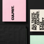
Culprit by Studio South
Culprit is a bar and restaurant located on Auckland’s Wyndham Street. It has a menu made from ingredients supplied by local New Zealand producers, growers and farmers, and is inspired founder’s Kyle Street & Jordan MacDonald’s travels across the United States and Europe. Culprit has a modern interior design in a converted loft space created by Kirsty Mitchell. This is characterised by large exposed beams and brick...