Theatre
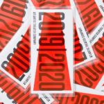
OlssønBarbieri rewrites the rulebook on ‘formality’ in its melodrama-infused Theaterbaren identity
Oslo’s Nationaltheatret (simply translated to English as National Theatre) first opened its doors more than a century ago in 1899, and has since come to not only reflect, but actively shape cultural identity in Norway. Having staged everything from more traditional Norwegian dramas from the likes of Henrik Ibsen to experimental contemporary works, the building itself is also a marriage...
PAC NYC by Porto Rocha
There have been some brilliant logo designs inspired by the very buildings they represent. The Centre Pompidou, for instance, bears a powerfully stark logo that’s been largely unchanged since it was first created in the 1970s: six black stripes crossed by two zigzags representing the site’s ‘caterpillar’ escalator, one of the most famous parts of Renzo Piano and Richard Rogers’...

Vineyard Theatre by NB Studio
Much like identity work for art galleries and publishing houses, master brand design for theatre is often neutral, leaving plenty of space for a programme of diverse productions and eclectic marketing images to ‘take the stage’. When everything is in constant flux, there are typically some constants: a straightforward, recognisable wordmark, a distinctive typographic personality, and a consistently tight grid...
Atlantic Theater 2019 – ’20 Season by Pentagram
Atlantic Theater Company was founded in 1985 by playwright David Mamet and actor William H. Macy and, since then, has established itself as an influential Off-Broadway theatre group. It is also known for having a bold and original voice, producing groundbreaking new works by both emerging and established playwrights. This bold and original voice was central to the design of the theatre’s...
New Victory Theatre by Pentagram
The New Victory Theatre, located on New York’s 42nd Street, is described as the city’s first and only not for profit performing arts venue for kids and families. It has a programme that covers a multitude of artistic disciplines and draws on traditions from a variety of cultures. Alongside performances and family workshops the theatre also seeks to offer performing arts...
Shakespeare In The Park 2019 by Pentagram
Shakespeare In The Park is an annual event and duo of free performances presented by New York’s The Public that takes place at the Delacorte Theater in Central Park in May and June. 2019 saw performances of Much Ado About Nothing and Coriolanus under the theme “Rumours and Rebels”. The event was promoted through a city-wide campaign developed by Pentagram’s...

Atlantic Theater 2018 – ’19 Season by Pentagram
Atlantic Theater Company continues to work with Paula Scher and her team at Pentagram, this time on the campaign for their 2018–19 season. This is characterised by a contrast of bright fluorescent gradients and solid black ink. These fill, define and intersect the condensed sans-serif letterforms and graphic emblem of the theatre; the megaphone A, designed and introduced in 2015....
Shakespeare In The Park 2018 by Pentagram
Shakespeare In The Park is an annual event and series of free performances presented by New York’s The Public Theatre that will take place at the Delacorte Theater in Central Park during May and throughout June. This year will see performances of Othello and Twelfth Night. These are being promoted by a campaign developed by Pentagram’s Paula Scher, with assets...
Boundless Theatre by Spy
Boundless Theatre, led by Artistic Director Rob Drummer, is a UK based theatrical group that creates plays for 15 to 25 year olds, “as well as curious others”, that respond to a diverse global culture and empowers young people to collaborate and find their voice. In the spirit of the name, Boundless Theatre tours both nationally and internationally. With the intention of...
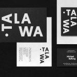
Talawa by Spy
Talawa, Jamaican patois for “small but feisty”, is an all black theatre company that looked to address the lack of opportunities for minorities and their marginalisation at the time of its founding in 1986. Since then it has established itself as one of the most successful theatres of its type in the United Kingdom. “Our work is informed by the wealth...
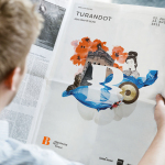
Bregenzer Festspiele by Moodley
Bregenzer Festspiele is a performing arts festival and opera venue with a 7,000 seat open-air amphitheatre. The festival is held each year in July and August and features a unique set built on top of a floating stage on Lake Constance in the Austrian city of Bregenz. Notable set designs include a giant book and skeleton for Giuseppe Verdi’s Aida, the...
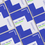
Basement Theatre by Studio Alexander
Basement Theatre is an independent, underground, community theatre located on Auckland’s Lower Greys Avenue. It was established in 2008 as a place to showcase new voices, fresh perspectives and emerging young talent, and to provide these with the space to develop their performances. The theatre has played host to dancers, visual artists, poets, musicians, comedians and everything in between. Taking their...