Atlantic Theater 2018 – ’19 Season by Pentagram
Opinion by Richard Baird Posted 11 September 2018
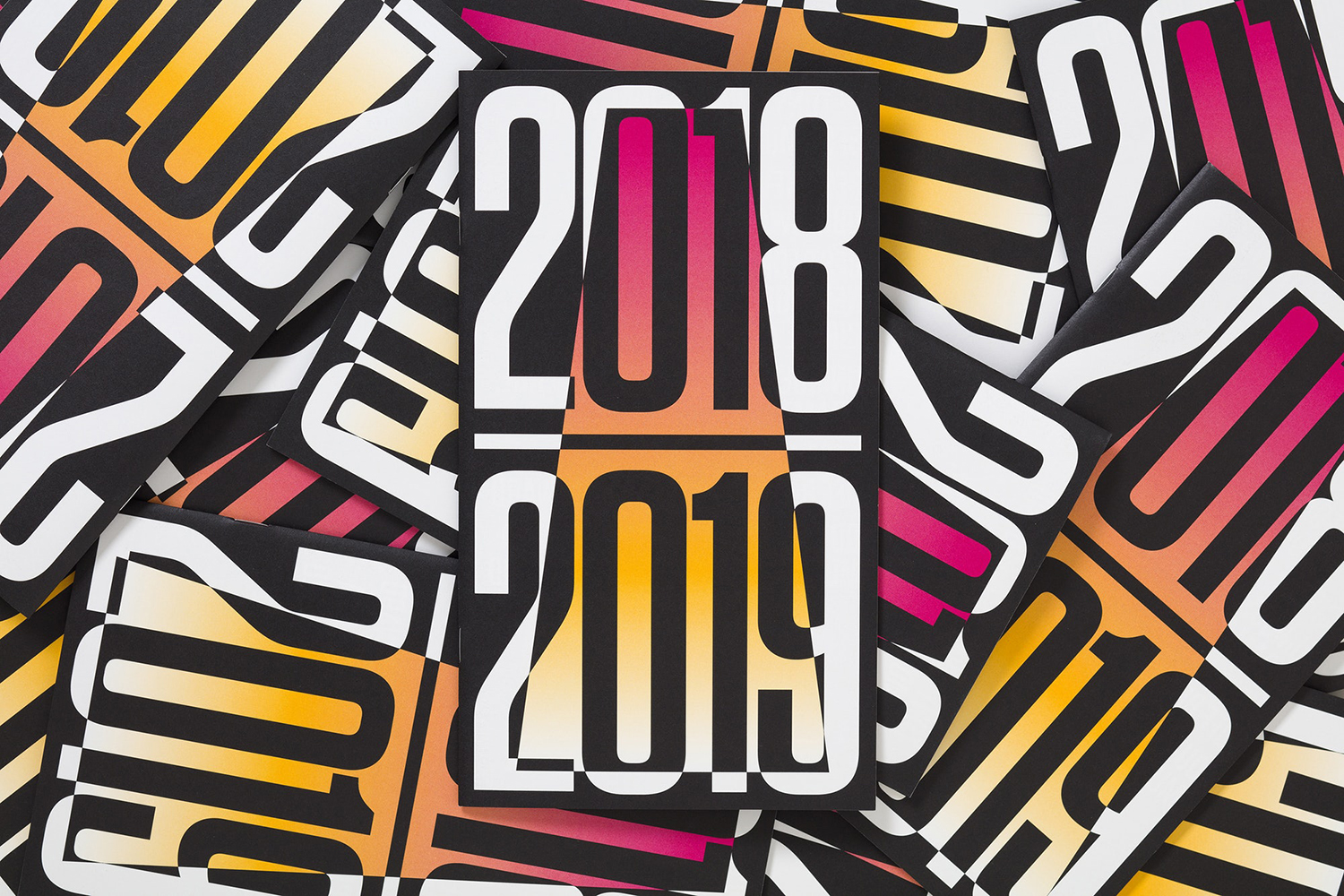
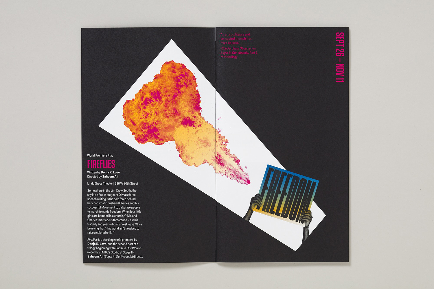
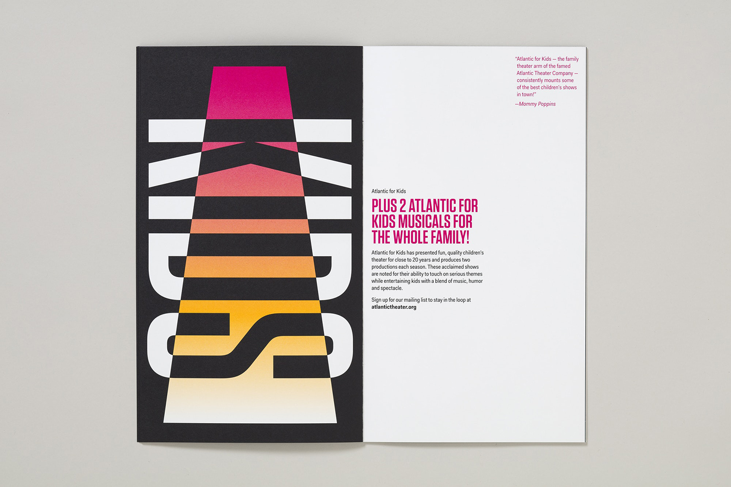
Atlantic Theater Company continues to work with Paula Scher and her team at Pentagram, this time on the campaign for their 2018–19 season. This is characterised by a contrast of bright fluorescent gradients and solid black ink. These fill, define and intersect the condensed sans-serif letterforms and graphic emblem of the theatre; the megaphone A, designed and introduced in 2015. This runs across a printed programme of upcoming productions, kids programming and educational opportunities.
Each new season at Atlantic Theater is defined by its arrangement of type and form, and in a change of colour. Much like Public Theater in New York, also designed by Paula Scher and team, the graphic identity is reconfigured over time. Identity becomes an incrementally evolving expression, rather than rigidly codified, locked into grids and guides, defined assets and colour palettes, that serves seasonal changes in programming and creative direction. Outside of a complete restructuring, internal political conflict and change, this affords the theatre the capacity to play with a variety but within a continuum, rather than abrupt reinvention. The approach facilitates new graphic expressions which avoid a potential communicative lethargy whilst also contributing to the building of a visual legacy.
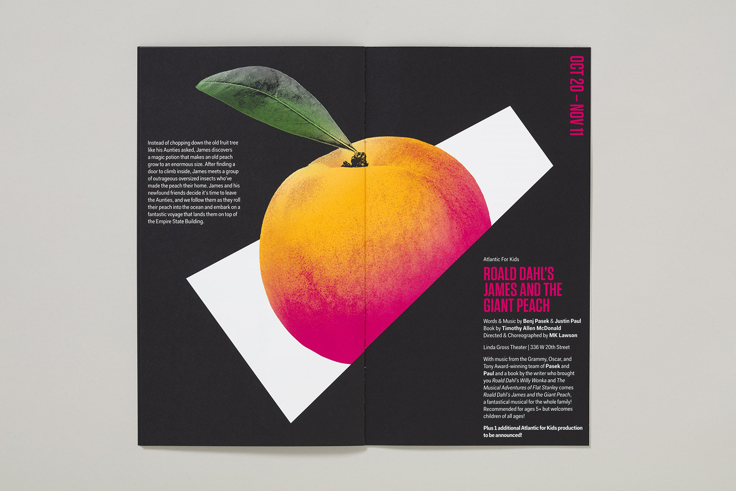
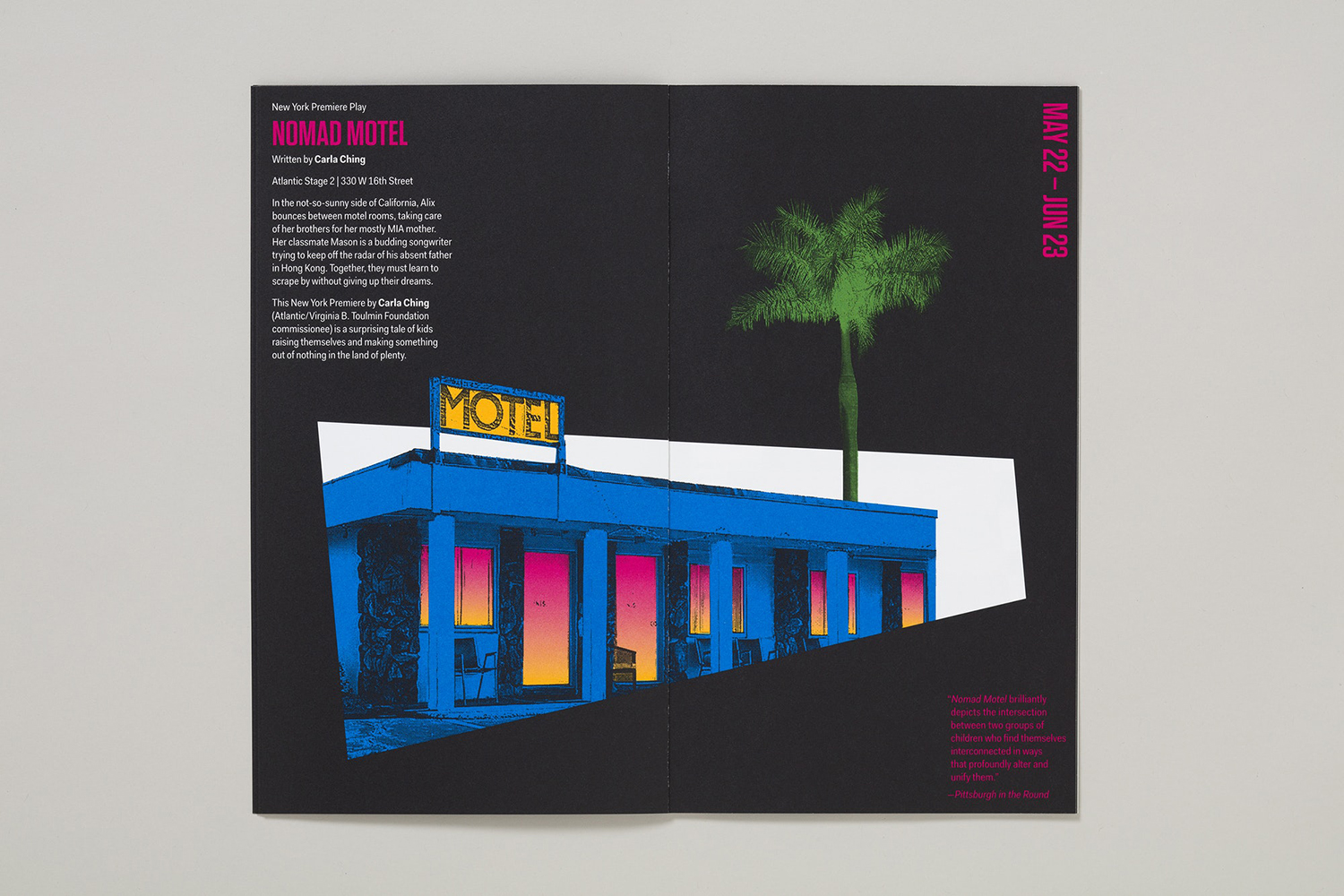
Paul Scher’s work has been based around defining and expressing Atlantic Theater’s bold, original voice. This vocalisation is visualised in through a strong and central graphic emblem and its megaphone association. Colour augments this through a combination of fluorescent inks and acute contrasts. Its form language is simple and fairly universal (vertical the megaphone becomes spotlight) and serves as a throughline in which to reconfigure identity and develop new campaign imagery.
The megaphone has, for the most part, served as a backdrop with type overlaid. Here, it becomes a container or portal, a vehicle for a variety of performances and related visuals, or a threshold to be crossed by a mix of found imagery, montages and photo illustrations.
Just as the graphic identity reconfigures itself between seasons, the imagery used is found and repurposed, lending the work a thoughtful layer of detail. This is brought out in the texture of the images; a slight incongruence between these and the solid shapes, precise lines and smooth gradation of colour.
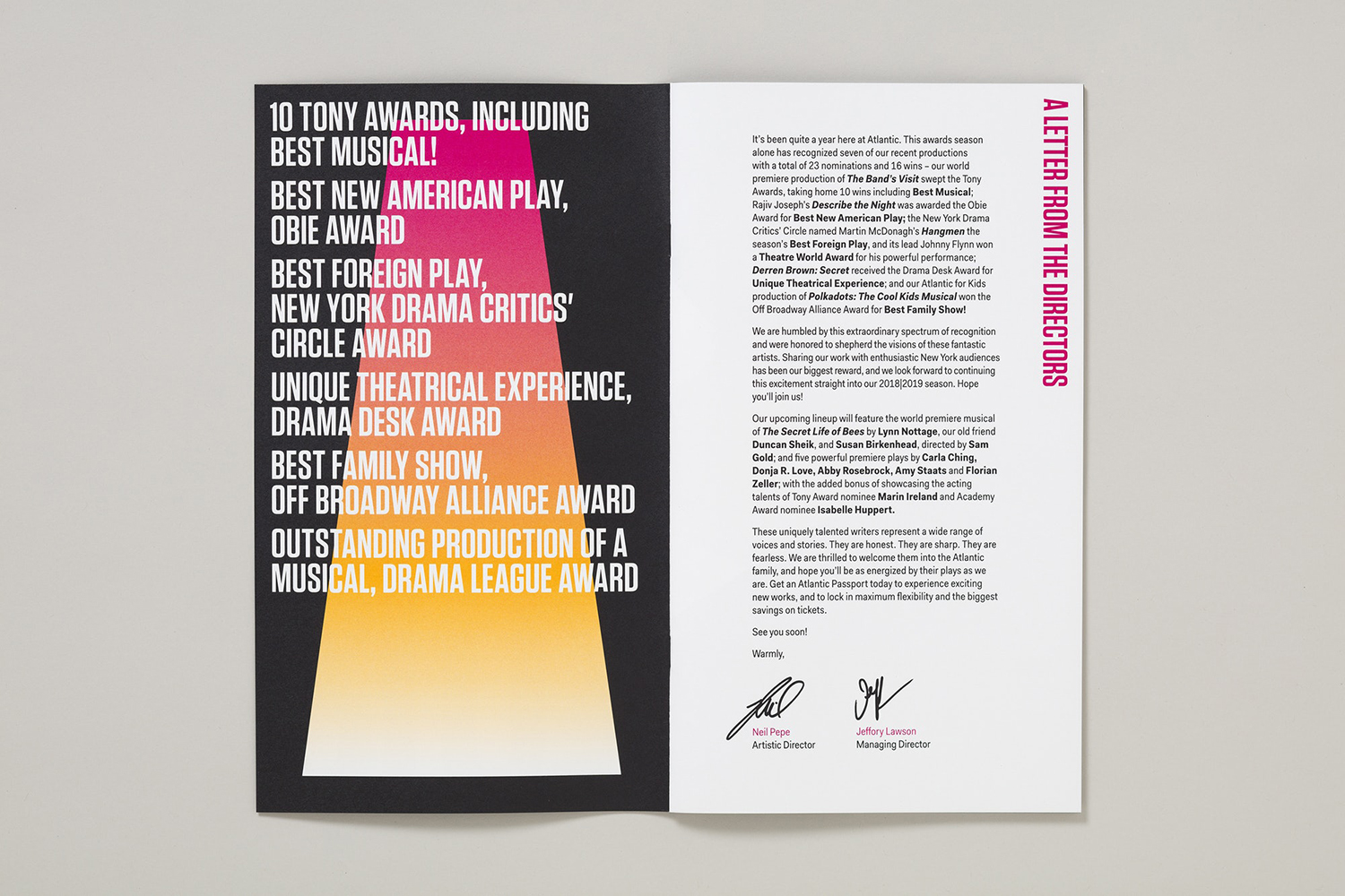
The choice and arrangement of text, the interplay of text (Tungsten) and form remains. These function as a consistent visual anchor and part of a graphic continuum. The work effectively plays with the eye-catching and stylistically pleasing, it serves to arrange information in a way that leverages what has already been learnt but is also easy to enter into. Graphic identity is in the confluence of shape, colour, type and layout. The degree to which each of these dominates the surface of a page, poster or spread provides a welcome variety while their relationship establishes continuity and distinction, particularly within the built environment amongst other loud visual communications. More work by Pentagram on BP&O.
Design. Pentagram. Partner In Charge: Paula Scher. Project Team: Rory Simms & Emily Atwood. Opinion: Richard Baird. Fonts: Tungsten
