Thermographic Ink

Unfolded by Commission
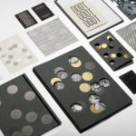
Unfolded is a design and print festival that celebrates the creative work happening across Europe in the disciplines of design, printing and brand communication. This was held by and at The Gmund Paper Factory in Germany on the 9th November 2018. The event created a space for sharing ideas and fostering dialogue between creative individuals, providers of printing services, brand...
Jackalope Hotels by Fabio Ongarato Design
Jackalope Hotels is a luxury hospitality experience developed by Melbourne-based Louis Li, a hotelier described as having a penchant for the avant-garde. The first Jackalope Hotel is situated in the heart of the Mornington Peninsula, Victoria, Australia. It is unique in its location, surrounded by the hotel’s vineyard, in its architecture and interior by Carr Design, and in its visual...
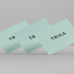
Trika by Bunch
Trika is an interior design company, working on both public and private spaces, with a showroom and studio in the Croatian capital of Zagreb. They represent furniture and equipment manufacturers such as Billiani, Enea and Federicia, amongst many others, whose brand names are described as being synonyms for quality, comfort and design. Graphic design studio Bunch worked with Trika to develop a new brand identity....
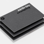
Adrián Key by Face
Adrián Key is a San Pedro based architecture firm and architect working with the rich and famous from “one of the most exclusive corners of northern Mexico”. Design agency Face Creative developed a new visual identity for the firm with a “clean, simple aesthetic with bold and modern touches, an icon that cleverly encases the name of the brand in its design, and...