Frydate by Skinn
Beyond its eye-wateringly strong beers, decadent chocolates, and waffles; Belgium is famous for serving up one beloved belt-buster that’s easy to eat, and deceptively hard to get right: chips. A new Belgian homemade burger and snacks offer, Frydate, positions itself far beyond a humble chippie and into the realm of ‘Belgian frymanship’-led ‘friterie concept’. To help it achieve its ‘insatiable...
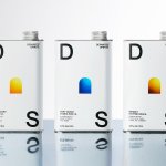
Departed Spirits by Marx Design
Maybe it’s been ‘silly season’ summer; maybe there’s a lack of risk-taking/imagination/budget; maybe I’m just jaded, but it’s felt as though recent months haven’t exactly seen a wealth of particularly exciting branding and packaging projects. That’s not to say there hasn’t been a steady stream of good work, but I’ve personally not felt hugely ‘wowed’: there’s been work that’s strong,...
Top of the Mornin’ Coffee by Earthling
Anyone over about 25 would likely feel that of all people, big-time YouTubers aren’t exactly in need of a coffee fix: high-octane, breathless excitement and endless, pause free chitchat don’t exactly scream ‘3pm slump’. However, Irish YouTuber Seán McLoughlin, aka Jacksepticeye – who boasts more than 52 million social media followers, and nearly 16 billion views on YouTube alone –...

Wype by Among Equals
London-based creative agency Among Equals recently worked with ‘below-the-waist wellness company’ Wype on its brand identity and art direction, aiming to help the company build a new brand that would set it up for its next phase of growth. Wype is a gel that was designed to ‘turn any toilet paper into an eco-friendly wet wipe, all at the squeeze...
Veg NI by Jack Renwick Studio
The economics of regional farming, in the face of global market forces, continues to be unfavourable to local producers; narrowing margins and pushing some out of business. Alongside this, unfair and self-defeating politics continue to chip away at a basic message; locally grown food is a good, not just in a regional economic sense, but in terms of the health...
BP&O Voices
Seth Rowden on Brand Language:
Period puns and CBD tampons. The story of two brands.
A guest article from Seth Rowden on the brand language of two period care brands. BP&O Voices presents the opinions of industry experts on a wide range of topics....
BP&O Voices
Seth Rowden on Brand Language:
Farmyard Frozen – Vibrant language to brighten up your freezer
A guest article from Seth Rowden on Farmyard Frozen’s brand language. BP&O Voices presents the opinions of industry experts on a wide range of topics....
BP&O Voices
Seth Rowden on Brand Language:
Mami Wata – Catching a break with West African folklore
A guest article from Seth Rowden on Mami Wata’s brand language. BP&O Voices presents the opinions of industry experts on a wide range of topics....
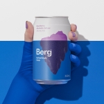
Berg by Marx Design
Marx Design worked with drinks company Lion to develop a brand identity for Berg, an alcoholic / hard seltzer free from artificial colours and preservatives aimed at “discerning drinkers who’ve been yearning for a more refined alternative.” Berg is available in three flavours, Berg Watermelon, Berg Lemon & Yuzu and berg Blackberry. While delivering a clarity and crispness of flavour, Berg is...
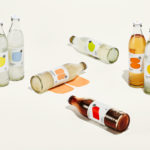
StrangeLove Lo-Cal Soda by Marx Design
StrangeLove is an Australian soft drinks brand that began with a four flavour range of energy drinks. Although mass-produced, each of these was created with the intention of evoking a taste of the homemade through carefully sourced and high-quality organic ingredients. The range was developed in response to energy drink brands who StrangeLove believed had failed to live up to their...
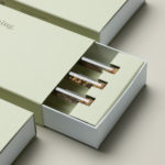
Garden 13, Graanmarkt 13 by Base
Graanmarkt 13 is a restaurant, high-end concept store and apartment in Antwerp. It is described by Base, the studio behind its graphic identity, as a special house, a crossover place full of surprises. This was articulated through a story that positioned Graanmarkt 13 as a haven for people in search of objects and experiences with soul and meaning. Garden 13...