StrangeLove Lo-Cal Soda by Marx Design
Opinion by Richard Baird Posted 15 February 2019

StrangeLove is an Australian soft drinks brand that began with a four flavour range of energy drinks. Although mass-produced, each of these was created with the intention of evoking a taste of the homemade through carefully sourced and high-quality organic ingredients. The range was developed in response to energy drink brands who StrangeLove believed had failed to live up to their premium positioning.
Keen to avoid the tricks and tropes of the category and secure a witty, eye-catching and original look, New Zealand-based Marx Design worked with StrangeLove to improve on the illustrative character that had been used across the brand’s earlier bottles, developing simpler compositions surrounded by plenty of white space and paired with sharp and humourous copywriting. Check out the BP&O review of these here.
StrangeLove went on to create a range of mixers, organic soft drinks and source a mineral water, each with its own unique visual language. 2019 sees the brand continue to expand their range and explore and challenge the drinks market, further working with Marx Design, this time on a range of “Lo-Cal” sodas.


The StrangeLove visual identity is characterised by shifting faces, a desire to be agile, adjusting and responding to a quickly evolving market, declining and emerging categories. With the rise of kombucha and kefir the soda market has experienced something of a decline. With this in mind, StrangeLove and Marx Design saw an opportunity to reimagine the category. As Ryan Marx, Creative Director explains, “that meant first looking back to the glory days of soda–the 60s, 70s and 80s–and trying to unpack some nostalgia and discover the dominant category cues of the time.” The cues; refreshment, flavour and effervescence, alongside the provocation “what does the future of soda look like?” led to positioning the range as clean, crisp and refined, low-cal and locally made, light and better for you with a touch of nostalgia. The design language flows from this by way of a bespoke structural design, a light label with a strong single graphic motif and a continuation/refinement of the StrangeLove tone of voice.


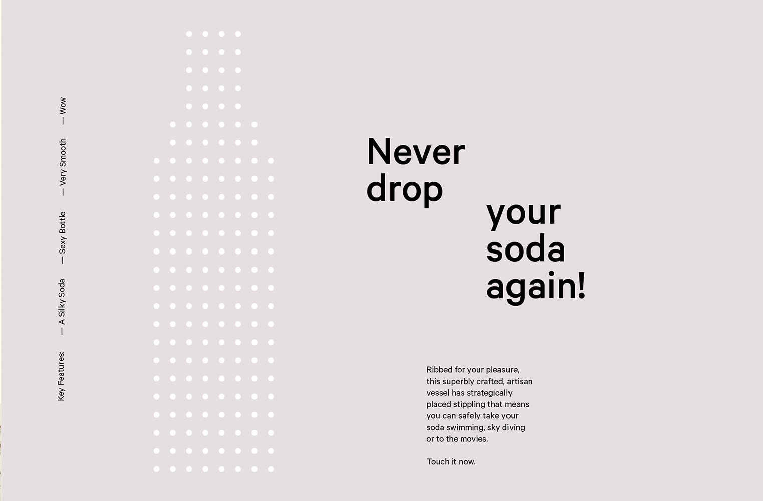
There are three distinct elements to the project. Structural design, the graphic language of form and colour, and copywriting. With each new iteration, StrangeLove finds a way to reconfigure itself. This is less about a visual continuity, aside from the wordmark and monogram, but the capacity to try new things, respond to category changes, to dare to explore new approaches, to dip into the past and reimagine old categories. To see past inform structural design; to tie a stippled relief to practicality yet also a haptic nostalgia, and then to consider weighting with a 10mm base, is a surprising highlight where the graphic is likely to be the initial draw (and allows the brand and product to move effectively online).

Copy Opinion by Seth Rowden
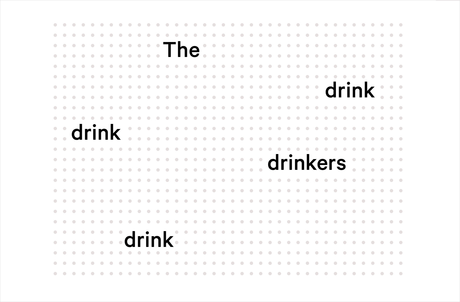
The last time I spoke to James, the founder of StrangeLove, he told me that a ‘brand’ was a gut feeling that’s not even rational. We discussed his approach to copy. He would find a little insight, a relatable shard of truth, then use it to spin the product. No overworking or diluting the idea. If some people hated it, more people would love it. That was the thinking. The expression was raw and humorous – perfect for upsetting the energy drinks market.
The new Lo-Cal sodas look primed for a more sophisticated, mature audience. The kids have grown up, and so has the voice. The thread of cynicism that ran through the previous product copy has evolved into a light and playful tone, surfacing in lines like this: “She didn’t know whether she was a lemon, a grapefruit or a mandarin. And, more importantly, she didn’t care.” It feels connected to the golden era of soda with associations of freedom, youth, happiness and a refreshing beverage for those hot summer nights. But what makes the copy 10/10 is how StrangeLove pulls this off.
More so than their early products, the Lo-Cal range does more than provoke a strong reaction to the brand. The language is flavoursome and nuanced, with a careful choice of words used to communicate taste, texture and aroma. Take this headline: “From the makers of ninjas and fast trains comes Yuzu – a delicious hybrid citrus with notes of lemon, grapefruit and mandarin.” It’s still direct and truthful – like the voice in an overworked adman’s head – but the description of the ingredients help to sell the drink itself.
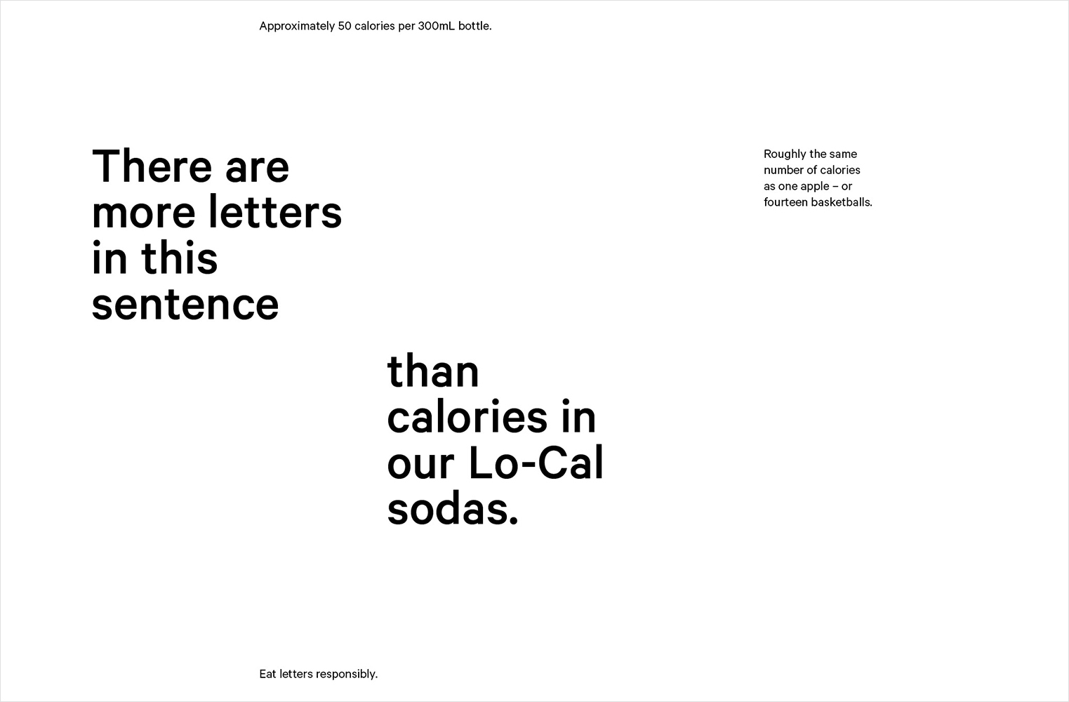
StrangeLove hit a string of selling points with their usual humour and offbeat style. “Like Christmas, but up to 45% more refreshing and with 35% fewer family arguments” is falsely packaged as a statistical claim, which is disarming. And then they drop in benefits: “There are more letters in this sentence than calories in our Lo-Cal sodas.” It’s factual and informative, while also asking us to think (there are 61 letters, to save you counting).
In smaller text, the sentence continues: “Roughly the same number of calories as one apple – or fourteen basketballs.” A reminder that, even without the illustration of a decapitated monkey head on the corpse of a flamingo plastered across the bottle, the new sodas retain a touch of the random – which is the one ingredient not listed on the packaging that makes this brand so irresistible.


The result is a strange and beautifully crafted convergence of old and new, never feeling like a pastiche or a quick nostalgia grab. Too far in the past and locality, better quality ingredients and a contemporary lightness would have been lost. Label design does a lot to serve this. This is an exercise in what might be understood as constructing and then partially dissolving a threshold between perceptions of Scandinavian simplicity and an East Asian balance.
Silver foiling, plenty of white space, strong but natural colour, painterly texture and a form language that play with the premium, the light, the crafted, and the elegant. The absence of a blunt specificity, put differently, a commercial communicative swiftness, is distinctive, its abstraction is a provocation to discover more. That this is followed with a material response that dips into but does not get lost in the past is intelligent and satisfying. More from Marx Design on BP&O.
Design: Marx Design. Photography: Walter Collalto. Opinion: Richard Baird. Copy Opinion: Seth Rowden. Fonts Used: Calibre.