Designed in Vancouver
Di Beppe by Glasfurd & Walker
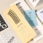
Di Beppe is a casual Italian caffé and ristorante, located in Vancouver’s Gastown neighbourhood, “inspired by the Italian immigrant’s desire to share a piece of home while living abroad”. Di Beppe is said to honour the sense of deep pride and self-assured nature associated within Italian culture through a classic and authentic Italian dining experience and in the design of its graphic identity,...
Earls.67 by Glasfurd & Walker
Earls is a family-owned premium but casual restaurant chain with 66 locations throughout Canada and the United States and a thirty year history. The hospitality sector has seen a lot of change in this time. It continues to be highly competitive and often demands innovation and adaptability to remain relevant. With this in mind, Earls commissioned Canadian graphic design studio Glasfurd & Walker and interior...
Faculty Brewing Co. by Post Projects
Faculty Brewing Co. strives to create an open and collaborative environment where visitors, of all levels of expertise, can learn about how craft beer is made with the intention helping them to navigating Vancouver’s thriving craft scene. The brewery boasts a 7 barrel, 1450 square-foot brewery with 6 fermentors, 6 bright beer tanks and 28-seat tasting room with an industrial and utilitarian interior design. It also...
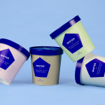
Mister by Brief
Mister crafts all natural, artisanal and seasonal ice cream from its location on Mainland Street, Vancouver, using a liquid nitrogen technique that rapidly freezes products to create less ice crystals and air compared to traditional ice creams. This gives Mister’s ice cream a richer, creamier and denser quality that does not require stabilisers or fillers. Mister worked with local graphic design studio Brief to develop a...
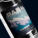
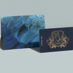
Park Distillery Vodka by Glasfurd & Walker
Park is a bar, restaurant and distillery located in the Canadian resort town of Banff, within the Banff National Park, and the province of Alberta. It is a region of diverse natural beauty, with mountains, prairies, forests and desert badlands that attract walkers, campers and skiers. Park Restaurant is a celebration of Banff’s alpine history and lifestyle. This runs throughout its interior, campfire-inspired menu and a...
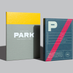
Park Restaurant & Distillery by Glasfurd & Walker
Park is a bar, restaurant and distillery located in the Canadian resort town of Banff, within the Banff National Park, and the province of Alberta. It is a region of diverse natural beauty which includes mountains, prairies, forests and desert badlands, and that attracts walkers, campers and skiers locally and internationally. The restaurant is a celebration of Banff’s alpine history and lifestyle. This runs...

Torafuku by Brief
Torafuku has a simple yet adventurous menu that reinterprets pan asian flavours as modern shared dishes. These are made from good quality and locally sourced ingredients, which are complimented by a variety of contemporary cocktails, a carefully curated wine list and local craft beers. Torafuku is located on the border of Vancouver‘s historic Chinatown and features an open and reductive urban interior space of leather upholstered benches, light...
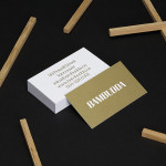
Bambudda by Post Projects
Bambudda is a contemporary Chinese restaurant, located in Vancouver’s Gastown district, with a menu that mixes Hong Kong and southern Chinese cuisine with a modern interpretation of Dim Sung. Design agency Post Projects recently developed a brand identity for the restaurant—which included a logo, menus, stationery and website design—based around a simple but unexpected logotype set in Timonium....