Faculty Brewing Co. by Post Projects
Opinion by Richard Baird Posted 8 September 2016

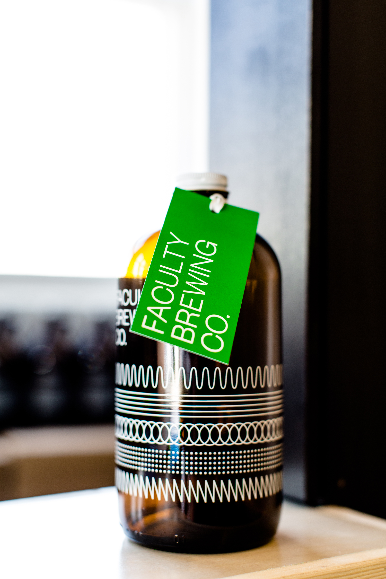
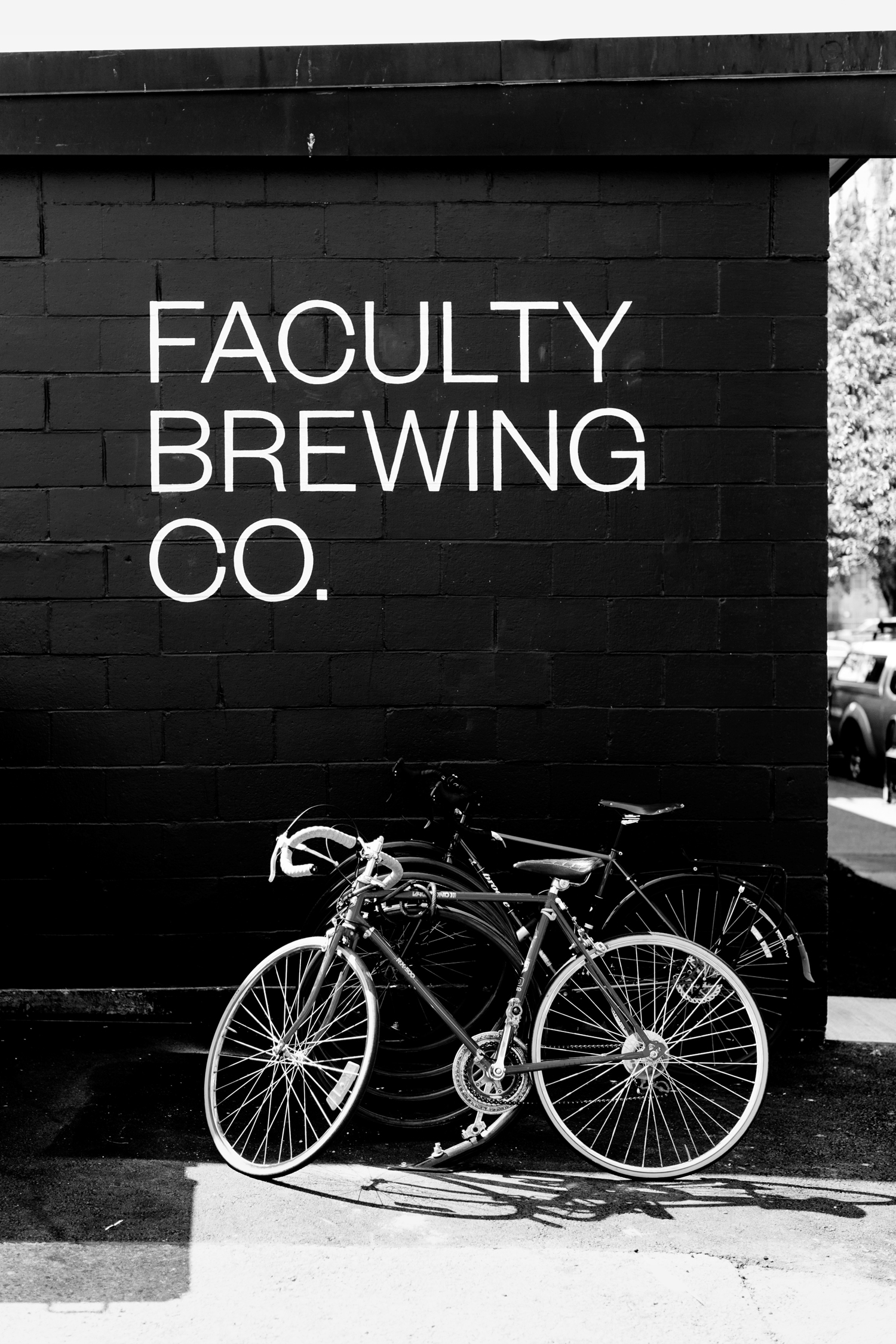
Faculty Brewing Co. strives to create an open and collaborative environment where visitors, of all levels of expertise, can learn about how craft beer is made with the intention helping them to navigating Vancouver’s thriving craft scene. The brewery boasts a 7 barrel, 1450 square-foot brewery with 6 fermentors, 6 bright beer tanks and 28-seat tasting room with an industrial and utilitarian interior design. It also features a brand identity created by local design studio Post Projects which reaches across packaging and signage.
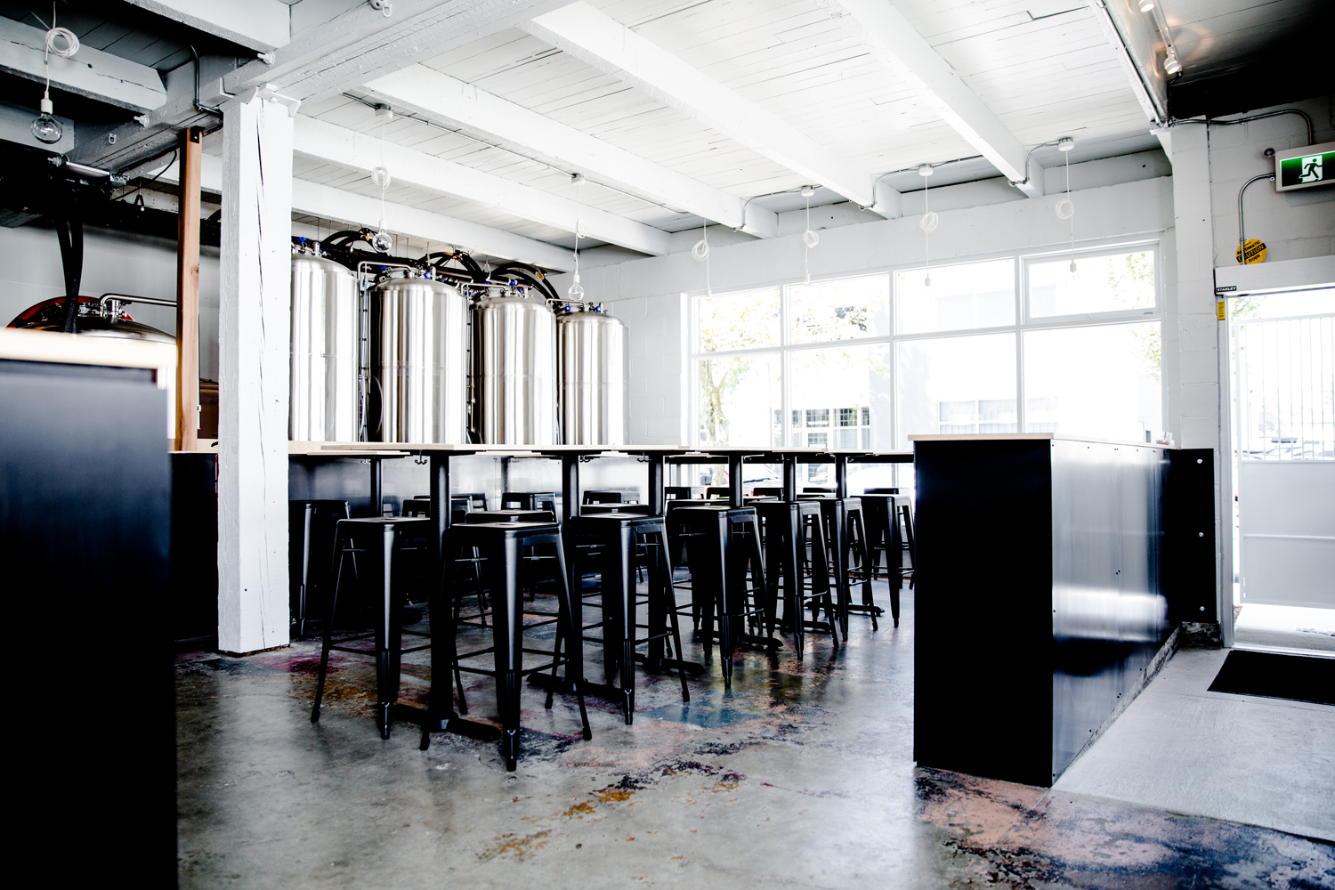
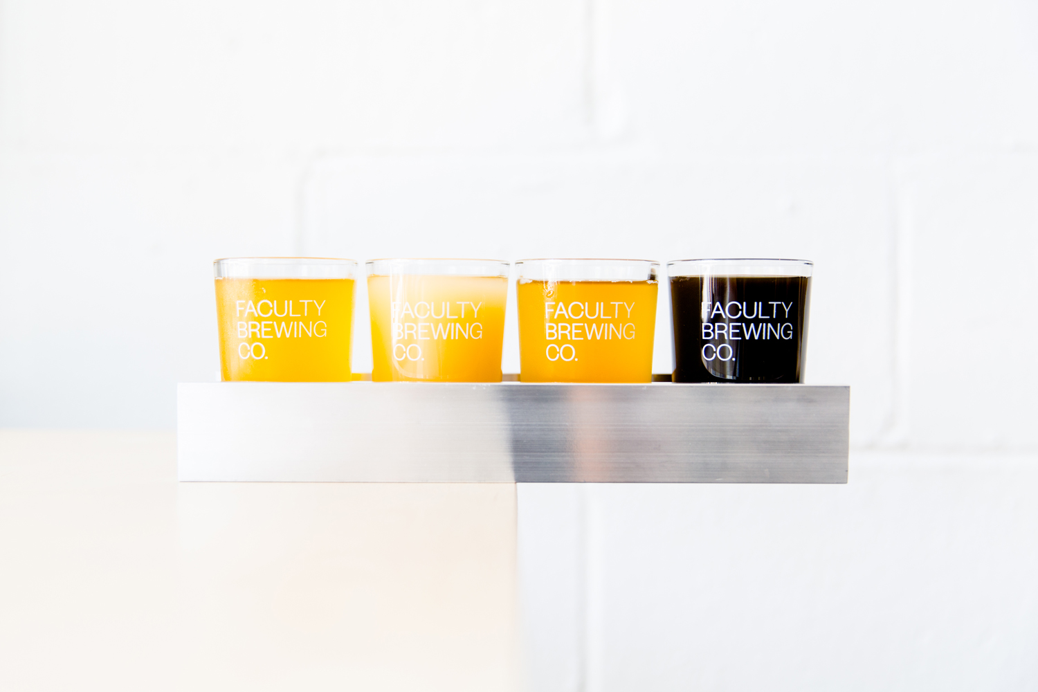
Faculty Brewing Co., as the name implies, was set up by a professor who wanted to educate and empower people with craft beer knowledge, and the idea that the brewery would share all the information behind the brewing process, including recipes. Beer from Faculty is sold pre-bottled from its own bar, offers the filling of growlers and sells kegs to pubs and bars. These services underpin the brewery’s brand identity, which is characterised by modern utilitarian and industrious approach to type, signage and interior design which is less about high-street retail and more about an onsite experience.

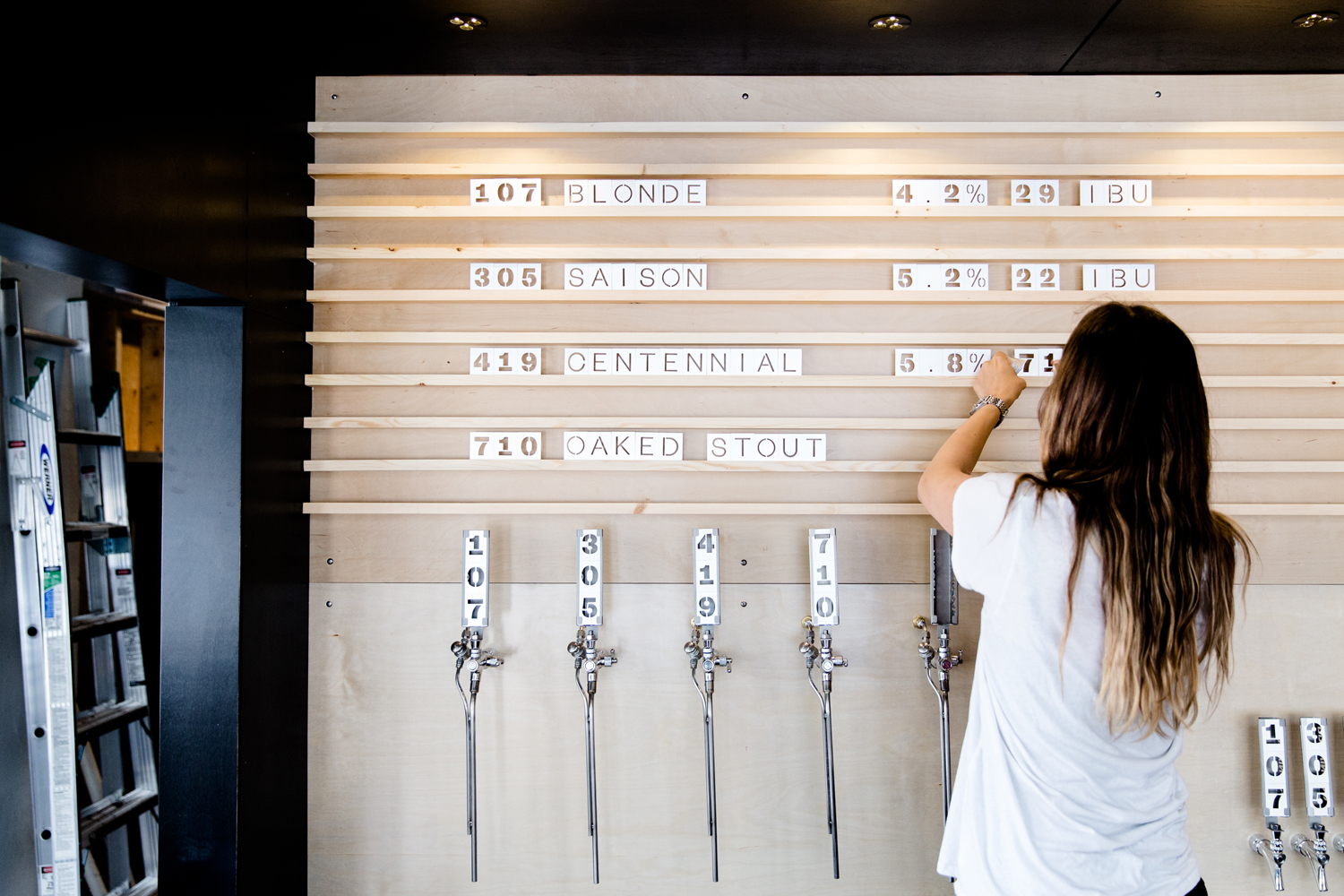
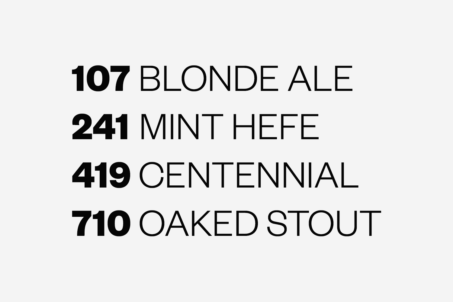
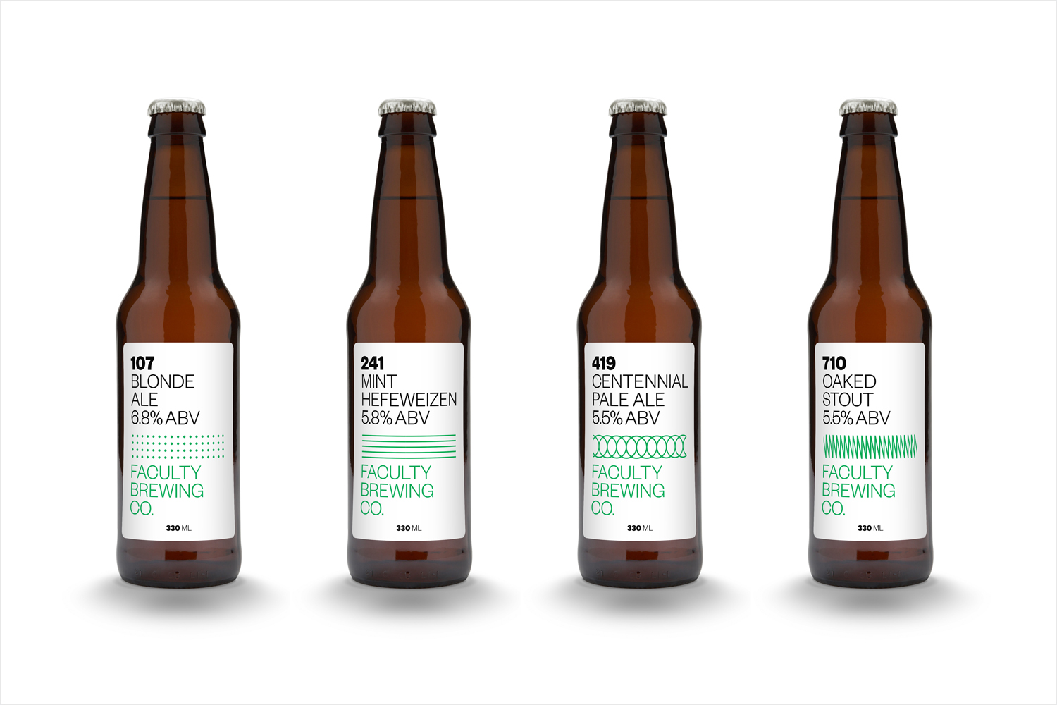
Type, used in two weights, appears as a contemporary and practical choice, retaining much of its character when cut into type blocks or beer taps, a particular highlight. The absence of typographical ornament is in keeping with an educational visual vernacular. This also plays out within a numbering which system which takes its inspiration from the way universities and colleges identify courses by their degree of complexity and necessary. This appears to have also informed pattern.
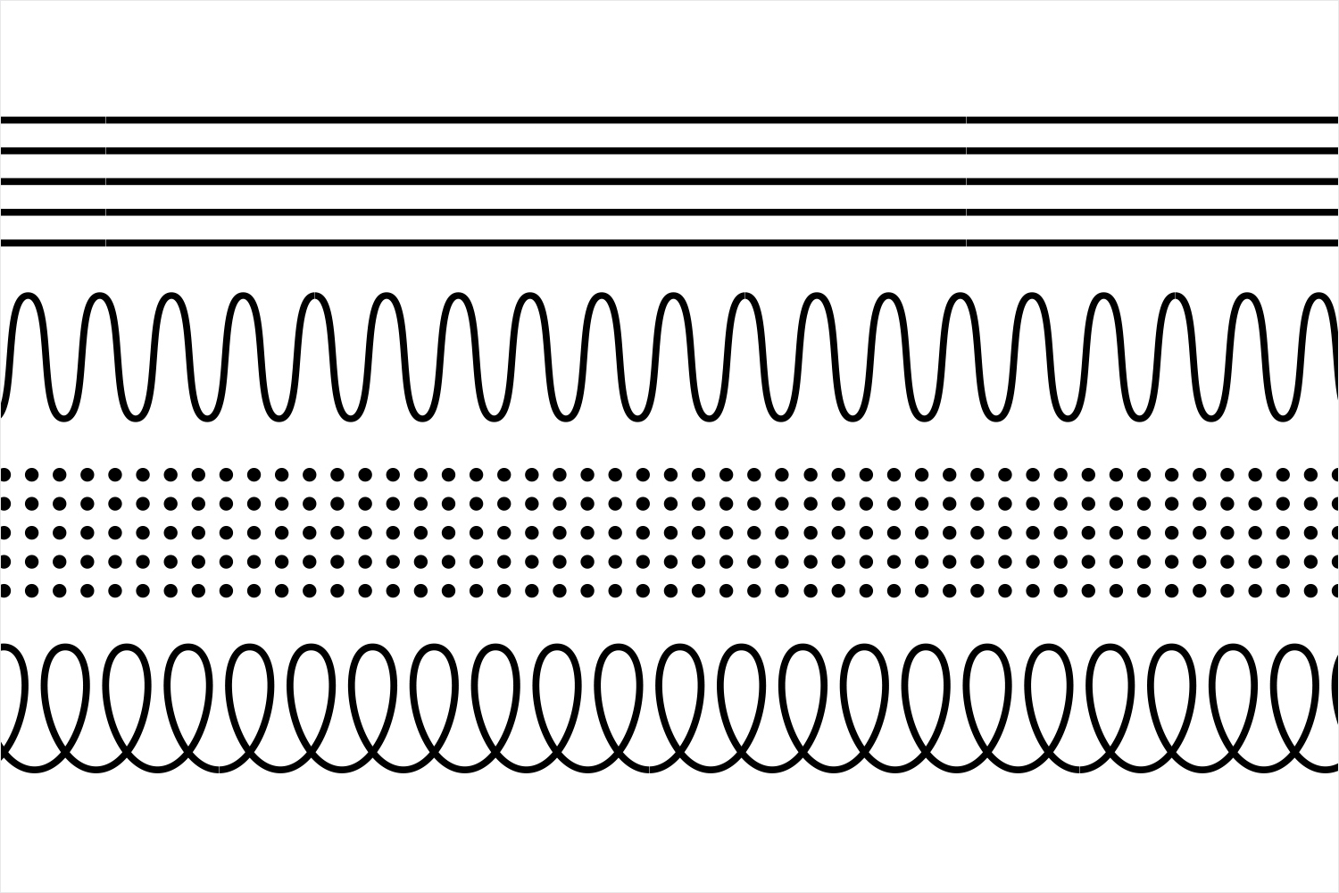
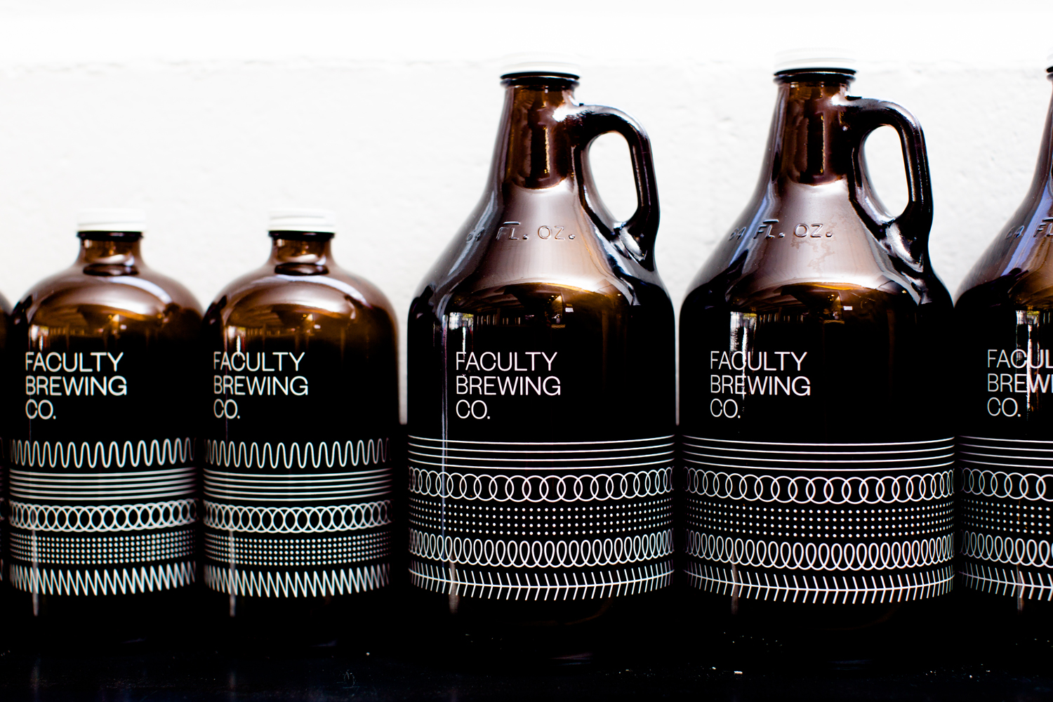
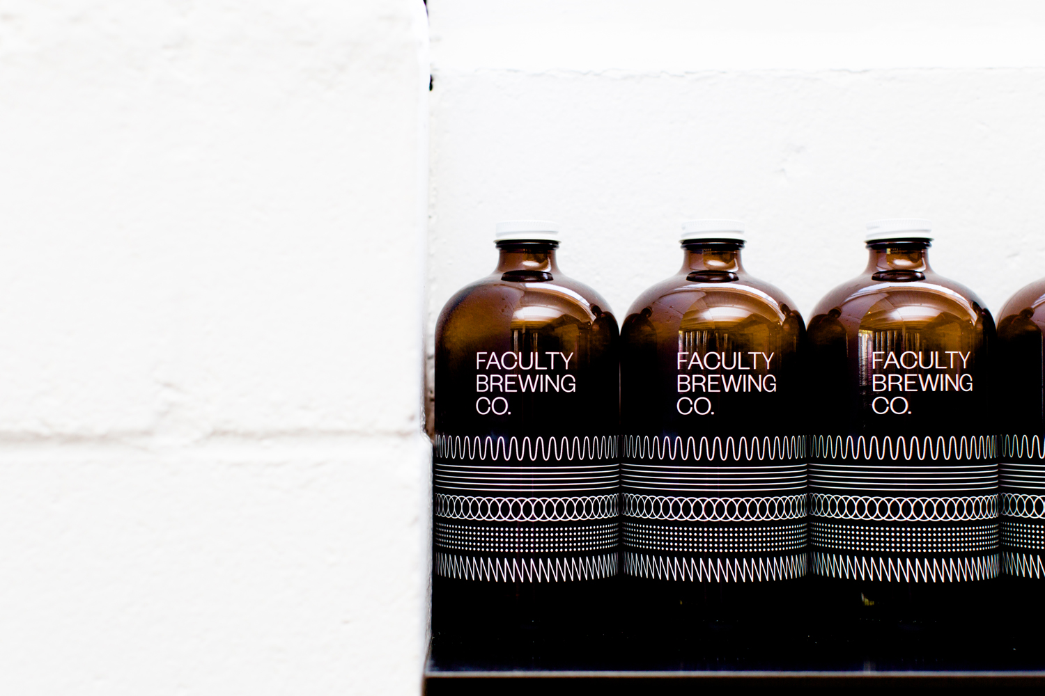
It is tempting to draw some conceptual or communicative value from pattern; perhaps a reference to process or collaboration, the complexity or flavour profile of each beer, or perhaps a connection with the oscillators of a lab, however, these offer more of a pleasant aesthetic flourish, appearing as a distinctive and unusual screen print across the dark glass of the growlers, or functioning to mark out different beer types across bottle labels. More from Post Projects on BP&O.
Design: Post Projects Opinion: Richard Baird. Fonts In Use: Founders Grotesk.
