Smets by Coast
Opinion by Richard Baird Posted 8 March 2012

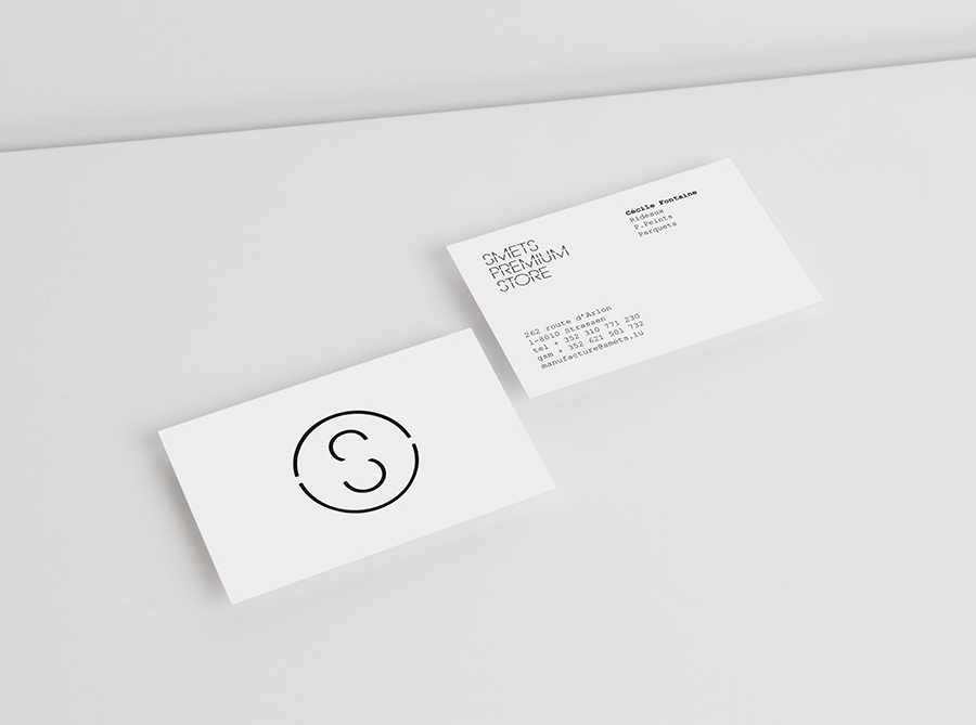
SMETS is a luxury department store located in the heart of Brussels (with two more locations across Luxembourg) with over 3.500 square metres of fashion, design, art, food and beauty. Following last December’s BP&O review of the SMETS identity, independent design agency Coast has recently published some further images outlining how this new visual identity has been executed across a wider variety of collaterals and touch-points.
“Our challenge was to bring the brand to a level consistency across all platforms, creating bridges between art, design, fashion and food. Our positioning work digged deep into the brand attributes, and our creative work resulted in a playful and consistent system of typeface, colours and symbols.”
“To ensure singularity and consistency, we have created a custom-made typeface called SMETS VOID. A typeface bringing together the world of art, design and fashion under one umbrella. This typeface, used throughout all applications and brand names (SMETS PREMIUM STORE, BOWERY restaurant,S BAR) is uplifted by the use of striking fluorescent colors and custom-made symbols.” – Coast
I really like the stenciled/strike through, mono-line weight execution of the logo-type, roundel and illustrations that while not entirely unique work very well to resolve the aspects of art, architecture, design and retail. The simple construction of the logo-mark has a nice balance of interior space and appears very modern and urban especially when juxtaposed alongside a bright and bold spray paint device that looks like a genuine practical effect rather than one that was computer generated. The use of Courier feels appropriate within such a functional retail space and delivers a classic and almost editorial/art-house sensibility that contrasts well with the uppercase format of the proprietary Smets Void typeface.