Atelier AF by Blok
Opinion by Richard Baird Posted 24 August 2012
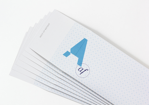
Atelier af is an international art consultancy and publishing firm based in Mexico City. This month the company launched a new visual identity based around an unusual and unique double monogram, created by independent and multidisciplinary design agency Blok, that fuses and contrasts forms that convey classic artistic ideals such as emotion, individuality and expression and the modernistic themes of systems, pragmatism and objectivity.
“The company’s initials derive from the last names of its founders, two women whose vision is to bring new thought and a different perspective to the world of contemporary art. The ‘A’ captures their intent to create a bold stamp on their profession, while the geometric cut within the letter represents the point of interaction between art, life and business.” – Blok
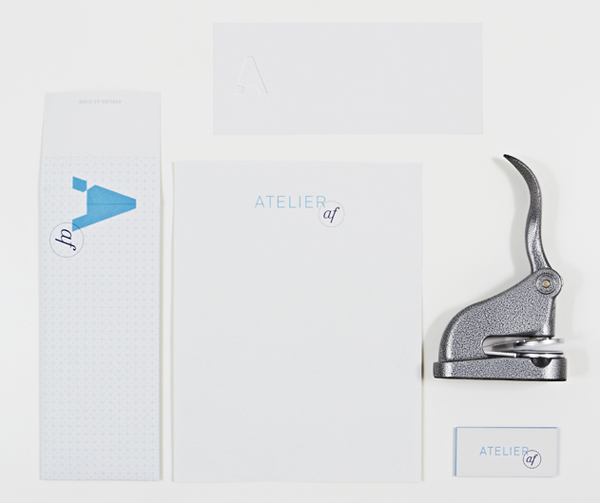
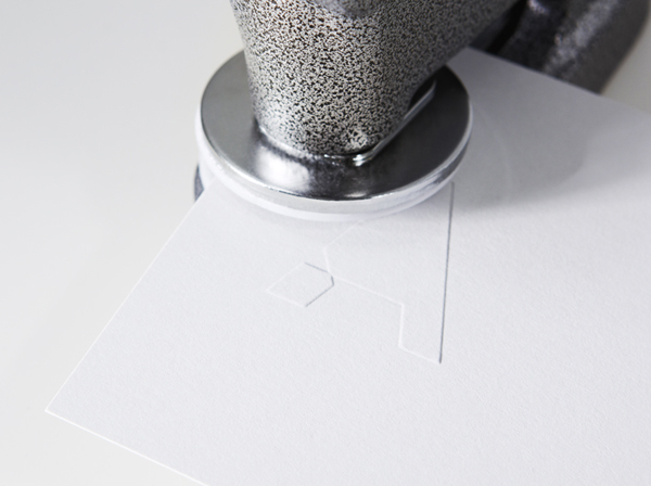
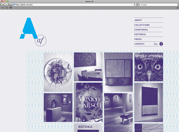
There is a clear and contrasting duality to this identity that neatly runs through every aspect of this project influencing colour, form, print and material choices that make this project an interesting and communicative piece. The elemental and triangular constituency, absence of a counter (creating a sense of open internal space) and simple cuts (adding a structural dimensionality) of the A deliver a clear architectural sensibility that, alongside the technical qualities of a finer, neutral san serif logo-type and light geometric grid-based backgrounds, hint at a more pragmatic approach to contemporary art based services. The italics, lowercase letter-forms, ligatures and circular form of a roundel, executed across and intentionally opposing the practical and elemental qualities of the A, introduce a far more personal, dynamic and classic aesthetic balance that appropriately reflects the experience and passion of Atelier AF’s founders.
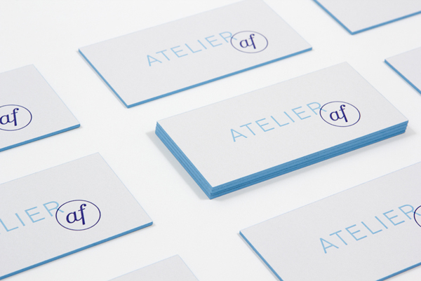
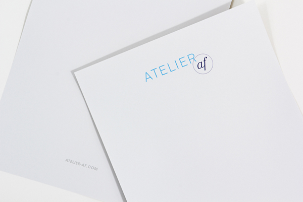
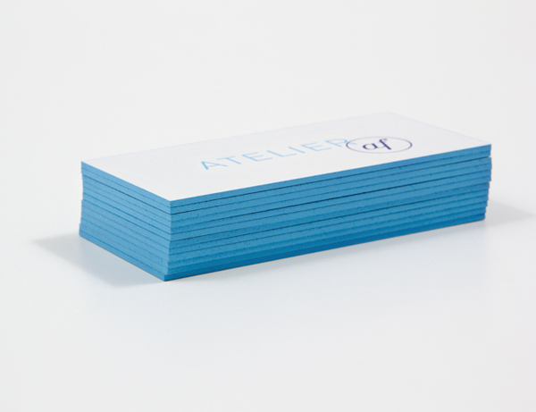
Like the graphic components of the visual identity the colour palette juxtaposes the architectural, professional and innovative associations of a sky blue, the restraint and modernism of ample white space and the creativity and richness of a deep purple. The heavy board, classic edge detailing and wider design of the business cards makes for a smart union of modern authority and classic knowledge while the overprint stamp-like print treatment and hand-embossed finish of the stationery introduce a subtle sense of craft, individuality and personal service.
