Hardpop by Face
Opinion by Richard Baird Posted 9 November 2012
Hardpop is an electronic music venue located in the Mexican city of Juárez that plays host to both international and national DJ’s. Their new brand identity, a contemporary interpretation of classic military insignia, familiar and unusual typographic forms, print that reflects the contrasting nature of the name through material choice, colour and print finish, was created by design studio Face.
“No introduction needed for Hardpop. One of the best clubs in the world (named twice by DJ Mag), after 6 years it was in need of a little upgrading; a touch of minimal and modernism, along with some obscure, mysterious elements, but nonetheless aesthetically perfect. Based on german military symbols, modernist typography and a very swiss-german layouts, we re-created this iconic identity giving the brand a “facelift” that evokes both the classic and modern styles you can find inside its walls.”
– Face
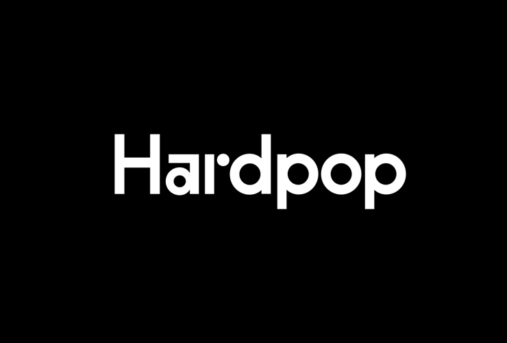
Like the almost antithesistic compounded nature of the name, Face’s identity solution is a contrast of aesthetics. This is perhaps most notable within the logo-type’s mix of conventional geometric letter-forms and the unconventional square arc detail of the ‘a’ and the isolated geometric ball terminal of the ‘r’. This union of standard and unique characters occurs throughout an expanded typeface delivering a contemporary, eclectic and left-field sensibility rather than the authentic but tired calligraphic-based selection of the venue’s previous identity.
Clearly borrowing cues from military history and heavy metal, the union of horizontal and vertical strokes, heavy but consistent line weight and square terminals of the eagle symbol – qualities shared by the logo-type – retain the strong posture and masculinity of the original but favour geometric simplicity and sharpness over illustrative detail and curves. It appears far more contemporary and neatly distils some of the musical qualities of minimal techno while achieving a distinctiveness and originality but with a subtle layer of authoritative history and nationalistic pride – references I personally do not mind but would be interested to read any alternative opinions.


The duality of the name resonates well through a monochromatic colour palette and a lovely contrast of raised gloss thermographic ink detail—which delivers a wax seal and historic quality that compliments the eagle—delivered across an uncoated substrate with a sharp die-cut edge detail that introduces a subtle sense of craft that continues through the poster images, their layouts and stickers.
It is a solid mix of graphic design, material and print choices that confidently reflect the unique personality of the venue and compounded nature of the name. It sets an underground and authoritative tone but delivered with the polish and consistency expected from a world-renowned venue.