Logo and Branding: Revolver
Posted: November 28, 2012 Filed under: Logos & Branding, Music, TV & Film | Tags: Art, branding, Branding News, Business Card, design, graphic, graphic design, identity, logo, logo news, logo-type, packaging, review, Revolver, richard baird, stationary, Sydney, Toko, typography, visual identity 4 Comments »
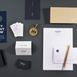
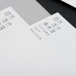
Revolver is an Australian film production company with a string of awards and a diverse collection of directors and producers. Their visual identity, refreshed by Sydney-based independent design agency Toko, is a simple, clean and coherent expanding logo-type solution – built from the single, well spaced, all uppercase sans serif Helvetica – that utilises a ‘This Is’ prefix to bind, through typographical consistency, a variety of communication and the directors. Its over-sized application alongside finer details, full bleed, bright neon spot highlights and the juxtaposition of both vertical and horizontal layouts across the collaterals introduce a creative and multi-perspective sensibility that keeps the solution from appearing too corporate.
Visit the BP&O Logo Gallery for a chronological guide to all the identities reviewed on BP&O.


If you liked this you may also like:


I haven’t a problem with Helvetica and do like its execution but can’t deny there are plenty of similar but slightly more distinctive choices that may have given this more of a proprietary vibe? Do you agree?
Reminds me of — Revolver-Art but not as good.
I guess that’s the risk you run with an over-sized sans serif, it’s common although not always well executed which I felt this has been.
I think choosing a different sans serif could be that something ‘extra’, something with a slightly more unusual cut.
(http://www.a2-type.co.uk/)
But yes, well executed!