Sweet Greek by Studio Brave
Opinion by Richard Baird Posted 22 January 2013
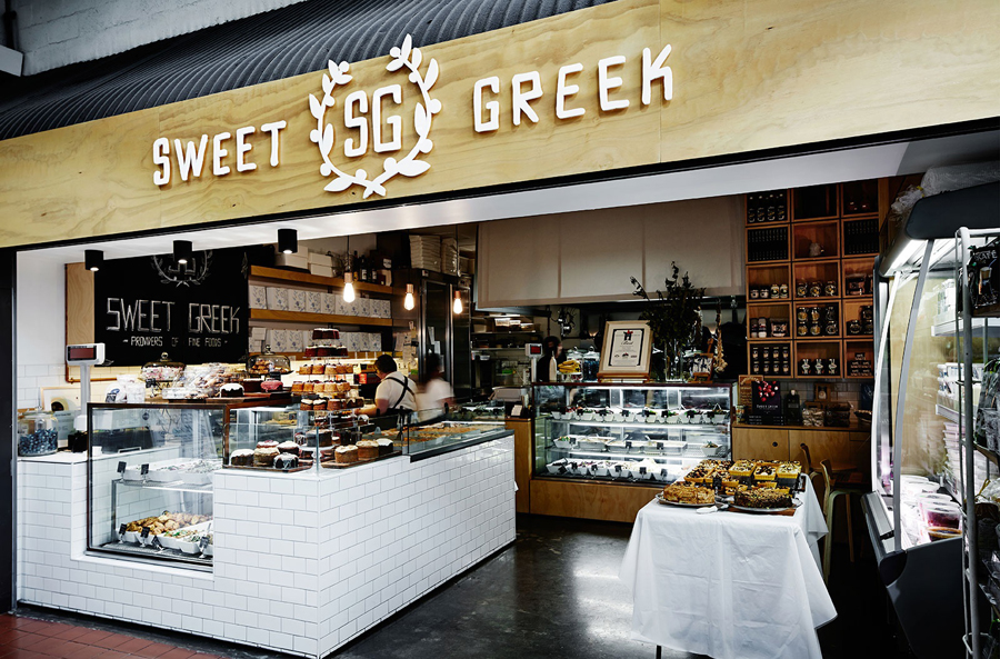
Sweet Greek is a food store run by Kathy Tsaples, located in Melbourne’s Prahran Market, that sells classic sweets and authentic, freshly baked, ready-to-eat Greek cuisine. The store’s visual identity, created by Studio Brave and Elise Lampe, mixes the loose and personal qualities of a hand rendered logo-type and monogram with illustrations of meats, olives and laurel wreathes. Executed across a tactile, uncoated board with elements associated with craft such as string, stickers, the texture of a hand stamped print finish and a single, economical, cobalt blue—reminiscent of china dining sets and the Greek national flag—these elements convey a culinary honesty representative of authentic products made from simple, local and good quality ingredients.