Domestic Parcels by Interbrand
Opinion by Richard Baird Posted 17 April 2013

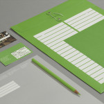
Interbrand’s Melbourne office have recently completed the design for Australia Post’s new domestic parcel range. Developed to aid the continuing increase in on-line shopping the solution provides a more ‘straightforward, hassle-free’ design language that builds on AP’s new identity system – also created by Interbrand – by taking an expected but well executed utility of ample white space, large stretches of flat colour, a clear, consistent and communicative format, iconography and simple language choice and fusing these with the subtle, proprietary detail and contrasting sizes of a custom sans-serif typeface.
“Our designs were borne out of the idea that delivering a parcel should be as easy as 1, 2, 3 – for consumers and small-medium businesses alike. Selection choices have been consolidated and simplified. With helpfulness in mind these new parcels have been designed to follow a consistent, clear hierarchy and colour coding system, giving customers a more intuitive way of finding the most suitable service to get their parcels from A to B.
Creative Director Oliver Maltby explains, “All parcel designs were created using elements from the new identity system. An original typeface was developed and implemented consistently across the range to aid navigation. The role of red was determined to call out the most important navigational aspects – the size of the parcel, plus the requirement for a customer signature, where necessary. A simple suite of icons was included to aid navigation.”
The launch of this new range of domestic parcel products is part of an exciting brand refresh for Australia Post. The role of existing brand elements has been revisited and new elements introduced.
Executive Director Nick Davis adds, “The brand is designed to be extremely helpful, and these parcel designs epitomise the new customer experience we are working to develop with Australia Post. Very simply, the whole brand revolves around being helpful.” – Interbrand
The difficulty in achieving a proprietary quality whilst retaining a communicative simplicity is why I have a particular love for all things utilitarian. Here the need for consumer understanding and brand association alongside the functionality and effectiveness of the service it navigates leaves little room for significant distinction. Instead it relies on the subtitles of type and the clear practicality of colour and size to resolve these two considerations. It is perhaps not what you might expect to find on inspiration site nor is it conventionally/aesthetically beautiful, I do however believe it is a solid and inspirational piece of design that is certainly worth sharing.