Feral Sphere by Mind
Opinion by Richard Baird Posted 7 October 2013
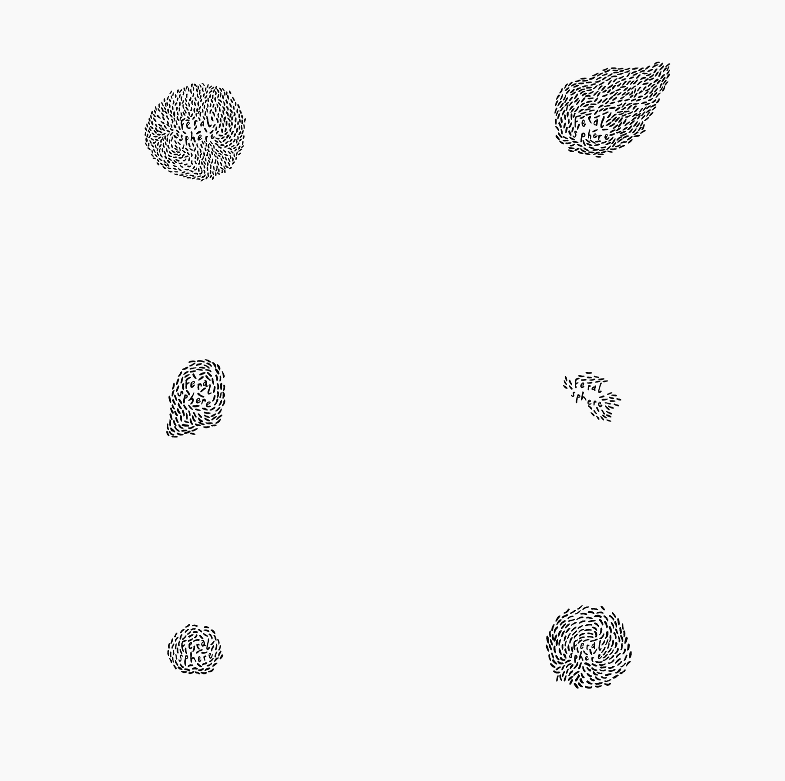
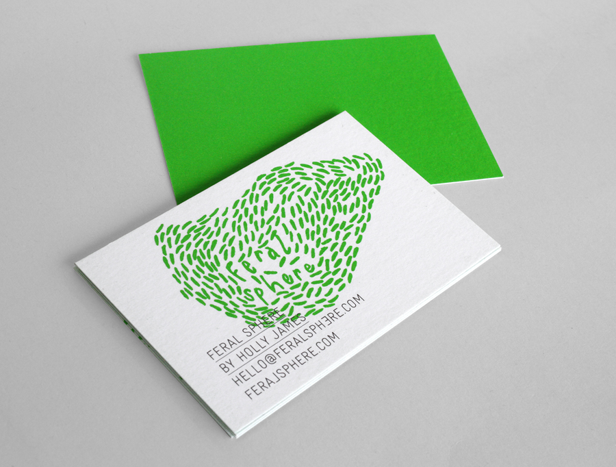
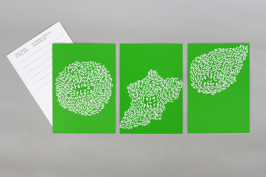
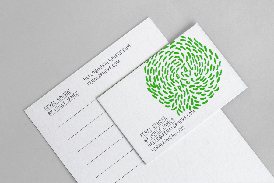
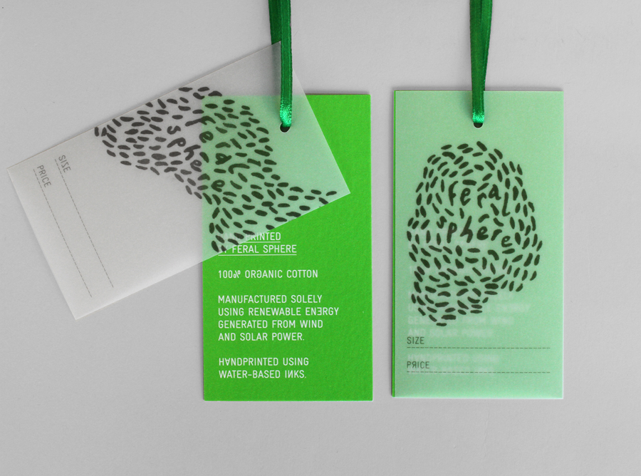
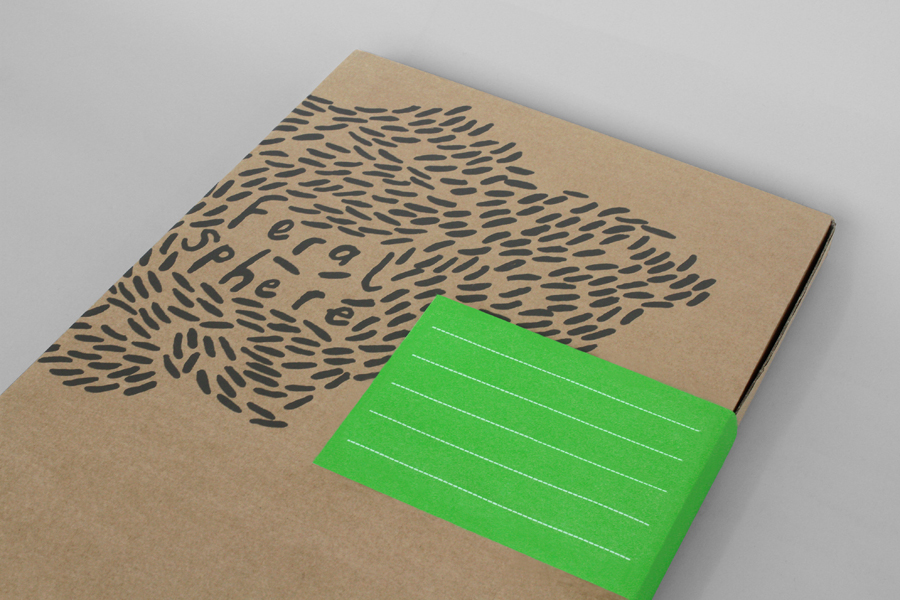
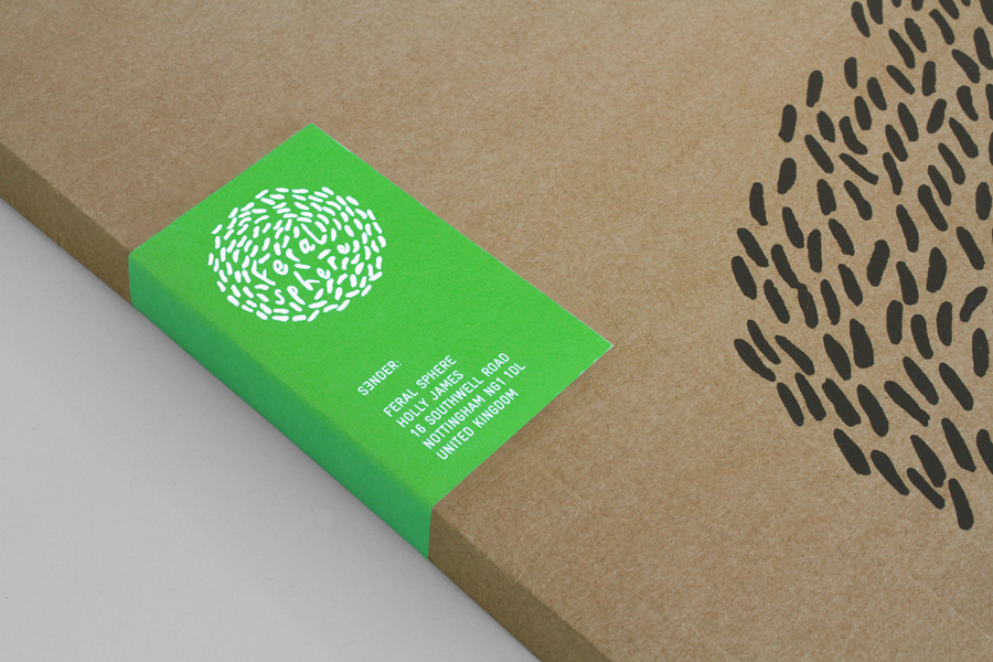
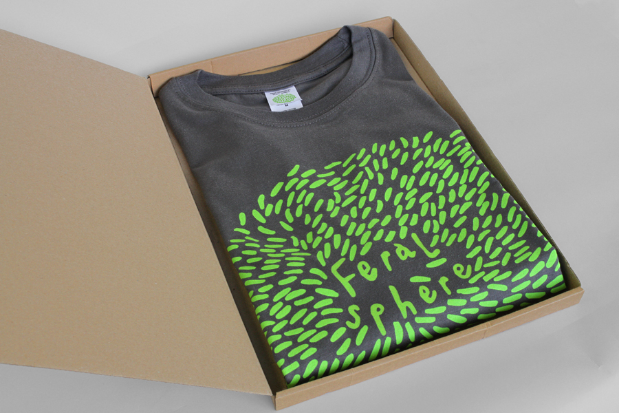
Established by Goldsmiths graduate Holly James earlier this year, Feral Sphere is a UK-based fashion label that creates simple, colourful and comfortable clothing and accessories made from organic cotton using 100% renewable solar and wind energy. The label’s brand identity and packaging solution, created by Mind Design working in collaboration with illustrator Lenia Hauser, was “inspired by Japanese Shinto spirits and the ghost in the TV series ‘Lost'” and utilises what Mind describe as a ‘many logos and none solution’, a technical typographic detail, an earthy material choice and the contemporary economy and impact of a green and black ink combination.
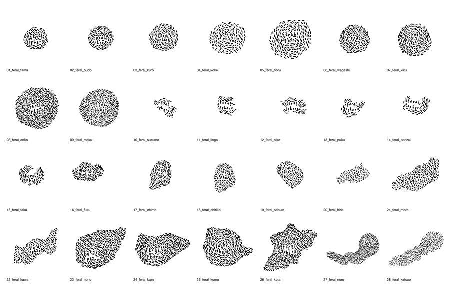
While I am not quite sure I get the Japanese Shinto reference within the context of the fashion label I can appreciate the aesthetic and communicative value that emerges from it.
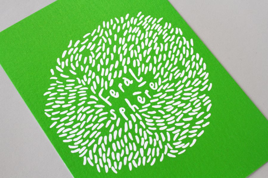
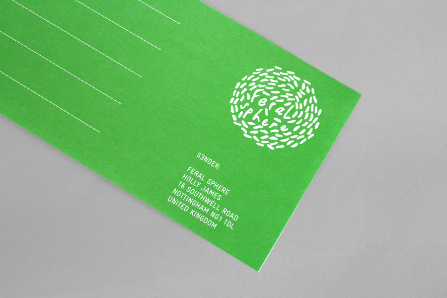
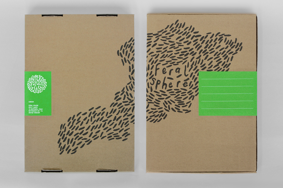
Lenia’s illustrations look great. These have plenty of natural hand drawn character, and a fluid sense of motion as an animated logo but also in its various static forms. They feel distinctive, personal and crafted with a similarly styled typographical detail that sits well at the centre. Swooping swallows, swarming bees, multiplying organisms, wind currents and cloud formation all come to mind and clearly draw from nature, a direction that feels appropriate for a brand with such a sustainable commitment. The illustrations work well across business cards, packaging, notecards and tags.
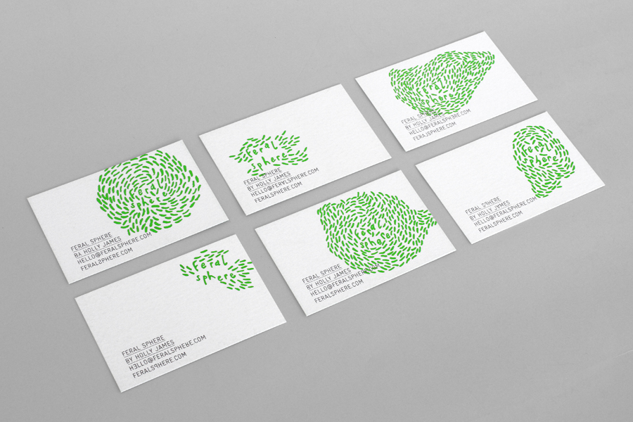
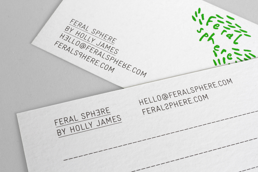
In stark contrast to the illustrations the fine line weight of an uppercase sans-serif choice introduces a rigid technicality and consistency to the identity and perhaps a more reliable corporate sensibility needed for growth into stores. This is tempered slightly by the small typographical quirk of backwards facing and upside down letters, an element described by Mind as “representing those people who can see ghosts or spirits”. It is an unusual detail set within such a cold, functional type choice and I am not entirely sure it works as intended but it does, however, have a clear practical/playful duality that works well for basic clothing items that have colourful prints.
A print treatment that utilises the economy but impact of a fluorescent green spot colour, black ink and uncoated unbleached, recycled board boxes, functions well to resolve the simplicity and bright colours of the garments and the environmental commitments of the brand in a contemporary and intelligent way.
