Håndværk by Savvy
Opinion by Richard Baird Posted 18 December 2013
Håndværk is a New York based clothing brand that mixes craftmanship, minimal elegance, premium materials and innovative fabrics to produce high quality everyday essentials for both men and women.
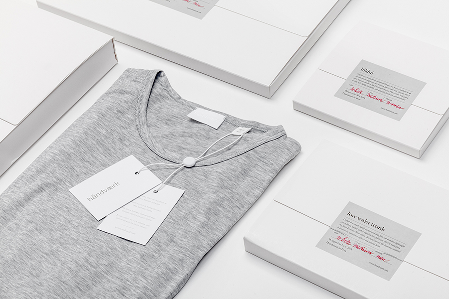
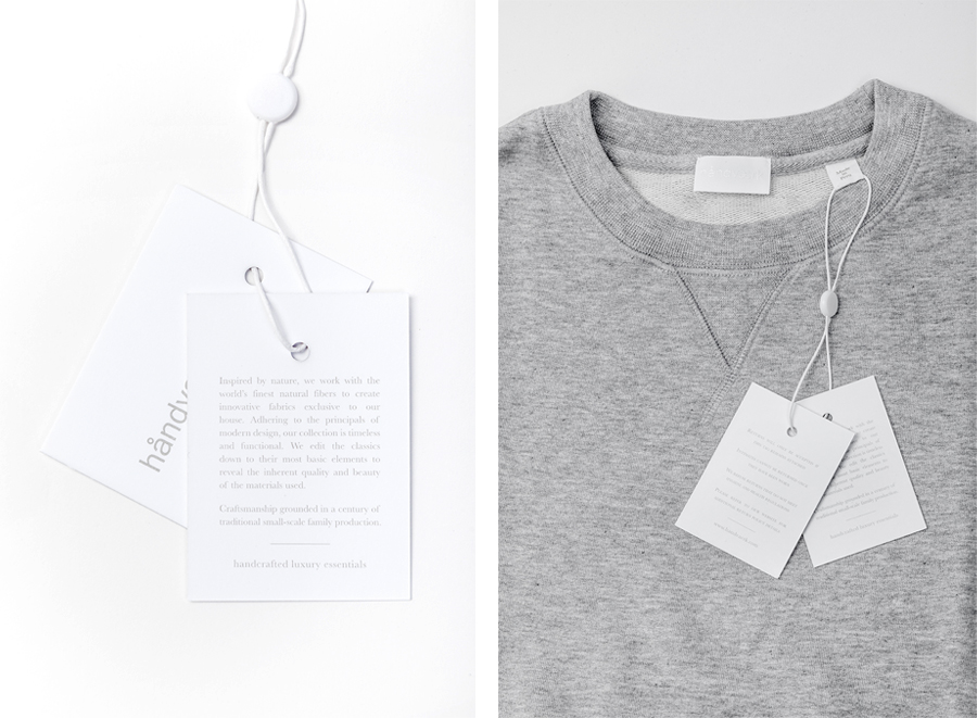
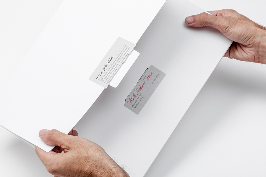
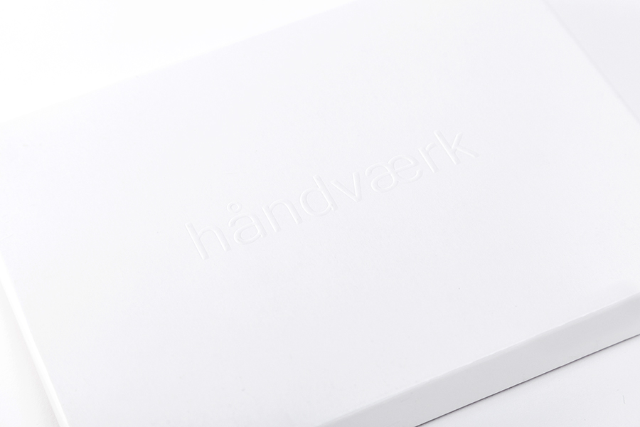
Designed by Savvy, Håndværk’s new brand identity—which includes a logo, swing tags and packaging solution with a blind emboss detail—conveys the brand’s elegant and elemental nature with what Savvy describe as clean lines and a simple typographic approach based on “minimal scandinavian and japanese aesthetics”.
“Håndværk’s products, simple in their aesthetic nature, use only the best quality materials, mostly perceived through touch. We have communicated this through a graphic language that is based on minimal aesthetics, predominantly white. Their principle of simplicity and upmost quality is always reflected in all supporting materials, from their packaging to the language used for their texts.
Through simple yet elegant finishes, such as embossing, we achieve to communicate key brand values of simplicity, luxury, quality and truthfulness – it’s about communicating in a subtle manner; just like these values, it’s about understatement through its tactile principle. A functionality that blends with its aesthetics. Understated luxury essentials.”
– Savvy
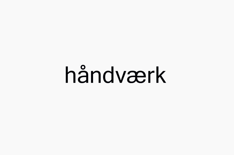
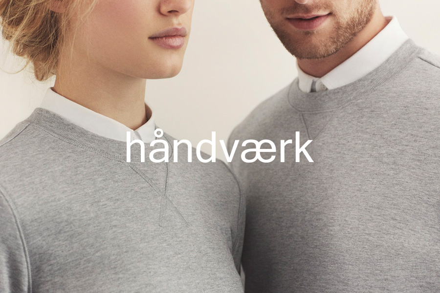
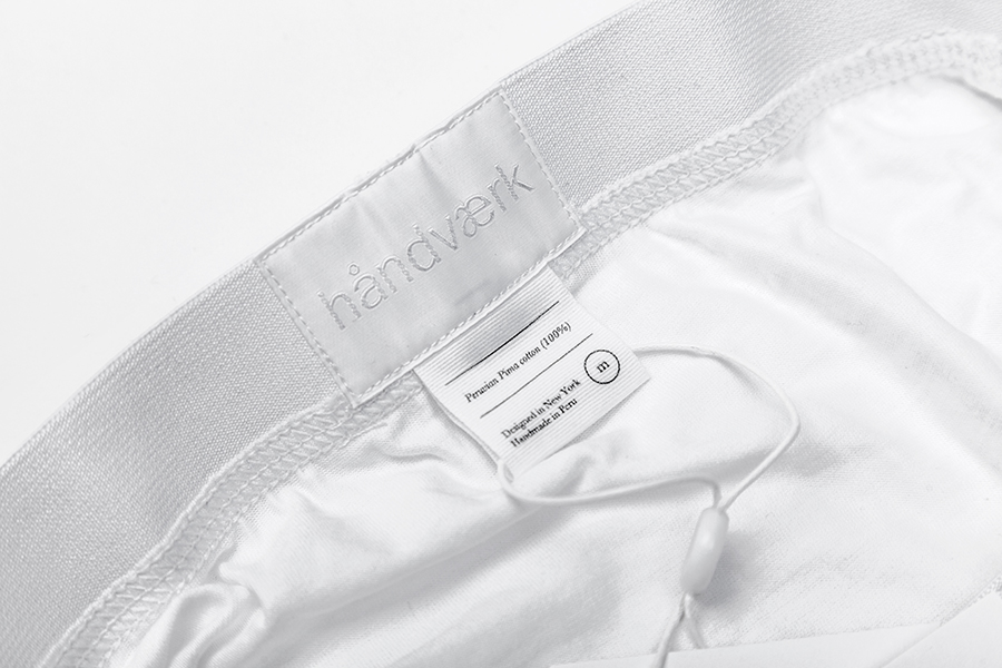
Although the well spaced, consistent weight and all lowercase sans-serif characters of the logotype, set in what looks like Trade Gothic Next, are reflective of the basic, essential and accessible nature of the line, it is the name and the å and æ characters contained within this that really establish a Scandanavian tone and leverage the high quality design expectations foreign markets have now come to associate with the region.
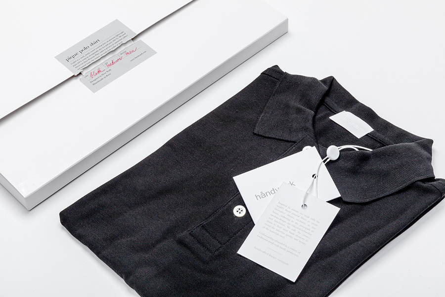
These values are effectively built upon through the logotype’s confident execution as a blind emboss across the open white space of a structural choice with a portfolio and lookbook-like quality that introduces a subtle layer of contemporary high fashion without appearing superfluous.
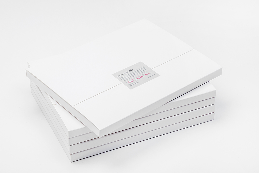
The typographic density of the label delivers significant contrast to the unprinted regions of the packaging. A silver sticker, mirroring the utilitarian grey of some of the garments, carries the serif and italic detail of New Baskerville and a hand written script—picked out in a bright red—to neatly convey traditional values of high quality, fine detailing and handcraft.
The handwritten element (alongside the other treatments) essentially infuses what might be perceived as a commodity item with a limited batch produced value which is further enhanced by placing a weight on the provenance of design and manufacture set just below.


A product naming convention with all lowercase letters and a recurring circular motif—taken from the å—which appears as buttons, size details and string ties on the labels are small but considered details that tie everything back to the few but distinctive elements of the logotype.

