Stephenson Personal Care by Robot Food
Opinion by Richard Baird Posted 16 June 2014

Stephenson Personal Care is a fifth generation family business which has been making soap bases from top grade, renewable, ethically sourced ingredients since 1856, yet remain innovative and ambitious. Over this time Stephenson have built a broad customer base that includes multinationals, supermarkets and hobbyists. Stephenson recently worked with Leeds based design studio Robot Food to develop a new brand identity and flexible packaging treatment that would place their significant heritage and experience at the heart of communication, convey the concept of ‘creative chemistry’, support their international ambitions and would be sensitive to both their blue-chip and homecraft markets.
The Stephenson logotype is informed by some clear communicative priorities. Its bold, uppercase, geometric letterforms — based on what looks like Brandon Grotesque — have a practical and efficient sensibility that is tempered slighted by rounded corners and generous spacing. Often described as ‘functional yet warm’ this particular type choice, inspired by those of the 1920 and 30’s, works well to establish a clinical accessibility, which is enhanced by colour, and hints at some degree of history. Although the drip as an ‘o’ is obvious and a little superfluous in print it adds a proprietary value to the resurgence and familiarity of these particular letterforms.
The stamp like qualities of the roundel, its light line weight — providing contrast to the logotype — script detail and date effectively resolve traditional values, handcraft and heritage but is rendered with a contemporary eye for space and layout. The geometric sans-serif, executed well across the curve of the baseline, effectively binds the roundel to the logotype when separated while the language choice draws on the creative opportunities the products offer hobbyists.


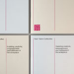
The contrast of heritage and clinical functionality laid down by the logotype and roundel continue across the packaging. Corrugated card, off-the-shelf structural choices, a condensed sans-serif with heavy borders, mechanically stamped labels, the economy of a black ink, plenty of white space and a strong grid based layout establish an industrial utility while the finer detail of an italic, dotted lines, the priority of Facebook and bright spot colour offer a more accessible and commercial dimensionality. The provenance that originated from the craft industry is well utilised, reassuring national clients of origin and leveraging an associated prestige for the intentional market.


The iconography takes what could have been the hard-edged quality of laundry directions and softens it, much like the roundel and logotype, with a light contemporary mono line weight, rounded terminals, plenty of internal space and small detail. Size is used to great effect in print to set a priority over language and efficiently deliver instructions.


Plenty of white space, large clear iconography, a contrast of type, type size, case and colour in print, divides content and establishes a clear and consistent hierarchy of information much like the packaging. These are accompanied by the detail and colour of lab based imagery and raw product shots that clearly reinforce the carefully formulated and base nature of the products.

Robot Food describe their solution as blending science and lifestyle in a way that is clinical but not cold and addresses a wide-ranging consumer base. It is a difficult balance to achieve but one successfully done so here through a variety of familiar but communicative tools (type, image, iconography, contrast, language, material and structural choice), that individually have a ubiquity but united offer distinction. More from Robot Food on BP&O.
Design: Robot Food. Opinion: Richard Baird. Fonts Used: Brandon Grotesque.