Iona Brown by Sam Flaherty
Opinion by Richard Baird Posted 17 June 2014

Iona Brown is a London based contemporary jewellery designer who favours classic simplicity, understated detail, precise finishes and minimalist lines, shapes and materials. Graphic designer and art director Sam Flaherty recently worked with Iona to develop a new visual identity for her expanding collection. Built around a customised logotype and a simple print and packaging treatment that uses few but good quality and contrasting paper and print choices, the solution reflects the key aesthetic and design values that run throughout Iona’s work.

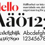
Sam’s approach is one of craft and reduction appropriately informed by the design and philosophy of Iona’s collection. This is perhaps reflected most acutely in the two stroke width and high contrast of the logotype built from the characters of Grilli Type’s Sectra Display and the process of reduction used to customise it. Originally a contemporary serif that mixed broad nib of calligraphy with the sharpness of a scalpel knife, Sam’s modifications, which sees the removal of the serifs and shows consideration of space, appear sensitive to both Spectra’s hand drawn and handcrafted influences and the simplicity and dual weight of Iona’s jewellery.


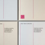
Paper and print finish share some of the ideas that underpin the logotype and provide the broader brand identity with further communicative value. G . F Smith’s Colorplan dark and light grey uncoated boards and the gloss of a white and black block foil print finish, used in the creation of a duplex business card and packaging solution, like the fine and bold strokes of the logotype, continue to develop the theme of contrast and complement, both in aesthetic and ideation, the high quality materials and craft processes used in the design and manufacture of Iona’s collection. The black, grey and white colour palette effectively mixes classic fashion conventions with a more recent urban cool, an approach also shared by the lookbook’s photography and the garments used to dress the models, to draw out the gold and silver of the jewellery.
Design: Sam Flaherty
Opinion: Richard Baird
Fonts Used: GT Sectra & GT Walsheim