Cured by Föda Studio
Opinion by Richard Baird Posted 19 June 2014

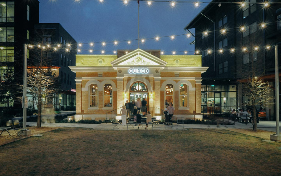
Cured is a restaurant located in the recently renovated Admin building of Pearl Brewery’s culinary and cultural campus in San Antonio. Run by chef Steve McHugh, an expert in charcuterie, salumi and all forms of preserves, the restaurant offers a wide variety of meats cured for between 2 and 10 months.
Föda Studio developed a brand identity for Cured, which alongside logo and print included architectural collaboration, that resolves the history of the location, the time involved in preserving meats, Steve’s community and charity involvement as well as his recent cancer survival, through naming, iconography, custom typography and an interesting interaction component. The project also included menu design, business cards and signage.
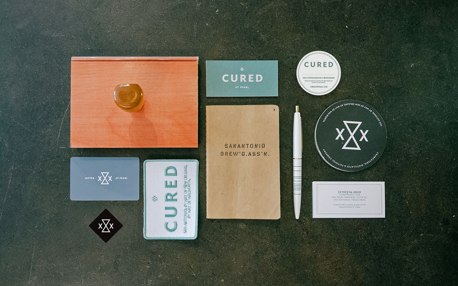
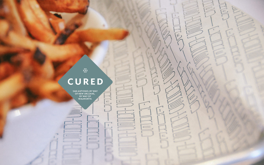
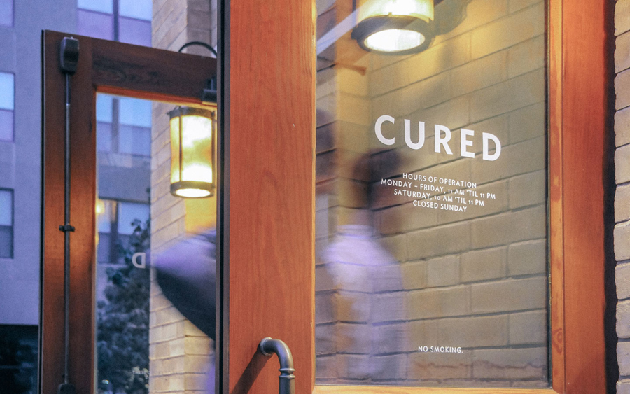
While subtle, the engraved retrospective influence on the logotype’s uppercase characters, which sees very few straight lines, offers an age that resonates well with the traditional practice of curing and the significant history of the building. This is also evident in the stitch badge, style of uniforms and hand painted nature of Cured’s signage. In contrast, while similarly referencing age, time and location, the geometric and reductionist hour-glass shape the xXx — a re-appropriation of a mark long associated with Pearl in Texas — offers a more recent and on-trend aesthetic that recognises the popularity of traditional crafts and local butchery.

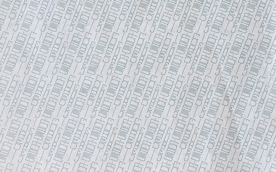
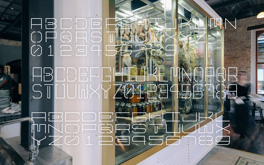
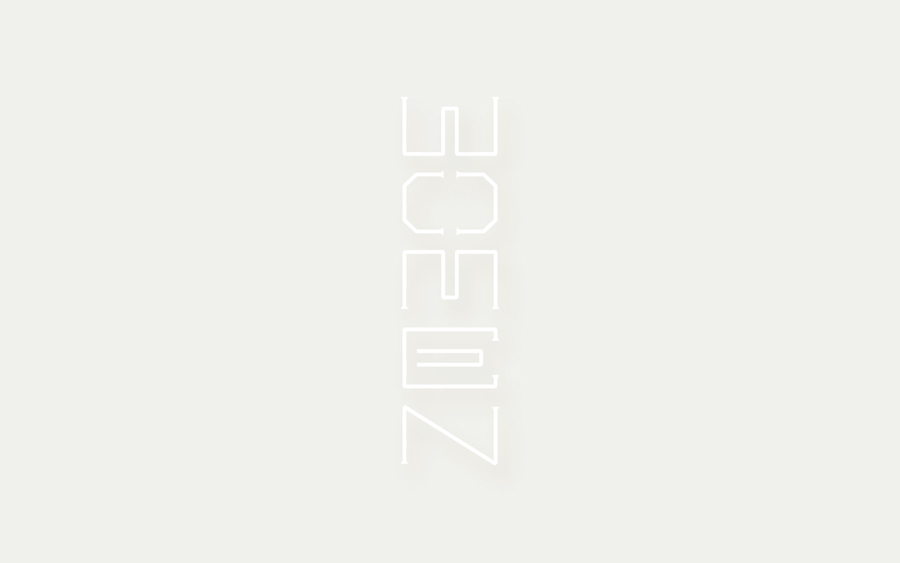
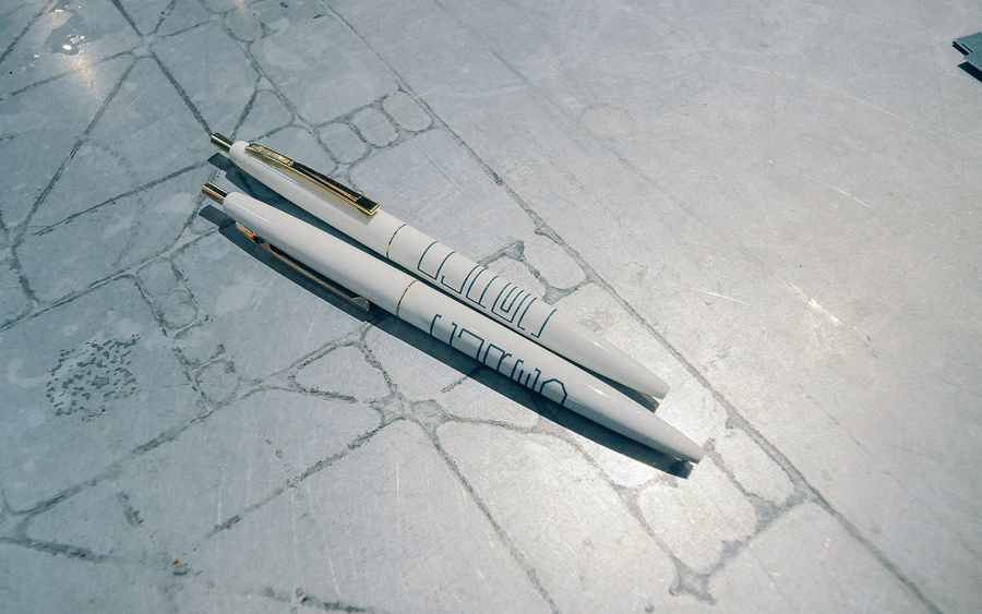
A secondary custom typeface, inspired by the string trussing of charcuterie and salumi as it cures and drawn with consistent line weights, a strong preference for geometry and rendered as three weights, like the mark appear contemporary and although a little difficult to read as part of the way finding system work well as pattern across the butchery paper.
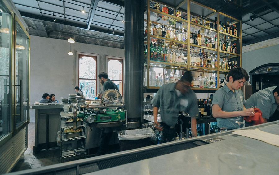
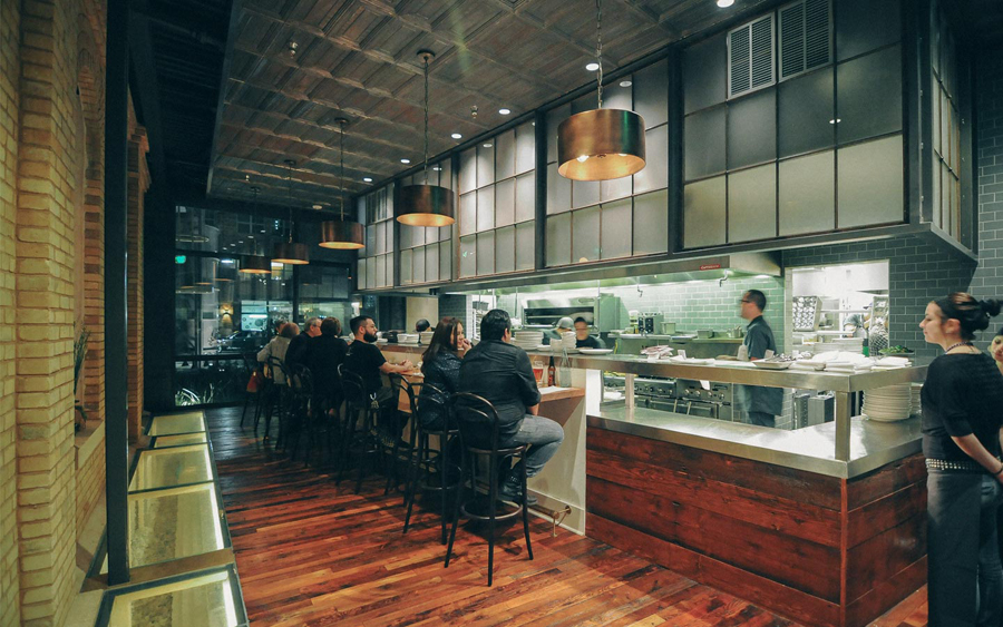
The typographical contrast of weight, traditional and contemporary form and detail, the clear influences of location heritage and the processes and time involved in meat craft make for a rich and communicative contrast. The colour pallete is bland but period in print and looks great within the context of an interior of steel, copper and vintage machinery.


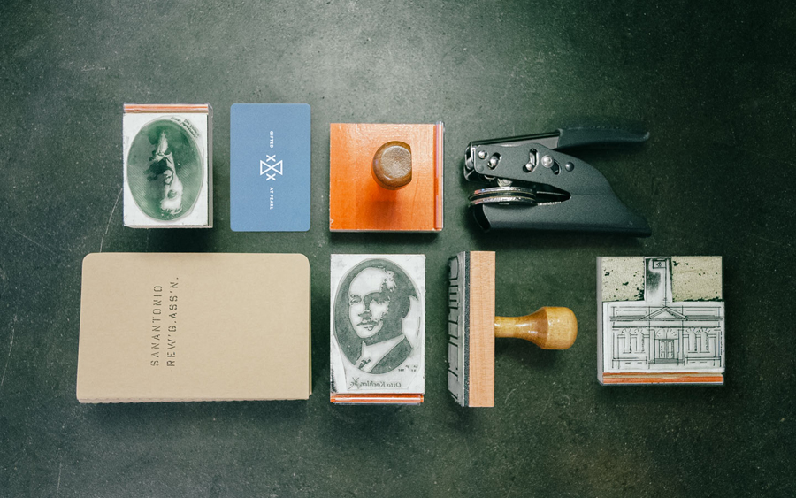
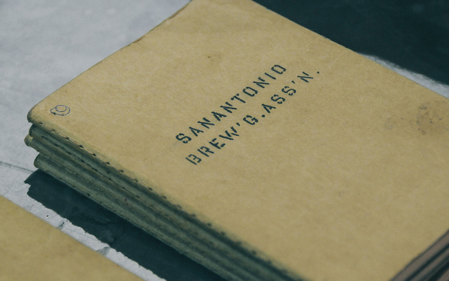
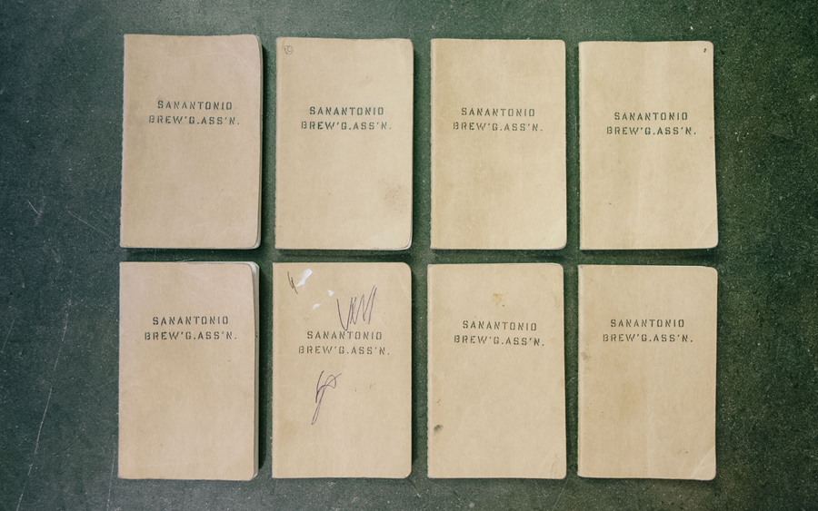
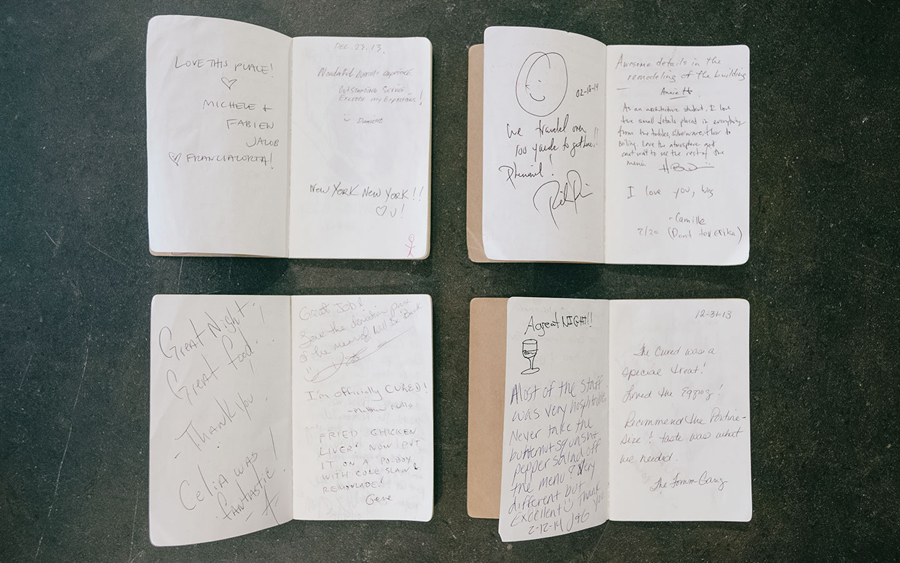
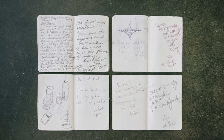
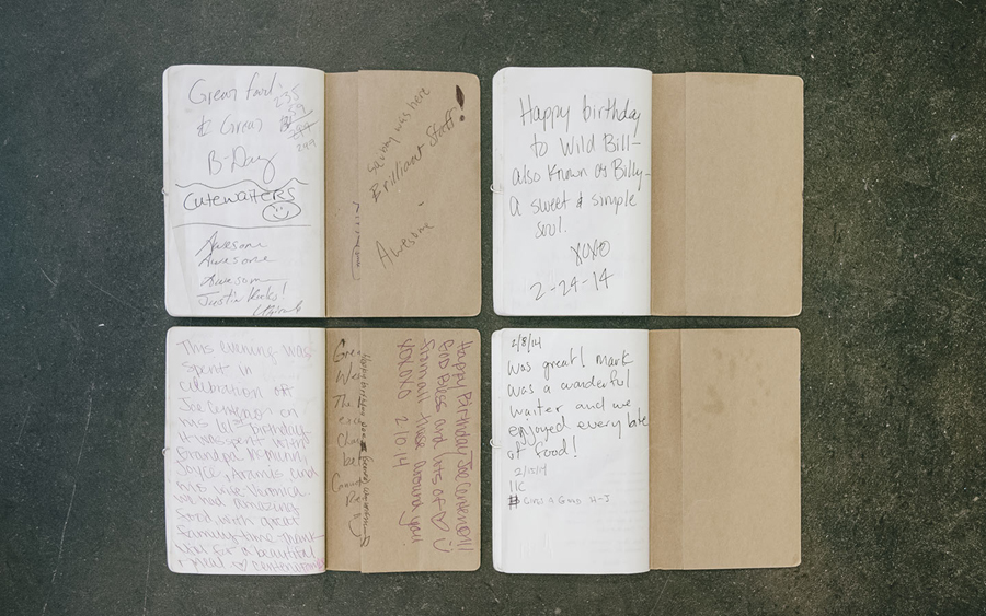
Perhaps the most interesting aspect of this project lies with what Föda describe as the ‘Cheque presenter’, a cultural experiment that functions much like a guest book of a hotel. Presented as Moleskine notebooks with rubber stamping and hand embossed detail these are dropped in with customers bills. No direction was given but several hundred were filled in 90 days with messages and illustrations. Föda go on to describe how these books transformed a simple interaction into time capsule, compendium, comic strip, critical review and graffiti wall, and incapsulated the range of human expression, from the mundane, profane and heartfelt. It is a smart and unusual detail that looks to leverage a frequent formality into a positive and brand specific interaction.
The gradual wear of these notebooks, stencil cut type across the front and stamp detail, frame the diversity of their content with a cohesive and consistent hand finished aesthetic that resonates with Cured’s interior detail of exposed utilities, industrial tools, steel, wood and concrete as well as its hand prepared menu. See more of the notebook’s contents here.
Design: Föda
Opinion: Richard Baird
Fonts Used: Ideal Sans
