La Taverna Del Suculent by Comité
Opinion by Richard Baird Posted 24 September 2014
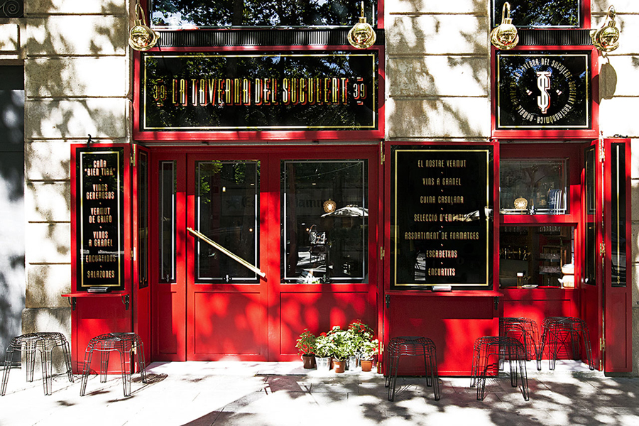
La Taverna Del Suculent is a traditional kitchen and table-less bar in the Spanish city of Barcelona. It serves homemade dishes and is described as the “next door restaurant”, a place for those looking to avoid cotton napkins and pretentious waiters, and are happy to settle for vermuth, la caña and cheese.
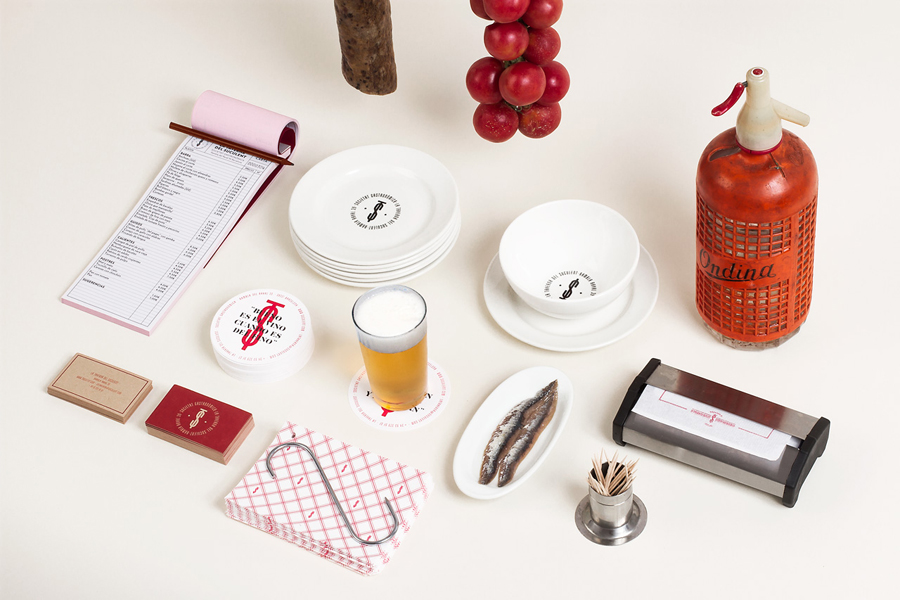
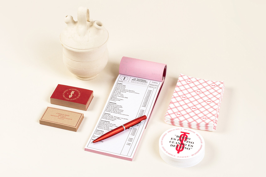
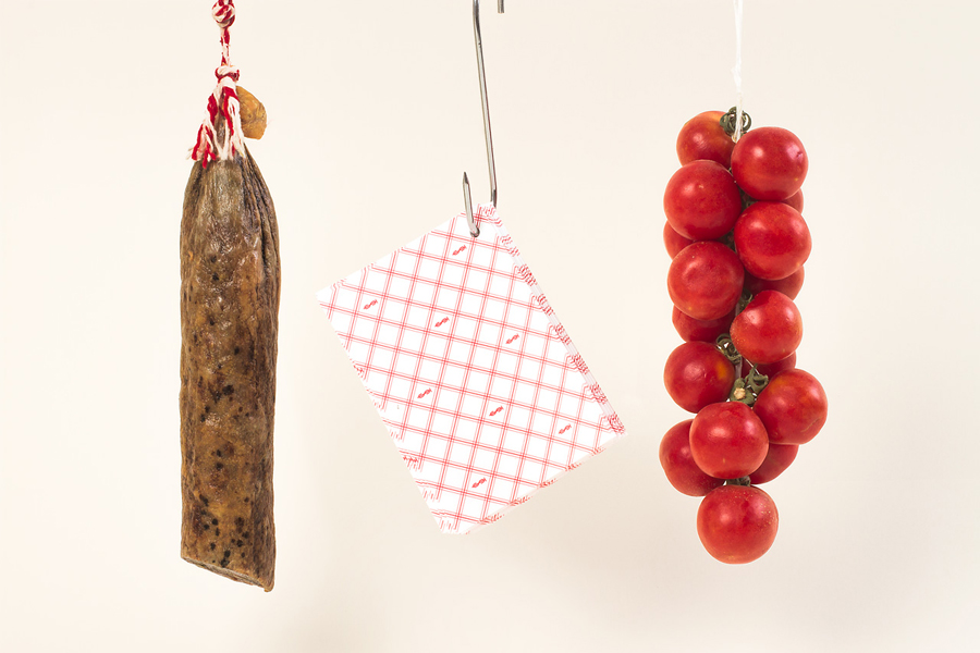
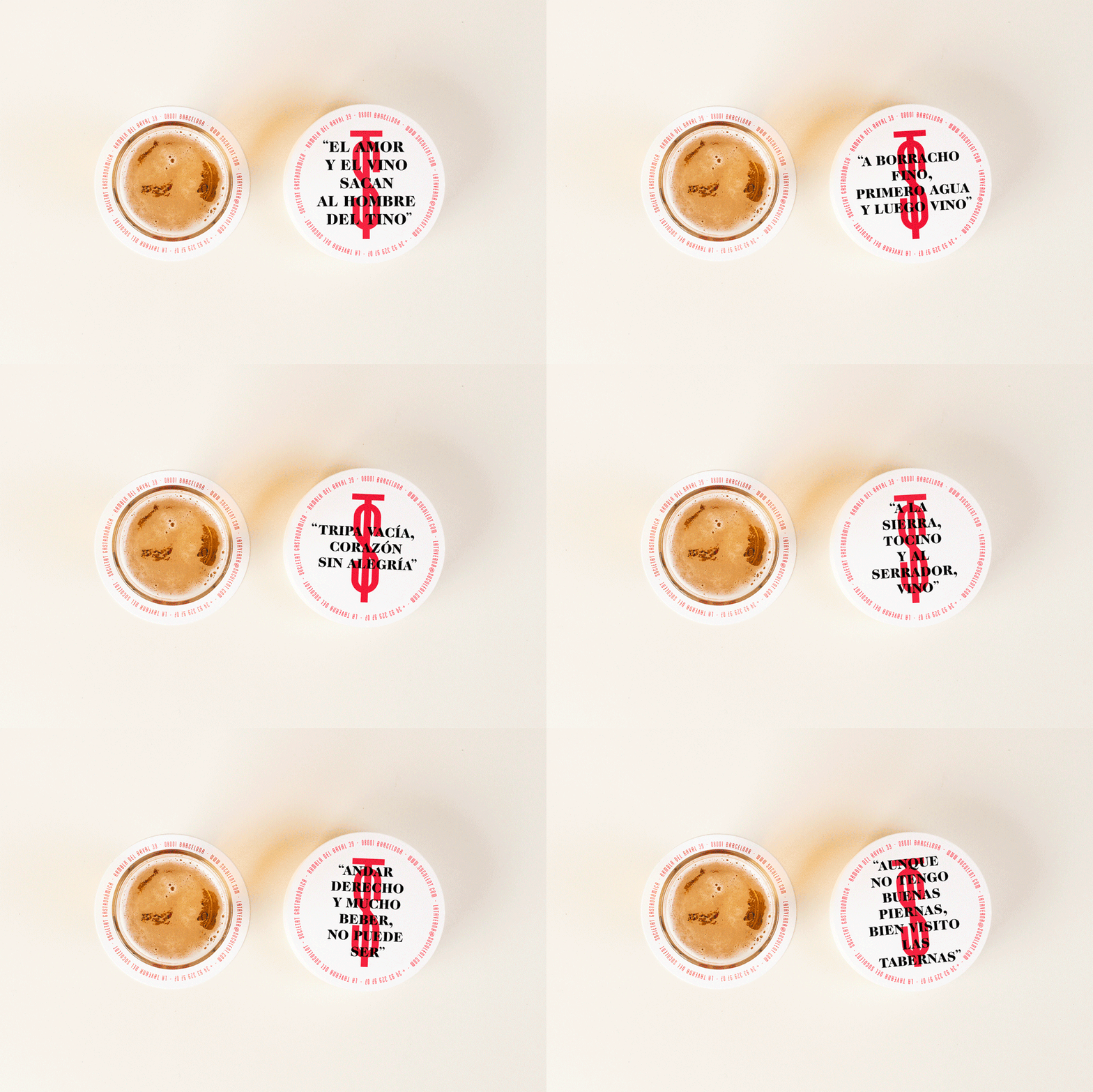
La Taverna Del Suculent’s brand identity, designed by Comité, respects and draws on many of the characteristics and design assets from the original restaurant, whilst introducing what the studio describe as a blackguard touch. This is visualised through a bright red ink, uncoated and unbleached boards, white porcelain dishes, traditional pottery and classic glassware, a new stamp inspired by bullfight graphics, as well as a simple diamond pattern, retro order book and hand painted signage. The treatment takes many well-established typographical details of the past, subtle cultural references and executes these with a contemporary restraint, quality and consistency. The project included business cards, coasters and menus.
