Simplee Aloe by Designers Anonymous
Opinion by Richard Baird Posted 20 October 2014
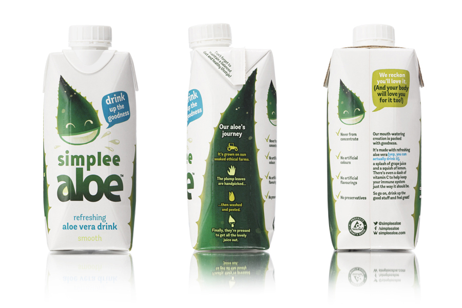
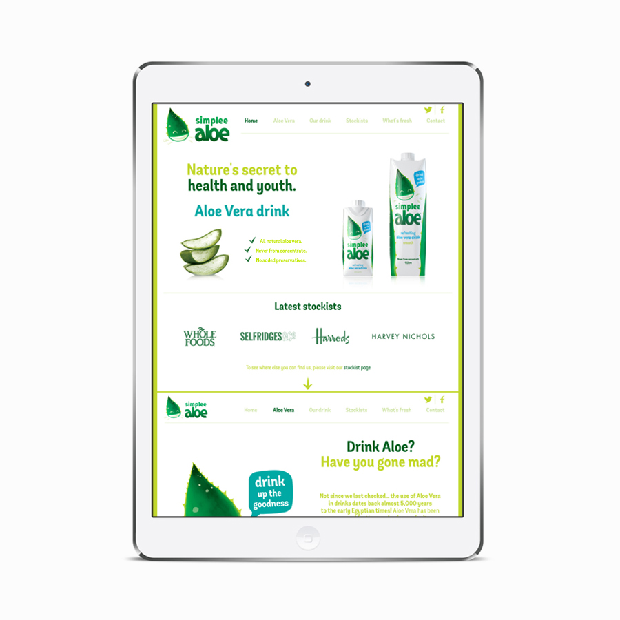
Simplee Aloe is an all natural aloe vera-based drink with grape juice and a splash of lemon created as a healthy alternative to products made with sugar, and is available in 1 litre and 330ml sizes. Founders Alex and Raymond Pang approached Designers Anonymous to help them to communicate Simplee Aloe’s unique qualities, compete with both aloe vera drinks and coconut waters, and to secure listings with big supermarkets through an engaging brand identity. This included strategy, illustration, packaging, poster and website design.
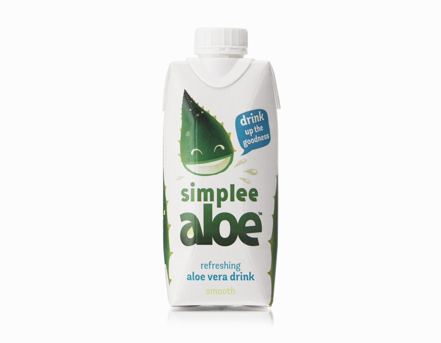
Designer Anonymous have managed to extract a lot of aesthetic impact and communicate value from the distinctive yet simple shapes of the aloe vera plant. The anthropomorphisation of a key ingredient is a frequently utilised approach, however, this project benefits from some good observational creativity, a natural duality and a cohesive variety across logotype, secondary type choice, iconography and character design.
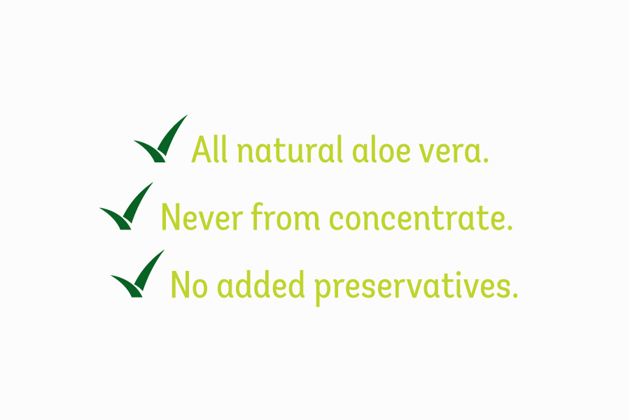
Small details such as the stem-like ‘al’ ligature of the logotype, a resonance between tapering leaves and the terminals of its letter, the use of negative space to form a droplet, the duality of the hand picked icon, the leaf-like checkmark and the cuts of the tractor, Facebook and Twitter icons are all well done and mix the obvious with the subtle. It is a consistent approach that, for the most part, appear cohesive with plenty more similarly styled assets appearing across Simplee Aloe’s website.
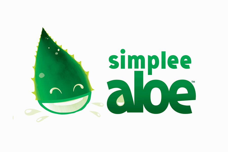
As a product of a simple observation the illustration work is great. It effectively leverages the thick cross section of aloe vera to establish an ingredient / character duality that appears unforced and well-rendered. The squint of the eyes, drawing on the liquid of the plant, alongside the mouth appear positive and expressive and makes the most of the well-known external and internal characteristics of plant. Although the speech bubbles and conversational tone of voice is perhaps a little obvious it is well-suited to a character based approach.
While aloe vera’s serrated edges could have been perceived as aggressive, the character is playful and accessible without appearing childish. This also resonates throughout a good sans-serif type choice with personality and a lowercase informality. A limited colour palette of deep greens, a subtle watercolour finish and panels of white appear fresh and natural and ground the youthful qualities of the character.
The solution establishes a strong universal brand character founded on a visually distinctive ingredient already associated with health and wellbeing, and which cohesively ties together a variety of assets.
Design: Designers Anonymous
Opinion: Richard Baird
Fonts Used: Andes Condensed
