Melt by Can I Play
Opinion by Richard Baird Posted 27 November 2014
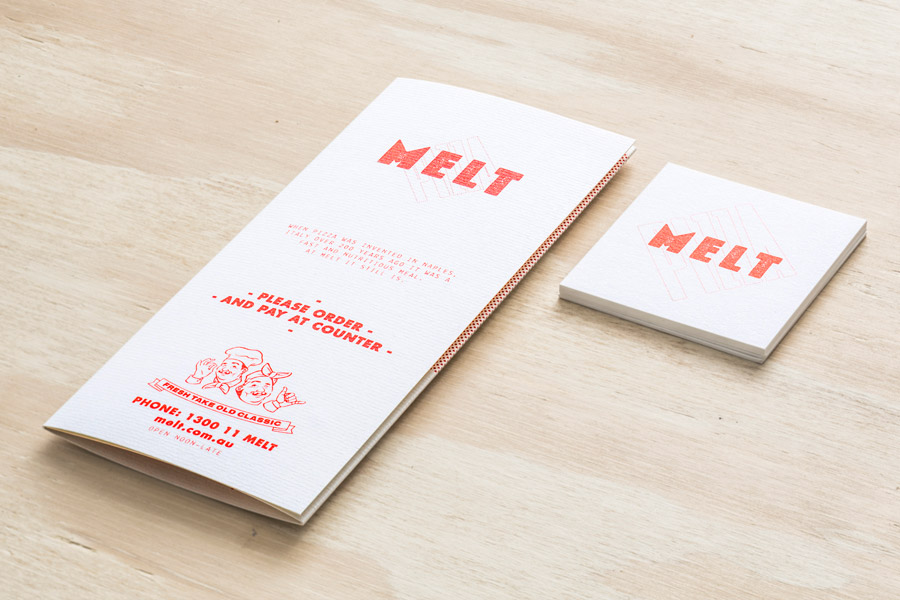
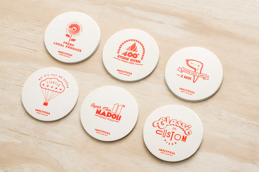
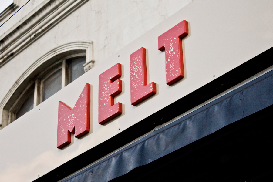
Melt is a Australian takeaway and restaurant franchise with a philosophy that looks to honour the 200 year old Napoli history of pizza making and its origins as a fast and nutritious meal by mixing high quality ingredients and recipe authenticity with the speed, price-point and openness that today’s consumers have come to expect. These values are also reflected through an absence of oil, fat or sugar from the pizza dough, displays of fresh ingredients, and throughout a brand identity treatment and interior design created by Can I Play. This included business cards, coasters, menu design and signage.
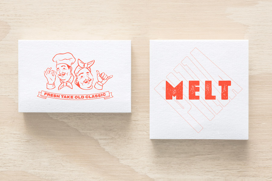
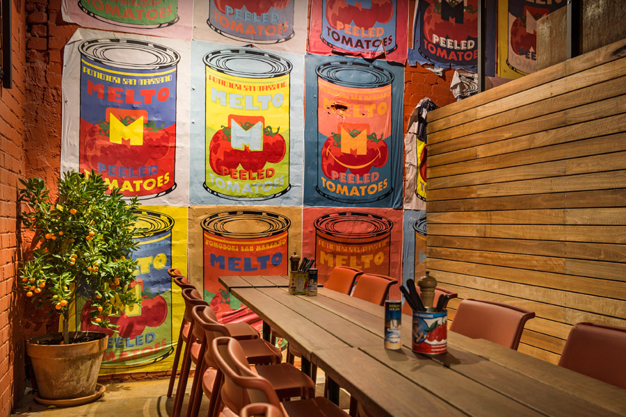
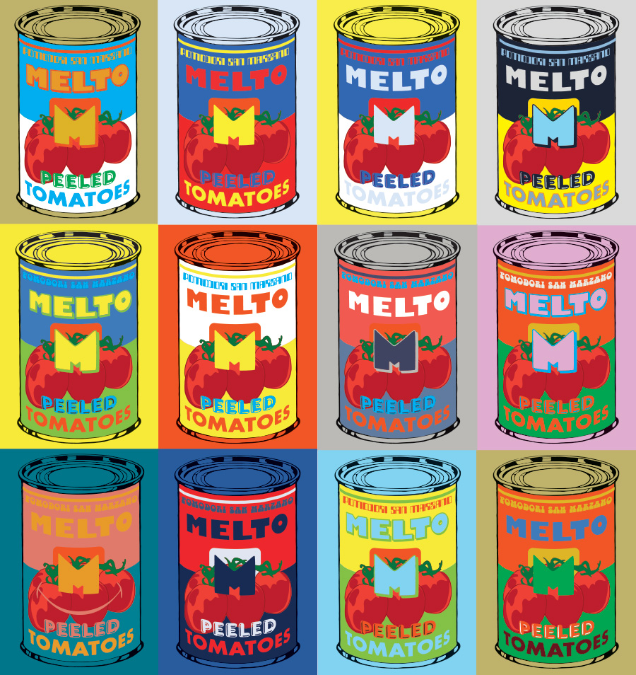
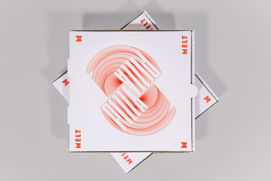
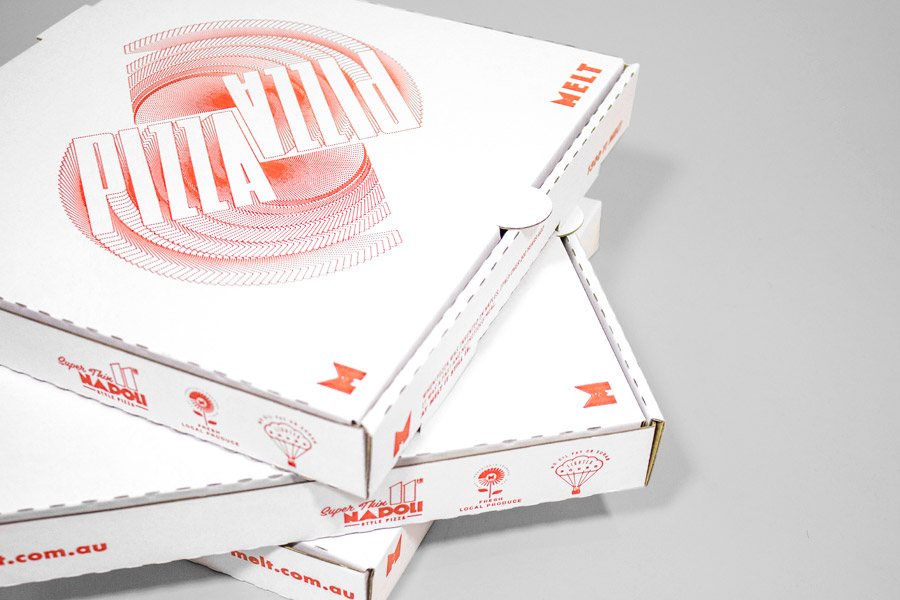
Can I Play’s brand identity, which include logotype, stationery, pizza box and menu design, as well as interior fit-out and custom artwork, effectively uses image, type and an ink restraint to reflect key values and deliver a creative and playful brand personality. It unapologetically leverages clichéd imagery in the form of two chef characters and their contemporary vector rendering to convey an element of authenticity without falsely implying a genuine Italian heritage, and a modern experience far removed from anything rustic or old-world. This is reinforced through a Fresh Take Old Classic strap line. The characters are well rendered with a good eye for expression and a retro appreciation, and while their outfits, hand gestures and moustaches could be described as a tired stereotype, are clearly used knowingly and with a cheerful intention.
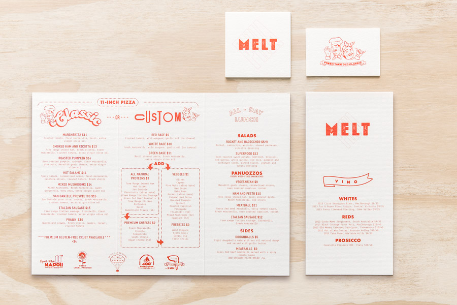
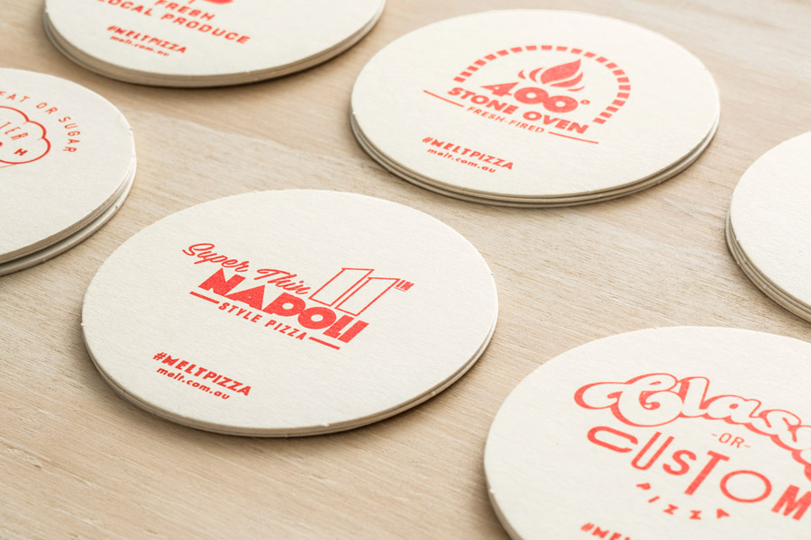
Although authentic Italian experiences may often choose to leverage a particular period aesthetic, Can I Play’s broad typographic contrast dips into the past at a variety of points, mixing the fine and heavy, detailed and reductive, worn and sharp, script and geometric, in a confident way that perhaps reflects ingredient choice. This secures a contemporary quirk and playful brand character in a familiar and frequently used way, but is largely well resolved, using an unrestrained inconsistency as a consistent brand asset. Implemented across coaters, menus and online, these, alongside illustrative detail, these draw out the stone-baked process, speed, ingredient quality and locality which are the foundation of Melt’s pizzas. These choices are intentional clunky and awkward in places but are brought together through colour.
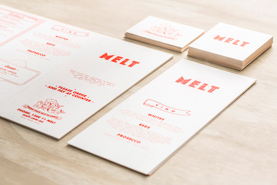
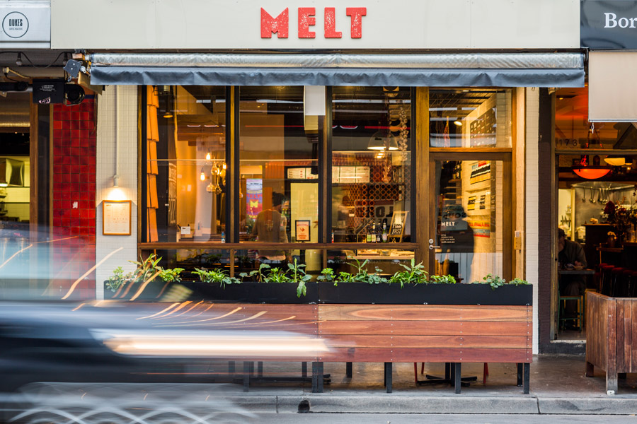
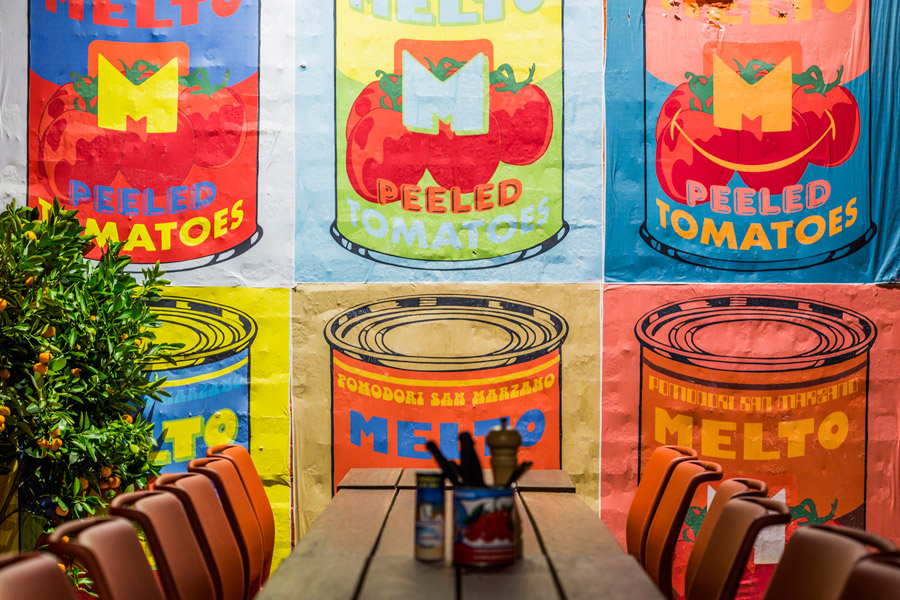
There is a wealth of detail, individually distinctive but cohesively bound. The logo, logotype and iconography while disparate, appear balanced in their impact through size and consistency of colour. There is an economy that comes through in such an approach, one that works well to convey the accessible price-point of the restaurant, but uses a variety of subtle substrate changes and in conjunction with a rich interior space of wood, concrete, brick walls, plants and bright original artwork to keep it from appearing cheap.
Design: Can I Play. Photography: Tony Mott. Opinion: Richard Baird
